Home
A/B Testing Idea #277 - Avoid showing your Call-to-action more than once on the same page
Description
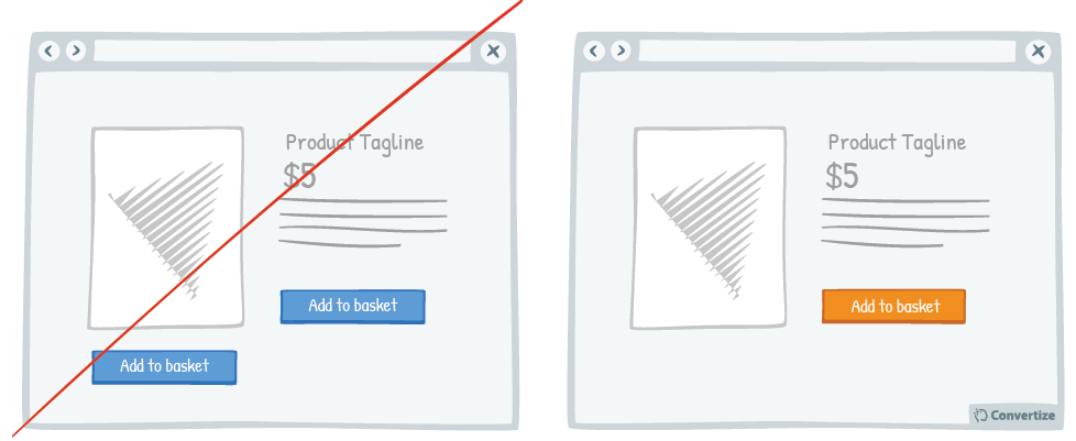
Don't be tempted to display the same information twice in two different locations on your page (if it is a one-screen page that doesn't require any scrolling) because this will make it too busy and unclear. It is unnecessary to display the Call-to-Action, contact details, or any other information twice on the one page and could in fact be counter-productive. "Simplicity is the ultimate sophistication" according to Leonard De Vinci so lighten and clean up your page with white space and by displaying each piece of key information only once - which will be sufficient if properly placed and depicted on the page.
Principles
- Processing Efficacy (Jacoby & Dallas, 1981)
- Attentional bias (Bradley & al., 1996; Buodo & al., 2002; Pessoa & Ungerleider, 2004; Vuilleumier, 2005)
The Research
Processing Efficacy
We tend to prefer things that are simple for us to understand or use.
Attentional bias
Attentional bias is the way in which human beings notice and pay much more attention to things that touch us emotionally.


Oops, you have reached your limit of 1 free tactic per hour
To get unlimited access to our 250+ tactics,
Join our FREE mailing list
Or wait 00:59:59
Congratulations!
You have unlocked our library of 250 tactics.
Keep learning or sign up to Convertize.com to start
implementing them directly in your webste.