Home
94 Best Beginner A/B Testing Ideas
This is the ultimate library of the Best A/B Testing Ideas: We have compiled 250 A/B Testing Ideas that you can try on your website to optimize your conversion rates and increase your revenues.
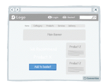
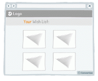
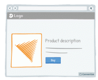
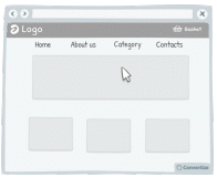
A/B Testing Idea #3 - Reduce the number of default products on your homepage
Displaying fewer default products on your homepage will help your visitors make better decisions, and feel less overwhelmed. Research shows that information overload results in less effective and satisfying…
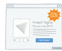
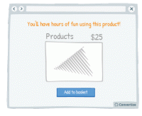
A/B Testing Idea #6 - Offer & clearly display an attractive guarantee or refund policy
By clearly offering an attractive guarantee or refund policy, customers won't find the process of paying as difficult, or negative, as they will feel that they will be able to return the product…
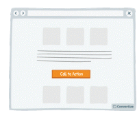
A/B Testing Idea #7 - Choose a contrasting button colour and size for your Call-to-Action
The objective of a Call-to-Action (CTA) button is to encourage your visitors to do something specific. Choosing a contrasting button colour and size will make it more prominent on your page so that…

A/B Testing Idea #8 - List the strongest benefits first
Re-ordering the benefits of your offer by putting the strongest ones first will more easily capture your visistors' attention, and make a better impression. Research has shown that people recall…

A/B Testing Idea #9 - Appeal to people's fear of loss (Loss Aversion) rather than emphasising potential gains
Loss aversion is the scientific term that explains how the pain of losing is 'felt' about twice as much as the pleasure of gaining. In general, people will be more motivated to act if they …
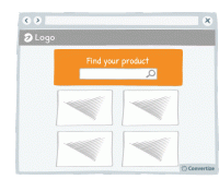
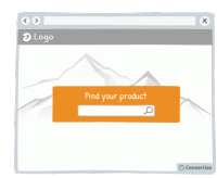
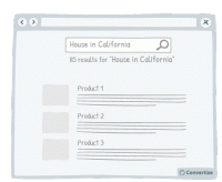
A/B Testing Idea #11 - Emphasise your search bar
If you notice that your site visitors are using the search bar often, make it more prominent by varying its colour, size and position on your page. People are more likely to notice and remember…
A/B Testing Idea #17 - Blur or fade images to reduce the emphasis on them
By blurring or fading images, you can place emphasis on something else instead. People are more likely to notice and remember an element that stands out. Your visitors will immediately be attracted…
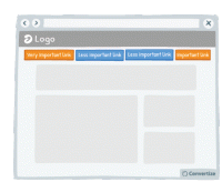
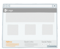
A/B Testing Idea #28 - Restructure your navigation menu
Re-ordering your navigation menu by putting the most important links at the beginning and the end of your menu will help to ensure visitors notice and click on them. Research has shown that people recall…
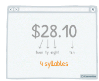
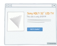
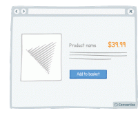
A/B Testing Idea #29 - Select a price which has the smallest amount of letters possible
Choosing a price with fewer syllables removes a little of the cognitive strain from your customer and things which are quicker and easier to understand are instantly more familiar. The clearer you can…
A/B Testing Idea #33 - Display the daily or monthly price to make the amount seem smaller
By showing the price per day or month rather than the total price, it can often seem like less. Your customer will tend to use this smaller amount as an anchor to decide whether the purchase is good…

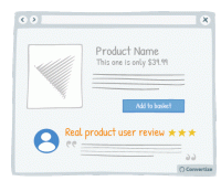
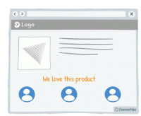
A/B Testing Idea #35 - Display customer testimonials right under the product
If you have positive reviews about your products or services then make sure they are clearly displayed; showing this "social proof" from your customer's peers is an effective persuasion …
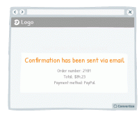
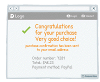
A/B Testing Idea #46 - Reassure your customer on the post-purchase confirmation page and email
Reassure your customers on the purchase or booking they have just made by clearly confirming the transaction has successfully gone through and by sending them a follow-up confirmation email. This will…
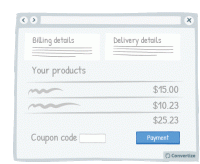
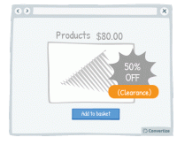
A/B Testing Idea #48 - Bring less attention to your discount/coupon code
Making your "coupon / promo code" section less visible on the page will reduce the likelihood that those who don't have a code to enter will notice it and suddenly feel as though they'…
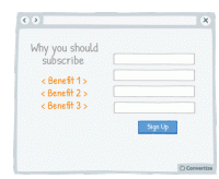
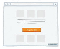
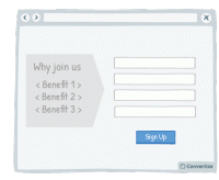
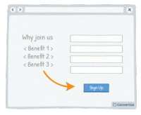
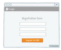
A/B Testing Idea #50 - Display clearly the 3 main benefits of registering
if you do not offer a guest checkout option, you should clearly explain to your customers the advantages of registering (to encourage them to take the time to do so). By showcasing just the 3 main …
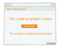
A/B Testing Idea #54 - The 4 Ws "Who, What, Where, Why" - Ensure that your homepage addresses all of these
Your homepage is most usually the first page your customers will arrive on when they visit your website and so it is vital that it is clear, easy to understand and gives them as much information as they…
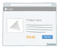
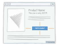
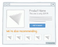
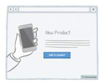
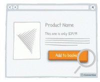
A/B Testing Idea #61 - Product name should be descriptive and unique
Choose a product names that is descriptive and unique. Indeed, having a descriptive name simplifies the understanding of the product and avoid confusion for your customers. In addition it helps to boost…
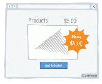
A/B Testing Idea #65 - Reduce the left digit by one and minimise the digits after the decimal
Reducing your price by one cent or penny can make all the difference when it results in the left digit going down by one. Whereas $3.89 to $3.87 wouldn't be of any consequence $4.00 to $3.99 definitely…
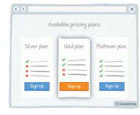
A/B Testing Idea #68 - Put your default pricing plan in the middle and make it more visible
When you have a default pricing plan (the option you would prefer people to choose) then you can influence how attractive this option is by making it stand out from the others. Placing it in the middle…

A/B Testing Idea #72 - Add strikethroughs for absent features
Adding strikethroughs for absent features on lower cost pricing plans is a great way of showing people what they'll be missing out on. Research shows that people strongly prefer avoiding losses…

A/B Testing Idea #73 - Make the free plan less visible
By making the free plan less visible, you will automatically draw attention to the other (paid) plans offered as they will stand out visually on the page. It is important to display your free offer…
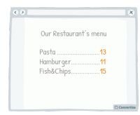
A/B Testing Idea #75 - Place your price at the bottom left corner of the screen
It has been proven that our perception of the value of a price can be influenced by the way it is visually presented to us. People tend to think of numbers on an imaginary horizontal line, with numbers…
A/B Testing Idea #76 - Utilize smaller font sizes to indicate price to pay
Using a smaller font size for your pricing is doubly effective. Firstly, it of course makes the price more subtle and so doesn't automatically draw people's attention towards the fact of paying…
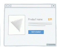
A/B Testing Idea #77 - When possible, get rid of the decimal point in the price tag
Whenever possible, remove the decimal point from your pricing as it is not necessary and adds a little extra cognitive strain for your customer. The clearer you can make things the better as people want…
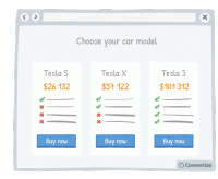
A/B Testing Idea #78 - For high numbers, more than five digits, prices should not be rounded
Careful and precise pricing is particularly important when dealing with a large sum of money. It has been shown that when purchasing a car, for example, people will actually pay more money when the prices…
A/B Testing Idea #80 - Avoid showing any signs of currency
Removing the currency sign from your prices will help customers to avoid the negative feelings associated with spending money. Indeed, research has shown that the act of paying really disrupts the pleasure…

A/B Testing Idea #82 - Give your pricing plans relatable, helpful names
The names you use for your pricing plans can really make a difference. By using names that your customers are familiar with, you will trigger an immediate emotional response that will enhance their positivity…

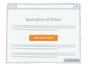
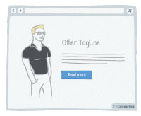
A/B Testing Idea #87 - Embed in your call-to-action some of your value propositions
Your Call-to-Action text is important as it is the final step before the conversion and so is the final point at which you can convince customers to follow through and click on that button. Use the…

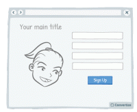
A/B Testing Idea #88 - Add human pictures to your testimonials
Adding human pictures to your testimonials and will lend them an extra credibility and therefore lead users to place more trust in them. People are likely to connect more immediately with a visual …

A/B Testing Idea #89 - Follow a simple rule: 1 Call-to-action 1: direct message 1: unique selling proposition
People respond best to clear, direct and easy-to-understand information and are easily distracted or put off by extraneous information or demands on their attention. To avoid this, try following the…
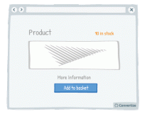
A/B Testing Idea #91 - Use a smaller font when displaying large quantities of stock (more than 5)
When you have more than 5 in stock of any given product, it's worth displaying this fact as discreetly as possible as it could deter visitors from rushing to make a purchase; if there is a large number…
A/B Testing Idea #94 - Ensure that your call-to-action appears above the fold
The "fold" is the line that separates the visible part of your webpage from the part that will only be visible once your visitor scrolls down. Your Call-To-Action (CTA) button should always …
A/B Testing Idea #95 - Limit the numbers of words in your call-to-action to 2
The simpler and more attention-grabbing you can make your Call-to-Action (CTA) the better. Customers prefer to use less mental energy and want to be led with ease around your site. Using only 2 words…
A/B Testing Idea #97 - Add white space around your call-to-action
Increasing the amount of white space around your Call-to-Action (CTA) will draw attention to it and make for a much more pleasing visual experience for the user. Equally, making sure there isn't an…
A/B Testing Idea #98 - Ask yourself if your call-to-action is persuasive enough
You want your Call-to-Action (CTA) text to tell people immediately why they should click on it and to help persuade your visitors to proceed forward with a positive action. Using engaging and persuasive…
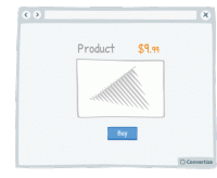
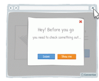
A/B Testing Idea #99 - Leverage the power of visual cues such as imagery to focus attention towards your call-to-action
Using clean, clear imagery is a great way to draw attention to your Call-to-Action (CTA). As in the example above, adding an additional simple visual stimulus that stands out through colour or another…
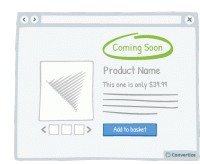
A/B Testing Idea #101 - Prioritise "coming soon" over messages saying "out of stock"
The chances are all e-merchants will at some stage be out of stock for a particular item. When this happens, in order to remain positive to your users, it's preferable to inform them that the product…
A/B Testing Idea #102 - If human pictures are used, the gaze should point towards crucial parts of your website
As humans, we have a natural, innate tendency to follow's others' gazes. It is an important social stimulus and often the way we learn about the world as we are growing up. This can therefore…
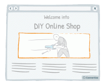
A/B Testing Idea #103 - Create a sense of trust by focusing users' attention to pictures they can relate to
Don't simply use random images on your website; it is best to encourage your customers to identify with the image. For instance, if you sell DIY products to private individuals, the most effective…
A/B Testing Idea #104 - Emotion and rational purchasing decisions: implications for rounding prices
Our brains process prices differently depending on whether a purchase is guided by rationality (for example for non-luxury, necessary goods) or by emotions (those products which we buy to make us happy…

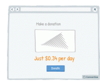
A/B Testing Idea #107 - Demonstrate the per day cost of monthly or yearly plans
Rather than only showing the yearly or monthly cost of a subscription, it can be effective to also display the daily equivalent. Studies have shown that we use a first piece of information as an anchoring…

A/B Testing Idea #109 - Expose your users to large numbers
Exposing website visitors to any high numbers before displaying your product prices can be very effective in influencing their perception of your price value. Studies have shown that people tend to…
A/B Testing Idea #110 - As your products become older, increase their price
Your customers don't judge prices in terms of "absolute values" (as they don't really know the exact value of things) but instead using a set of references constructed through looking…
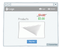
A/B Testing Idea #111 - When prices change, make the change stand out by displaying them with different font sizes
Displaying a previous, higher price alongside your current price is a great way of convincing people that what you're offering is good value. One easy and effective way to enhance this though is to…
A/B Testing Idea #114 - Emphasise the experiential advantages over the monetary ones
It's a good idea to avoid references to money when presenting your products to customers and instead to place emphasis on the experience that they will enjoy using them. People place more value…
A/B Testing Idea #117 - Explain the logic behind the promotion
Whilst offering discounts is a great way of moving stock, you don't want your customers to be left wondering why certain products are discounted and potentially questioning the quality of the product…
A/B Testing Idea #118 - Give discounts which are simple to calculate
Using precise, non-rounded numbers is a good way of making your prices seem smaller but one occasion when you don't want to do this is when you're offering discounts. You want your discounts to…
A/B Testing Idea #126 - Draw in your customer by using "we"
By using a personal pronoun instead of an impersonal form, you immediately involve your customer in the situation or product you're referencing, which will trigger a subtle emotional response and …

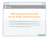
A/B Testing Idea #128 - Leverage the strength in displaying numbers rather than percentages to indicate amounts of individuals
Your visitors will perceive the same information in different ways depending on how you present it to them, It's therefore important to ensure you present information using appropriate values or framing…
A/B Testing Idea #131 - If you don't know their name, use "you" or "your" to personalise the message
By using a personal pronoun instead of an impersonal form, you immediately involve your customer in the situation or product you're referencing, which will trigger a subtle emotional response and …
A/B Testing Idea #135 - Contextualise product pictures in the ideal situation in which they should be used
If your customer can visualise themselves using your product then they'll feel more inclined to buy it. You can ensure this by setting your product images in such a way as to increase the chances…
A/B Testing Idea #136 - When appropriate, employ charismatic models
Using attractive models on your site can be very effective in the right context. Studies have shown that using a model to market a product increases its credibility, how much attention people pay to…
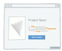
A/B Testing Idea #137 - Increase the size of terms which convey sentiments
Words that convey emotion are important parts of your content as these are trigger words that will elicit a response and engagement from your visitor. Studies have shown that we pay more attention …
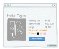
A/B Testing Idea #138 - Focus on the multitude characteristics of your products rather than on listing the technical specifications
On your product page, it is best to list all available features rather than just choosing to display a few of the main ones. People are generally more drawn towards products with lots of features and…
A/B Testing Idea #139 - Enhance your Call-to-action by altering its aesthetics thanks to border, levels or shadows
Your Call-to-Action (CTA) is a button - you need it to look like one! Adding depth to your CTA through using a border, bevel or shadowing will help to clearly distinguish it as a button that is there …
A/B Testing Idea #140 - Convey movement by adding an arrow to your Call-to-Action button
Your Call-to-Action (CTA) is a button - you need it to look like one! Adding an arrow to your CTA will help to clearly distinguish it as a button that is there to be clicked on to move on to the next …
A/B Testing Idea #142 - Continuously reassure your customer in their decision
Reassuring your customer about the choice they've made to select or purchase a certain product from your site can greatly influence how satisfied they are with that choice. To aid customer satisfaction…

A/B Testing Idea #146 - Show customers' feedback near offering or Call-to-action
Showing potential customers the positive feedback from others who have already purchased a product, used a service or signed up for membership etc. is an effective persuasion technique. Not only does…
A/B Testing Idea #148 - Nudge your visitor to your Call-to-action through arrows and visual cues
Your visitor's brains will be immediately drawn towards familiar visual elements (like arrows) as they notice and understand these visuals more quickly than any other information on the page. Utilising…

A/B Testing Idea #156 - Facilitate your user's thoughts before asking them to choose
Whilst offering a default choice is often very effective because it allows people to make a decision in a passive manner - which is often preferred as it requires less mental effort - there are some cases…

A/B Testing Idea #164 - Indicate "Most Popular" as your desired plan to be chosen
Marking your target plan as "Most Popular" is an effective persuasion technique to encourage customers to choose it. Research has shown that we have a strong tendency to copy others' …
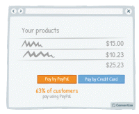
A/B Testing Idea #166 - Nudge your users to use a particular payment method by indicating how many users have used it
If you have a method of payment that you would prefer your customers use for any reason (reduced fees, easier management, etc.) then you can steer them towards this option through showing the percentage…
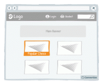
A/B Testing Idea #167 - Mark your best products as "Popular Choice"
Marking your best products as a "Popular Choice" is an effective persuasion technique to encourage more people to make the same purchase. Research has shown that we have a strong tendency…

A/B Testing Idea #169 - Indicate the number of users who have already created an account
Displaying the number of people who have already signed up to your website or newsletter is an effective persuasion tool. Research has shown that we have a strong tendency to copy others' choices…
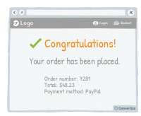
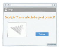
A/B Testing Idea #180 - Congratulate your customers on their booking or purchase
Congratulating your clients on the purchase or booking they have just made will induce positive feelings and help to therefore reassure them on their choice to complete this transaction. The happier you…
A/B Testing Idea #183 - Congratulate your user's decisions at every step of your funnel
Don't hesitate to congratulate your customers on their purchases. This constant confirmation that they are making a good choice will cement feelings of positivity and satisfaction around their purchase…

A/B Testing Idea #189 - Display groups of testimonials rather than just one solitary testimonial
It's always better to display multiple testimonials together rather than just one on its own. Firstly, your customers will be much more likely to feel confident in these testimonials if there are …
A/B Testing Idea #190 - Feature testimonials from target audience peers rather than celebrities
The main objective of displaying testimonials is to help your site visitors to identify with these, place trust in them and therefore decide to become customers as well. We're more likely to identify…
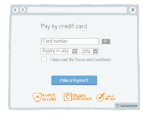
A/B Testing Idea #196 - Provide reassurance by displaying trust symbols
Trust symbols are a great and immediately impactful way to reassure your customers by showing that they can make a payment securely. Even a small factor of uncertainty can disrupt the payment process…
A/B Testing Idea #199 - Remove exit points from checkout page
Studies have shown that if you remove any distractions when people are purchasing something, they are more likely to complete the purchase. Removing all distractions from your checkout pages will allow…
A/B Testing Idea #254 - Add the word "Free" directly to your Call-To-Action
It has been proven that spending money actually activates the areas in our brain that are associated with physical pain and feelings of disgust. On the contrary, the term "free" causes us a …
A/B Testing Idea #255 - Utilize numerical values to convey more persuasive messages
Most people have a strong tendency to ignore generic and basic information and prefer to focus on recent or specific information. Therefore, in your content and titles, insist on statistics or specific…
A/B Testing Idea #257 - Avoid facial distraction by using face images to direct attention to the call-to-action
Beware of images! On the one hand, it's true that a user retains what is contained in an image more than in text. But be careful - if you use an image of a face that is looking directly at the user…
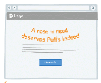
A/B Testing Idea #258 - Whenever possible, convey messages using rhymes as they will be more easily remembered
"A nose in need deserves Puffs indeed", "If the glove doesn’t fit, you must acquit". You know these slogans and better you will easily remember it. Indeed, these slogans have…

A/B Testing Idea #259 - Prioritise active over passive voice
Make simple, concise sentences in the active voice to simplify the understanding and impact of your message. A grammatically complex sentence will not have the same immediate effect on the mind of your…
A/B Testing Idea #260 - Prioritise pictures, visual elements over lone text
“A picture paints a thousand words”. Indeed, the human brain learns and retains information much better when it comes in the form of images rather than words. Images do not require translation…
A/B Testing Idea #262 - Prioritise 1st person pronouns
The power of "we" or "our" is not to be underestimated. We are social and group-dwelling beings, people, and we feel most comfortable and positive when we are included as part of a…
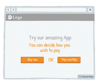
A/B Testing Idea #263 - Do not offer customers only one possibility.
A unique and effective tool of persuasion can in fact be to remind your customers that they have the freedom to choose what to do. Incorporating wording in your copy that emphasises to your customers …

A/B Testing Idea #265 - Utilize numbers in your header
It has been shown that a title containing numbers attract our look more often and therefore would increase the conversion rate. These figures don't need to be very sophisticated. "30-day free…
A/B Testing Idea #267 - Display pictures of your team members to enhance their trustworthiness
Obviously you want your site to look professional, but using photos taken from a database showing suited and booted workers with sparkling white smiles will ring as untrue to most customers. Instead, …
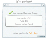
A/B Testing Idea #270 - Accurately indicate delivery time frames, including restrictions
To display delivery time in weeks or in days? That is the question... The answer is actually pretty simple. During the purchase process the customer will focus on the numbers themselves and they will …
A/B Testing Idea #274 - Display text in such a manner that it focuses the attention to the Call-to-action
Our brains form the majority of the images we “see” and like to be given direction about what to focus on so using visual cues help to draw attention towards certain elements. Lead your visitor…
A/B Testing Idea #277 - Avoid showing your Call-to-action more than once on the same page
Don't be tempted to display the same information twice in two different locations on your page (if it is a one-screen page that doesn't require any scrolling) because this will make it too busy…
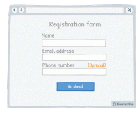
A/B Testing Idea #279 - On a form, specify which fields are optional rather than which are mandatory
When you ask your customers to fill in a form, specify which fields are optional rather than which are mandatory. On many websites we see asterisks or other visual cues to indicate if a field is mandatory…
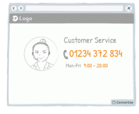
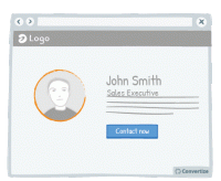
A/B Testing Idea #282 - Use a recognisable phone number for your customer service and add your opening hours
If you use a special service phone number then your customers will automatically think twice about calling as they will be expecting high call charges and long wait times. This will make your business…
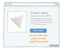
A/B Testing Idea #283 - Indicate the number of individuals who bought the product close to the call-to-action
Studies have shown that individuals tend to follow others' choices or behaviour when trying to make decisions. We automatically presume that if lots of our peers are doing something or buying a particular…
A/B Testing Idea #287 - Do not shy away from sharing crucial information for no compensation
It is proven that we are more likely to give something to someone if they have given something to us already - the desire to reciprocate such behaviour is strong and can certainly lead to action and conversion…

A/B Testing Idea #291 - Nudge users to read your page by slightly overlapping design elements and images
If you completely separate the design of each content block then you won't give your visitor the encouragement they need to continue on reading down. Rather, after reading only the first block they…

A/B Testing Idea #300 - Carefully select the period and constraints of your "free trials"
To encourage maximum conversion it is important to pick the right trial length and limitations to play into the idea of scarcity and urgency. Offering a free trial period that is too long can mean that…
A/B Testing Idea #306 - Visually distinguish between important functions using colour, size and space
To avoid grave slip-ups, make sure that important functions are highlighted by separating them and using a different colour. This will ensure that the user's attention is drawn to it and they won&#…
A/B Testing Idea #313 - Add hyperlinks for main menus, and any relevant categories
Users are not perfect, they make mistakes regularly. Indeed, it is common to see people click on areas that are not clickable. Do not try to fight against those mistakes, instead, add clickable functionality…
A/B Testing Idea #320 - Mention the location of your physical store
One of the biggest issues for making sales online can be the lack of security some shoppers associate with online eCommerce sites. Therefore, if you also have physical stores, it can be very effective…
A/B Testing Idea #324 - Utilize written content which slightly contradicts what the user wants to do
The more confident you user feels in navigating your website and completing tasks, the better experience they will have and the more likely they will be to convert. Report potential errors to your customers…
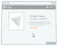
A/B Testing Idea #325 - Increase the clickable zone of your call-to-action if it is small
If your website contains small Call-to-Actions like the "see more" in the drawing above, add a transparent border around it in order to expand the clickable area. Users will not necessarily …
A/B Testing Idea #328 - Avoid placing advertising on top of lists of products
It is best to make sure that your customer's attention is fully focused on the main factors that will lead to conversion. Therefore it isn't advisable to have ad banners places above your product…


Oops, you have reached your limit of 1 free tactic per hour
To get unlimited access to our 250+ tactics,
Join our FREE mailing list
Or wait 00:59:59
Congratulations!
You have unlocked our library of 250 tactics.
Keep learning or sign up to Convertize.com to start
implementing them directly in your webste.