Home
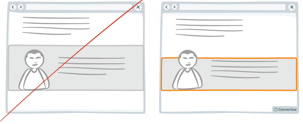
A/B Testing Idea #291 - Nudge users to read your page by slightly overlapping design elements and images

Description
If you completely separate the design of each content block then you won't give your visitor the encouragement they need to continue on reading down. Rather, after reading only the first block they might have the impression that they don't need to continue on reading and could quit the page at this point. It can be very effective therefore to lap certain design elements over different content blocks in order to make it clear that, although there a different blocks of content, each is part of the larger whole on your site. This will encourage visitors to read everything as the connection from one block to the next is emphasised.
Inspired by Nick Kolenda
Principles
- Processing Efficacy (Jacoby & Dallas, 1981)
The Research
Processing Efficacy
We tend to prefer things that are simple for us to understand or use.

Oops, you have reached your limit of 1 free tactic per hour
To get unlimited access to our 250+ tactics,
Join our FREE mailing list
Or wait 00:59:59


