Home
16 A/B Testing Ideas Used By Booking
This is the ultimate library of the Best A/B Testing Ideas: We have compiled 250 A/B Testing Ideas that you can try on your website to optimize your conversion rates and increase your revenues.
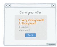
A/B Testing Idea #8 - List the strongest benefits first
Re-ordering the benefits of your offer by putting the strongest ones first will more easily capture your visistors' attention, and make a better impression. Research has shown that people recall…
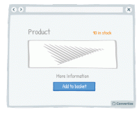
A/B Testing Idea #91 - Use a smaller font when displaying large quantities of stock (more than 5)
When you have more than 5 in stock of any given product, it's worth displaying this fact as discreetly as possible as it could deter visitors from rushing to make a purchase; if there is a large number…
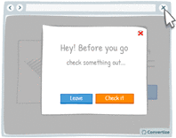
A/B Testing Idea #100 - Display an exit pop-up when your visitor goes to close the page
It happens all too often that your users leave your website because they did not find what they wanted. Perhaps they only visited one or two pages. Therefore, by setting up an "exit pop-up…
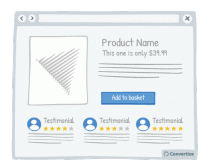
A/B Testing Idea #146 - Show customers' feedback near offering or Call-to-action
Showing potential customers the positive feedback from others who have already purchased a product, used a service or signed up for membership etc. is an effective persuasion technique. Not only does…
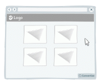
A/B Testing Idea #153 - Display pop-up information when hovering over a product
When customers hover over a product, display a pop-up product card that offers them condensed information. By showing only carefully selected information about the product in this way, customers won…
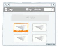
A/B Testing Idea #167 - Mark your best products as "Popular Choice"
Marking your best products as a "Popular Choice" is an effective persuasion technique to encourage more people to make the same purchase. Research has shown that we have a strong tendency…
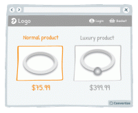
A/B Testing Idea #176 - Show lower-quality products near higher-quality ones
To make your higher-end products seem even more attractive, display them alongside your lower-end products so that customers can compare the two together. The difference in quality will be larger and …

A/B Testing Idea #184 - Ask your customer to share feedback
If you want to build up your social media community and generate organic publicity then asking customers to share feedback on products they've purchased from you can be very effective. Once we&#…
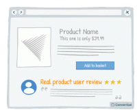
A/B Testing Idea #190 - Feature testimonials from target audience peers rather than celebrities
The main objective of displaying testimonials is to help your site visitors to identify with these, place trust in them and therefore decide to become customers as well. We're more likely to identify…

A/B Testing Idea #192 - Display contextual details (such as location) to allow users to identify with the reviewer
Featured testimonials will be more credible if your users can identify with the reviewers and view them as real people rather than just disconnected words on the screen. Contextual details like location…
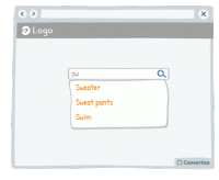
A/B Testing Idea #275 - Allow users, with your search bar, to jump to suggestions based on what they typed
In order to increase conversion rates, simply help your customer to find what they are looking for as quickly and easily as possible. Offering suggestions in the search bar based on what the customer …
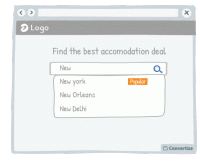
A/B Testing Idea #276 - Bring attention to a popular product to facilitate the visitor to make a decision
Studies have shown that individuals tend to follow others' choices or behaviour when trying to make decisions. We automatically presume that if lots of our peers are doing something or buying a particular…
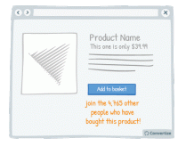
A/B Testing Idea #283 - Indicate the number of individuals who bought the product close to the call-to-action
Studies have shown that individuals tend to follow others' choices or behaviour when trying to make decisions. We automatically presume that if lots of our peers are doing something or buying a particular…
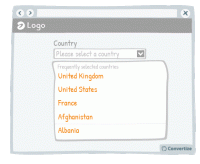
A/B Testing Idea #293 - Indicate popular options as the default ones
Everyone hates filling out information online - the easier and quicker you can make that for your users, the more likely they are to follow through, complete an action and ultimately convert. One way …
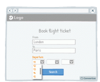
A/B Testing Idea #302 - Limit human error and frustration by only offering possible inputs in fields
In order to avoid preventable errors and possible frustration on the part of your customer, don't give them the ability to enter incorrect information. For example, as in the above drawing, when someone…

A/B Testing Idea #315 - Indicate what your visitor has most recently researched in a drop-down menu
When a user begins a search, start by showing them previous searches they have made that correspond. Displaying these first and perhaps in a different colour to really distinguish them is a good way of…

Oops, you have reached your limit of 1 free tactic per hour
To get unlimited access to our 250+ tactics,
Join our FREE mailing list
Or wait 00:59:59


