Home
10 A/B Testing Ideas Used By Ikea
This is the ultimate library of the Best A/B Testing Ideas: We have compiled 250 A/B Testing Ideas that you can try on your website to optimize your conversion rates and increase your revenues.
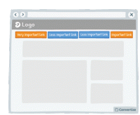
A/B Testing Idea #28 - Restructure your navigation menu
Re-ordering your navigation menu by putting the most important links at the beginning and the end of your menu will help to ensure visitors notice and click on them. Research has shown that people recall…
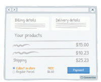
A/B Testing Idea #45 - Provide a free option for in-store pick-up
By providing a free store pick-up option, your customers will be giving customers three advantageous options: the option of avoiding delivery charges (awarding the pleasure of paying less); choosing the…
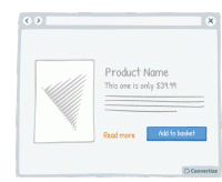
A/B Testing Idea #133 - Provide a "more info" button for every product
Your customers will feel like the more information they are given in order to make a decision, then the better that decision will be. So the more information you can give them about the product (in…
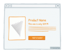
A/B Testing Idea #134 - Place graphs, visuals and pictures on the left-and side of the screen
Visual elements positioned on the left are processed by the right hemisphere of the brain, which is better suited for image processing. Therefore, people will "digest" the page more quickly …
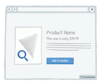
A/B Testing Idea #145 - Provide the option of enlarging product pictures
If the primary selling feature of your product is visual, you should provide the possibility of enlarging or zooming in on the image so that the customer can see the product in more detail, as they would…
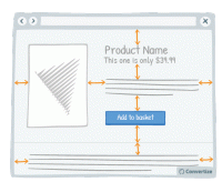
A/B Testing Idea #147 - Add more white space in your pages
A lot of websites consider white space to be lost space but they couldn't be more wrong! Increasing the amount of white space makes for a much clearer page and therefore a more pleasing visual experience…
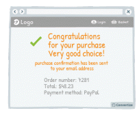
A/B Testing Idea #183 - Congratulate your user's decisions at every step of your funnel
Don't hesitate to congratulate your customers on their purchases. This constant confirmation that they are making a good choice will cement feelings of positivity and satisfaction around their purchase…
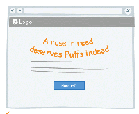
A/B Testing Idea #258 - Whenever possible, convey messages using rhymes as they will be more easily remembered
"A nose in need deserves Puffs indeed", "If the glove doesn’t fit, you must acquit". You know these slogans and better you will easily remember it. Indeed, these slogans have…
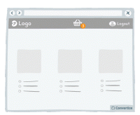
A/B Testing Idea #266 - Render the user's basket continuously accessible through out your funnel
It is a good idea to give customers the opportunity to view the contents of their basket at all times by displaying a basket icon on all pages that shows what is already saved in there when hovered over…
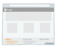
A/B Testing Idea #320 - Mention the location of your physical store
One of the biggest issues for making sales online can be the lack of security some shoppers associate with online eCommerce sites. Therefore, if you also have physical stores, it can be very effective…

Oops, you have reached your limit of 1 free tactic per hour
To get unlimited access to our 250+ tactics,
Join our FREE mailing list
Or wait 00:59:59


