Home
A/B Testing Idea #147 - Add more white space in your pages

Description
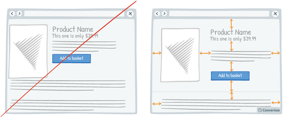
A lot of websites consider white space to be lost space but they couldn't be more wrong! Increasing the amount of white space makes for a much clearer page and therefore a more pleasing visual experience for the user.
In order to process information well, we need it to be presented in a clear manner without too much extraneous clutter. Limiting the information and presenting it well helps to guide the user across the page with minimal stress and confusion and ensures that certain important aspects are noticed, as presenting them in this way creates unmissable focal points for your user.
Displaying your content in this way will also add elegance and sophistication to your site, keeping it free of clutter and giving the impression of a high-class brand.
Inspired by Nick Kolenda
Principles
- Aesthetic-Usability Effect (Bloch, 1983; Donald Norman, 2002)
- Processing Efficacy (Jacoby & Dallas, 1981)
The Research
Aesthetic-Usability Effect
Aesthetic designs are perceived as easier to use than less-aesthetic designs, and are more likely to be purchased regardless of functionality.
Processing Efficacy
We tend to prefer things that are simple for us to understand or use.

Oops, you have reached your limit of 1 free tactic per hour
To get unlimited access to our 250+ tactics,
Join our FREE mailing list
Or wait 00:59:59


