Home
10 A/B Testing Ideas Used By Expedia
This is the ultimate library of the Best A/B Testing Ideas: We have compiled 250 A/B Testing Ideas that you can try on your website to optimize your conversion rates and increase your revenues.
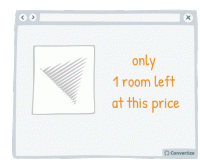
A/B Testing Idea #9 - Appeal to people's fear of loss (Loss Aversion) rather than emphasising potential gains
Loss aversion is the scientific term that explains how the pain of losing is 'felt' about twice as much as the pleasure of gaining. In general, people will be more motivated to act if they …
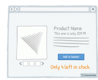
A/B Testing Idea #12 - Display low stock availability
Displaying the number of items left in stock will motivate people to make their purchase more quickly in order to avoid missing out. The more difficult or urgent it is to acquire an item, or the more…
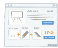
A/B Testing Idea #24 - Bundle products and offer 1-click "Add to Basket"
Offering a 1-click "add to basket" option both speeds up the paying process and makes it seem as though only one purchase is being made rather than multiple individual purchases. This will…
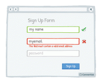
A/B Testing Idea #39 - Offer immediate feedback on completed fields
Letting your customer know instantly whether information they have entered is correct or incorrect will help to make the whole process clearer and easier. Research has shown that people are more motivated…
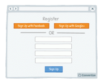
A/B Testing Idea #52 - Offer the option to register through social media
Statistics show that 1 in 4 customers abandon a purchase if they are forced to register for an account first. Today people feel like they have too many accounts and so one way of streamlining this …
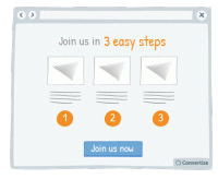
A/B Testing Idea #163 - Use pictograms to help visitors visualise the simplicity of a process or task
The more your visitor is convinced of the simplicity of an action on your site (for example your purchase or registration process), the more motivated they will be to complete it. Using simple, clear …
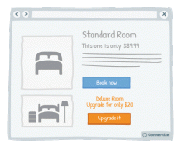
A/B Testing Idea #188 - Upsell by highlighting how small the extra cost would be
Upselling is a technique whereby you offer your client a superior and more expensive product than the one he was considering. By highlighting how small the price difference is between the two products…
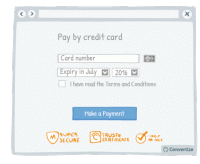
A/B Testing Idea #196 - Provide reassurance by displaying trust symbols
Trust symbols are a great and immediately impactful way to reassure your customers by showing that they can make a payment securely. Even a small factor of uncertainty can disrupt the payment process…
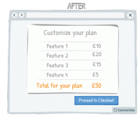
A/B Testing Idea #288 - If users have spent some resources, e.g. financial or time, in your service, indicate how much they have been spent
People are more likely to continue on in vain with a project or plans for which they have already invested money, time or effort, even if they no longer want to or there may be more potential losses to…
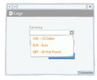
A/B Testing Idea #294 - Display often-used options at the top of drop down lists
Everyone hates filling out information online - the easier and quicker you can make that for your customers, the more likely they are to follow through, complete an action and ultimately convert. One …

Oops, you have reached your limit of 1 free tactic per hour
To get unlimited access to our 250+ tactics,
Join our FREE mailing list
Or wait 00:59:59


