Home
78 Best Expert A/B Testing Ideas
This is the ultimate library of the Best A/B Testing Ideas: We have compiled 250 A/B Testing Ideas that you can try on your website to optimize your conversion rates and increase your revenues.
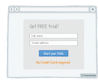
A/B Testing Idea #2 - Avoid demanding credit card information when offering free trials
Being required to enter credit card details evokes the negative feelings associated with spending money. Indeed, research has shown that the act of paying really disrupts the pleasure of an experience…
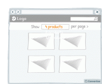
A/B Testing Idea #15 - Include an option to adjust the number of items displayed per page
Adding an option to adjust the number of items displayed per page allows your visitor to feel more in control of how they spend time on your site. This will allow also them to adjust the layout to…
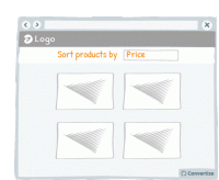
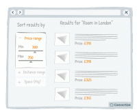
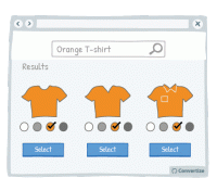
A/B Testing Idea #16 - Enable the possibility to filter options
Adding a sorting option will allow visitors to see the products that interest them without having to spend too much time and effort working out differences in features and costs. The easier and 'smoother…
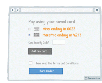
A/B Testing Idea #23 - Save customers' card details and automate payments
It is better to optimise the payment process as much as possible. Studies have shown that certain forms of payment 'hurt' more than others - the more observable, tangible or transparent the payment…
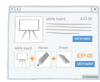
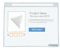
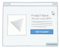
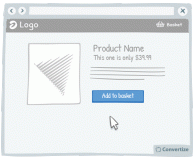
A/B Testing Idea #24 - Bundle products and offer 1-click "Add to Basket"
Offering a 1-click "add to basket" option both speeds up the paying process and makes it seem as though only one purchase is being made rather than multiple individual purchases. This will…
A/B Testing Idea #30 - Make your checkout page responsive for mobile devices
A mobile-friendly checkout page is essential to ensure that people follow through with their purchase. A checkout page that is mobile responsive will not only be more aesthetically pleasing but will be…
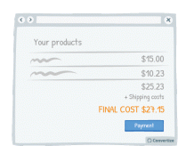
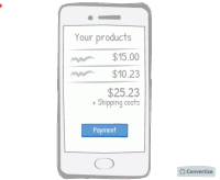
A/B Testing Idea #31 - Display the final price in the shopping basket before final checkout
Your customers want to have all information relevant to payment before proceeding with the purchase and, if they feel unsure about what they are going to be charged, they are more likely to abandon the…
A/B Testing Idea #32 - Make your menu responsive (mobile-friendly)
A mobile-friendly menu is essential to ensure that you don't miss out on customers using mobile devices. Having a menu that is mobile responsive will not only be more aesthetically pleasing but will…
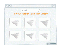
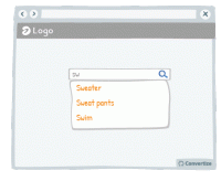
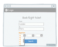
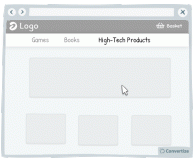
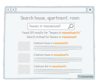
A/B Testing Idea #36 - Create a dedicated search bar within a specific range of products
Research shows that information overload and too much choice results in less effective and satisfying decisions than when less information is presented or fewer options are on offer. It can also lead …
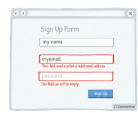
A/B Testing Idea #38 - Display an error-message for important fields which were incorrectly filled in or missing
By immediately showing your customers any issues with information they are entering, you will avoid any added stress or misunderstandings. Creating an easy process for your customers is key as they will…
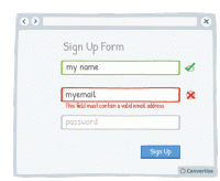
A/B Testing Idea #39 - Offer immediate feedback on completed fields
Letting your customer know instantly whether information they have entered is correct or incorrect will help to make the whole process clearer and easier. Research has shown that people are more motivated…
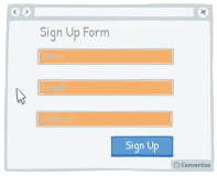
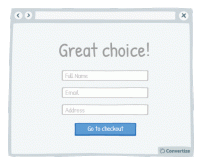
A/B Testing Idea #40 - Whenever possible, pre-fill fields whilst ensuring that users are able to alter them
Making forms as simple and quick to fill in as possible will encourage your customers to complete the desired actions. Where possible - and applicable - it will be helpful therefore to pre-fill form fields…
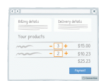
A/B Testing Idea #41 - Allow customers to update their basket
Allowing customers to clearly update the items that they have in their basket is important as it allows them the opportunity to review their purchases prior to making a final decision, the same way they…
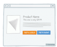
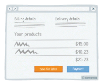
A/B Testing Idea #43 - Let a user save an item for later (wishlist)
Your customers will appreciate having the choice between buying the product immediately or saving it for another time. People like to feel as though they are in control of their shopping experience…
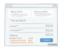
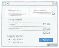
A/B Testing Idea #44 - Offer multiple delivery options, including Express
Offering multiple delivery options is important both to offer choice to the customer but also for the possibility of further profit made on that purchase. Customers like to have a sense of control …
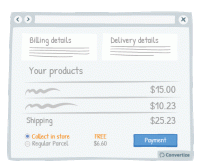
A/B Testing Idea #45 - Provide a free option for in-store pick-up
By providing a free store pick-up option, your customers will be giving customers three advantageous options: the option of avoiding delivery charges (awarding the pleasure of paying less); choosing the…
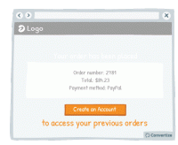
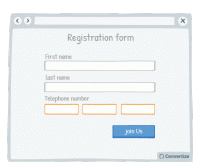
A/B Testing Idea #47 - Offer visitors the option to create an account AFTER checking out
There’s nothing more aggravating than being presented with the “Register to Create an Account!” pop-up before you can complete your order. This can often put people off continuing with…
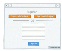
A/B Testing Idea #52 - Offer the option to register through social media
Statistics show that 1 in 4 customers abandon a purchase if they are forced to register for an account first. Today people feel like they have too many accounts and so one way of streamlining this …
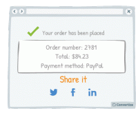
A/B Testing Idea #55 - Display social sharing buttons after customers have finalised their purchase
It's important not to miss an opportunity to offer your clients the chance to share your content or their actions on your site on social media as this can greatly boost awareness and popularity. …
A/B Testing Idea #57 - Make your website responsive (mobile-friendly)
A mobile-friendly website is essential to ensure that you don't miss out on customers using mobile devices. A website that is mobile responsive will not only be more aesthetically pleasing but will…
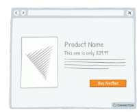
A/B Testing Idea #58 - Show more than 3 high-resolution product images
Product images are an important element of your product page. In fact, people react far more strongly to visuals than to text and it allows them to form a more emotional and personal attachment to the…
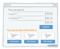
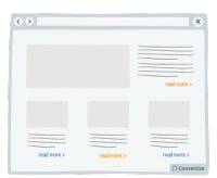
A/B Testing Idea #60 - Offer cross-selling
Cross-selling is an effective way of increasing sales by proposing related products to your customers when they are in the process of viewing or purchasing something. For example, these might be accessories…
A/B Testing Idea #69 - Create a default option or add-on
If you have a particular option or add-on that you would prefer your customer to choose, then making it a default option will greatly increase the chances of them doing so. Default options are so attractive…
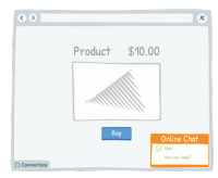
A/B Testing Idea #74 - Improve your customer service by having a live chat option
Live chat is a very effective method of communication with your site visitors. Offering an immediate and direct link to another human being will give your customers confidence and reassurance not only…
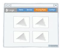
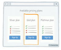
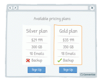
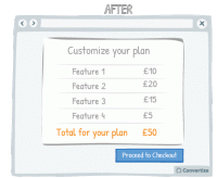
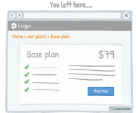
A/B Testing Idea #83 - Ensure to have a page dedicated to your pricing plans
Creating a page that is dedicated solely to your pricing schemes and offers has many benefits. Firstly, it's a simple, clear and effective way of displaying all your prices to your visitor meaning…
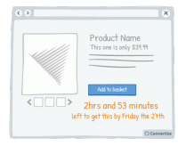
A/B Testing Idea #96 - Create urgency by giving a limited timeframe for fast delivery
Offering fast delivery time is a strong motivator for your customers to complete a purchase as we always prefer to take an option that results in quicker gratification. What's more, as you'…
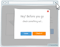
A/B Testing Idea #100 - Display an exit pop-up when your visitor goes to close the page
It happens all too often that your users leave your website because they did not find what they wanted. Perhaps they only visited one or two pages. Therefore, by setting up an "exit pop-up…
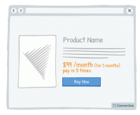
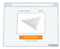
A/B Testing Idea #106 - Give the possibility to pay in instalments
The way in which a price is presented to your customer can greatly influence how they perceive the value of it. For example, offering people the option to pay in installments will subconsciously make …
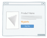
A/B Testing Idea #115 - Offer your very own method of paying or currency
Using a custom currency (credits, points, etc.) will reduce the pain of paying (the negative feelings associated with spending money). Indeed, research has shown that the act of paying really disrupts…
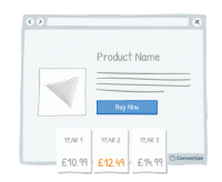
A/B Testing Idea #119 - Augment prices more often, but by smaller increments
Avoid waiting until the moment of desperation to suddenly raise your prices, anticipate and increase them gradually. Using frequent but small price increases will reduce the impact that these could have…
A/B Testing Idea #144 - Utilize a multi-step (at least 2) opt-in
Whilst is might seem counter-intuitive, two-step opt-ins are actually more powerful than one-step opt-ins. A One-Step Opt-In consists of simply presenting input fields directly on the page, whilst a Two…
A/B Testing Idea #145 - Provide the option of enlarging product pictures
If the primary selling feature of your product is visual, you should provide the possibility of enlarging or zooming in on the image so that the customer can see the product in more detail, as they would…
A/B Testing Idea #149 - Suggest complimentary products at the check-out
Cross-selling is a good way of increasing the user's basket before they complete the purchase. When a user is in the checkout process, it is a good time to display other products that may interest…
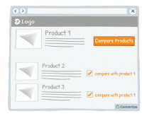
A/B Testing Idea #151 - Add a compare products option/tickbox
Adding a product comparison option to your site will allow visitors to see the products that interest them without having to expend too much effort working out differences in features and costs. The easier…
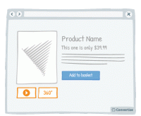
A/B Testing Idea #152 - Offer 360 degrees videos of your product
The more information a user has access to about a product, the more likely they are to buy it. You can take advantage of this by offering your user more extensive views of it. There are various different…
A/B Testing Idea #153 - Display pop-up information when hovering over a product
When customers hover over a product, display a pop-up product card that offers them condensed information. By showing only carefully selected information about the product in this way, customers won…
A/B Testing Idea #161 - Through cookies, save products in the shopping cart for a certain period
Reserving products in the shopping basket for a limited time only with motivate your customers to complete their purchases. The sense of urgency combined with the idea that they may miss out on the…
A/B Testing Idea #162 - Offer a "save for later" button on your basket page
Your customers will appreciate having the choice between making their purchase immediately or saving their items to complete purchase later. People like to feel as though they are in control of their…
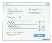
A/B Testing Idea #171 - Customize your discount promotions by integrating your user's name/details
Your customer will feel more involved in and connected with your coupon code - and therefore be more likely to use it - if you make use of their name to give it a personalised touch. A natural tendency…
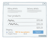
A/B Testing Idea #173 - Offer a FREE upgrade to a better delivery option with first purchase or referal
Providing a free upgrade to express delivery for new customers is a strategy based on the "give and take" idea: you provide your client with something of value (free express delivery) so that…
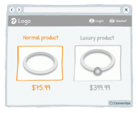
A/B Testing Idea #176 - Show lower-quality products near higher-quality ones
To make your higher-end products seem even more attractive, display them alongside your lower-end products so that customers can compare the two together. The difference in quality will be larger and …
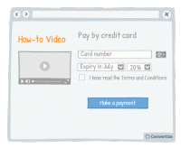
A/B Testing Idea #178 - Display "how-to" videos related to products on the checkout page
By placing instructional and informative "how-to" videos just before the final stage of payment, you are offering reassurance to your customers by showing them how easy to use and interesting…
A/B Testing Idea #179 - Seek a gradual engagement, over a hurried signup
Making a form easy and fun to fill in will encourage people to complete it and convert. Starting your form by asking for a lot of personal information will annoy people and they are more likely to abandon…
A/B Testing Idea #187 - Display an exit pop-up when people try to leave their basket before completing the checkout process
If your customers have made it to the basket or payment page of your checkout funnel then they've already invested a certain amount of time on your site. The exit pop-up is a good idea to try and …
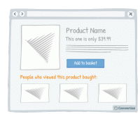
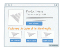
A/B Testing Idea #191 - Include a section: "People who browsed this product, also bought:"
Adding a “People who viewed this product bought...” feature is an effective persuasion technique. Research has shown that we have a strong tendency to copy others' choices when we are…
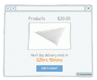
A/B Testing Idea #193 - Add a countdown timer for earliest delivery times
By adding a countdown timer showing how long they have left to purchase a product in order to get it delivered at the earliest possible time, a sense of urgency is added which will make the customer more…
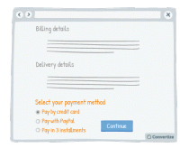
A/B Testing Idea #197 - Enable more than one means to pay
Offering multiple payment methods offers customers the possibility to make a purchase in the way they feel most confident and secure, increasing the likelihood of them finalising payment. People also…
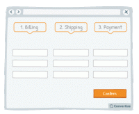
A/B Testing Idea #200 - Test a multi-page checkout process against a single one
To reduce bounce rate during the checkout process, test using a one-page solution: that is to say, display all the different steps - billing, shipping and payment - on one page rather than having a new…
A/B Testing Idea #202 - Don't ask for any non-essential information during the checkout process
When your visitors are in the process of completing their checkout then you don't want to do anything to distract them from this. Don't therefore ask for any non-essential information during this…
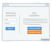
A/B Testing Idea #203 - Enable the possibility to checkout as a guest, without needing to create an account
Your customers will appreciate having the choice of when to register on your website as this induces the positive feeling of having the autonomy to influence the purchasing process. T his also gives…
A/B Testing Idea #266 - Render the user's basket continuously accessible through out your funnel
It is a good idea to give customers the opportunity to view the contents of their basket at all times by displaying a basket icon on all pages that shows what is already saved in there when hovered over…
A/B Testing Idea #272 - Offer feature-by-feature comparisons
Providing a comparison table will allow your customers to immediately access all the information required for decision-making. Studies have shown that our perceptions are formed by using comparison techniques…
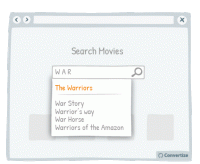
A/B Testing Idea #275 - Allow users, with your search bar, to jump to suggestions based on what they typed
In order to increase conversion rates, simply help your customer to find what they are looking for as quickly and easily as possible. Offering suggestions in the search bar based on what the customer …
A/B Testing Idea #285 - Offer the possibility to postpone payment
Offering the possibility to postpone payment of a purchase will make the price of the item become less relevant to the buyer. Instead of thinking about the price, they will be thinking about the fact …
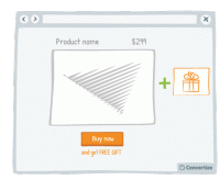
A/B Testing Idea #286 - Hand out free gifts with products bought
The promise of a free gift is a strong incentive to get people to buy. Studies have shown that people are likely to feel compelled to give something back when they receive something for free (it's…
A/B Testing Idea #288 - If users have spent some resources, e.g. financial or time, in your service, indicate how much they have been spent
People are more likely to continue on in vain with a project or plans for which they have already invested money, time or effort, even if they no longer want to or there may be more potential losses to…
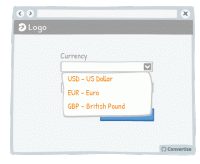
A/B Testing Idea #293 - Indicate popular options as the default ones
Everyone hates filling out information online - the easier and quicker you can make that for your users, the more likely they are to follow through, complete an action and ultimately convert. One way …
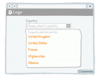
A/B Testing Idea #294 - Display often-used options at the top of drop down lists
Everyone hates filling out information online - the easier and quicker you can make that for your customers, the more likely they are to follow through, complete an action and ultimately convert. One …
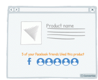
A/B Testing Idea #296 - If connected via Facebook, indicate how many friends have purchased or signed up
If you offer your customers the option to sign in using Facebook then make the most of this advantage. Indeed, using Facebook is a good way to quickly access data about a customer but that's not the…
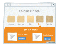
A/B Testing Idea #297 - Allow users to identify themselves with a certain category of people, and then show them content based on their choice
Allow users to identify themselves with a certain category of people and then submit introduce the products that match with their needs can have several advantages. First, your customer feels included…
A/B Testing Idea #298 - Display your call-to-action as a visual animation
Introducing a Call-To-Action (CTA) using a floating animation that appears after a few moments could help increase conversions. Drawing attention to the Call-To-Action is essential for getting people …
A/B Testing Idea #301 - Limit human error by disabling or replacing your call-to-action after users select it
Once your customer clicks on a Call-to-Action, disable or remove it to indicate that they have already clicked once and the action has been performed. This will prevent your customer from being tempted…
A/B Testing Idea #302 - Limit human error and frustration by only offering possible inputs in fields
In order to avoid preventable errors and possible frustration on the part of your customer, don't give them the ability to enter incorrect information. For example, as in the above drawing, when someone…
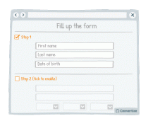
A/B Testing Idea #303 - As a user completes a form, unlock other sections
Rather than giving your customer access to an entire form in block layout, split your form into steps that they can unlock themselves. This will make the form seem less daunting and more bite-sized and…
A/B Testing Idea #304 - With forms, offer fields which match the required information
Matching your field layout to whichever input format is required will improve user experience by giving assistance and avoiding errors or frustration. For example, when asking for a phone number you should…
A/B Testing Idea #305 - Give a friendly reminder after items have already been placed in the basket
Making the purchasing process as fluid and easy as possible is important to encourage your visitors to follow through to completion and convert. By altering the Call-to-Action of a product to clearly …
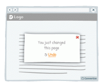
A/B Testing Idea #308 - After small changes, allow users to undo the move rather than to continuously confirm
Rather than asking your customers to confirm changes they make by clicking on "yes" or "no", offer them the possibility to undo what they've already done. Although slight, the …
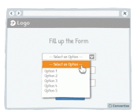
A/B Testing Idea #309 - Limit frustrations by enabling the possibility to leave a field blank, even after it has been selected
It can often happen that a customer might click into an option or function from a drop down list only to realise that they don't want to select anything but find themselves stuck as they are unable…
A/B Testing Idea #311 - After users leave a page, return them to where they left off
Sending the user directly back to the page or position in a sequence where they left off will help to minimise the negative effects of leaving a site or page. By sending them straight back to where they…
A/B Testing Idea #312 - Make sure you facilitate the user experience of drop-down menus and pop-up windows
Your users aren't perfect, they will regularly make mistakes with the cursor (as do we all!). For this reason, you need to create interfaces that are flexible and forgiving. Visitors are often confronted…
A/B Testing Idea #315 - Indicate what your visitor has most recently researched in a drop-down menu
When a user begins a search, start by showing them previous searches they have made that correspond. Displaying these first and perhaps in a different colour to really distinguish them is a good way of…
A/B Testing Idea #316 - Display links already used with a dissimilar colour
Clearly show which links a user has already clicked on by displaying them in a different colour. Using another colour will help those links to stand out, which will help the user to keep track of what…
A/B Testing Idea #317 - Ensure that your fields are reactive to errors, antonyms and other syntax differences
Making sure your site visitors have a user experience that is as fluid and easy as possible is important to encourage your visitors to enjoy using your site and ultimately find what they are looking for…
A/B Testing Idea #319 - Display navigation categories (breadcrumbs) to indicate the location of the user on your website
To help your visitor feel at ease with the logic and layout of your site, clearly display a breadcrumb trail (or other sequence map) so they can quickly see where they are on your site and how they arrived…
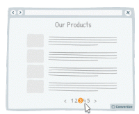
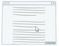
A/B Testing Idea #321 - Use page numbers or ‘Load More’ options rather than infinite scrolling
On eCommerce product pages, it is essential that you choose the right way to display your products to provide your customers with the most effective base to start making choices. People tend to become…
A/B Testing Idea #322 - Suggest a criteria option instead of a filter option for sorting search results
When you display search results, it is important to help your customers find what they are looking for as quickly and easily as possible. This will avoid them becoming overwhelmed by choice and quitting…
A/B Testing Idea #323 - When a customer selects a filter, ensure that it is automatically applied to the rest of your products
Often a customer types the colour of the desired product in the search bar. But often when typing, say, "red sofa", the search results will be all sofas, red or not red. To avoid discouraging…
A/B Testing Idea #326 - Make your menus responsive for mobile
It is important these days to ensure your website is mobile responsive. When designing the interface for this though, it is advisable to use one-window drilldowns. That is to say, present each section…


Oops, you have reached your limit of 1 free tactic per hour
To get unlimited access to our 250+ tactics,
Join our FREE mailing list
Or wait 00:59:59
Congratulations!
You have unlocked our library of 250 tactics.
Keep learning or sign up to Convertize.com to start
implementing them directly in your webste.