Home
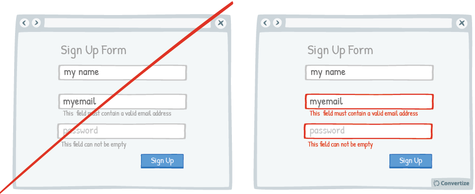
A/B Testing Idea #38 - Display an error-message for important fields which were incorrectly filled in or missing

Description
By immediately showing your customers any issues with information they are entering, you will avoid any added stress or misunderstandings. Creating an easy process for your customers is key as they will be put off completing an action if it is too complicated, difficult or information is not clearly given to help them.
Using visual indications to show straight away which fields require their attention will make it an even easier and more painless experience, increasing the likelihood that they will continue and complete the action.
Principles
- Cognitive Ease (Khaneman, 2011)
The Research
Cognitive Ease
The ease with which our brain processes information and how the level of ease impacts how positively we feel about something.
Browse A/B Testing Ideas bycategories
Browse A/B Testing Ideas bytype of website
Browse A/B Testing Ideas bypage type
Browse A/B Testing Ideas bybrands
Browse A/B Testing Ideas bydefinitions

Oops, you have reached your limit of 1 free tactic per hour
To get unlimited access to our 250+ tactics,
Join our FREE mailing list
*
Or wait 00:59:59


