Home
108 Best High A/B Testing Ideas
This is the ultimate library of the Best A/B Testing Ideas: We have compiled 250 A/B Testing Ideas that you can try on your website to optimize your conversion rates and increase your revenues.
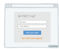
A/B Testing Idea #2 - Avoid demanding credit card information when offering free trials
Being required to enter credit card details evokes the negative feelings associated with spending money. Indeed, research has shown that the act of paying really disrupts the pleasure of an experience…
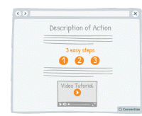
A/B Testing Idea #4 - To demonstrate how easy your site is to use, offer 'how-to' pages and prioritise video format
If you show your visitors how easy it is for them to act (i.e. to complete an action on your website, or to utilise one of your products, or services) by providing "how-to" pages and videos…
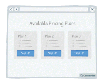
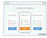
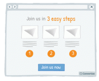
A/B Testing Idea #5 - Reduce the number of pricing plans available to no more than 3
Offering a maximum of 3 pricing plans will help your visitors to make better decisions and feel less overwhelmed. Research shows that information overload results in less effective and satisfying decisions…
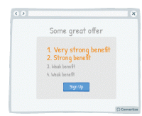
A/B Testing Idea #8 - List the strongest benefits first
Re-ordering the benefits of your offer by putting the strongest ones first will more easily capture your visistors' attention, and make a better impression. Research has shown that people recall…
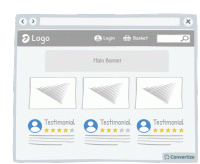
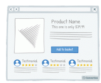
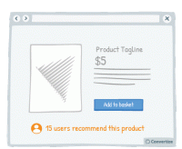
A/B Testing Idea #10 - Include testimonials (with name, logo and face) on your home page
If you have positive reviews about your products or services then display them on your homepage. Having this "social proof" as one of the first things visitors will see is a proven and&…
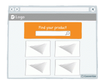
A/B Testing Idea #11 - Emphasise your search bar
If you notice that your site visitors are using the search bar often, make it more prominent by varying its colour, size and position on your page. People are more likely to notice and remember…

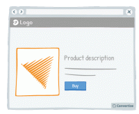
A/B Testing Idea #13 - Offer free trials
Offering a free trial enables potential customers to experience the benefits of your product or service without making them commit. This cuts out the negative feelings associated with making a payment…
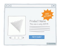
A/B Testing Idea #22 - Offer free returns
By offering free returns, your customers will be less likely to feel the "pain of buying" as acutely as they know that they have the option of returning the item if it is not what they …
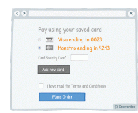
A/B Testing Idea #23 - Save customers' card details and automate payments
It is better to optimise the payment process as much as possible. Studies have shown that certain forms of payment 'hurt' more than others - the more observable, tangible or transparent the payment…
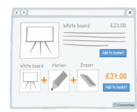
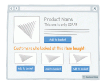
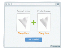
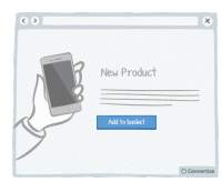
A/B Testing Idea #24 - Bundle products and offer 1-click "Add to Basket"
Offering a 1-click "add to basket" option both speeds up the paying process and makes it seem as though only one purchase is being made rather than multiple individual purchases. This will…

A/B Testing Idea #26 - Use a higher pricing plan as a decoy
Displaying a new pricing plan that is much higher than the others currently offered could be an efficient decoy, worth testing on your site. Offering a pricing plan that is significantly higher…
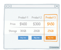
A/B Testing Idea #27 - Create a decoy-effect by displaying an extra product
Displaying a decoy product at a higher price will change people's perception of the perceived value of your other products on offer. Offering three options instead of two, with the highest price…
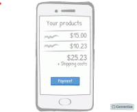
A/B Testing Idea #30 - Make your checkout page responsive for mobile devices
A mobile-friendly checkout page is essential to ensure that people follow through with their purchase. A checkout page that is mobile responsive will not only be more aesthetically pleasing but will be…
A/B Testing Idea #32 - Make your menu responsive (mobile-friendly)
A mobile-friendly menu is essential to ensure that you don't miss out on customers using mobile devices. Having a menu that is mobile responsive will not only be more aesthetically pleasing but will…
A/B Testing Idea #34 - Display a higher price first
People often use an initial piece of information to make subsequent judgements so if you display a higher price first, it will be the first one your customers read and they will use it as an anchor to…
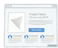
A/B Testing Idea #35 - Display customer testimonials right under the product
If you have positive reviews about your products or services then make sure they are clearly displayed; showing this "social proof" from your customer's peers is an effective persuasion …
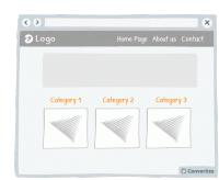
A/B Testing Idea #37 - Remove the Category drop-down menu from your homepage
The category bars and their drop-down menus are standard on most websites, but it's not always the best way to present the product category. These drop-down menus often offer a poor user experience…
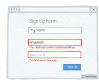
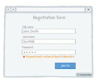
A/B Testing Idea #38 - Display an error-message for important fields which were incorrectly filled in or missing
By immediately showing your customers any issues with information they are entering, you will avoid any added stress or misunderstandings. Creating an easy process for your customers is key as they will…
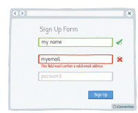
A/B Testing Idea #39 - Offer immediate feedback on completed fields
Letting your customer know instantly whether information they have entered is correct or incorrect will help to make the whole process clearer and easier. Research has shown that people are more motivated…
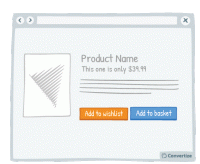
A/B Testing Idea #43 - Let a user save an item for later (wishlist)
Your customers will appreciate having the choice between buying the product immediately or saving it for another time. People like to feel as though they are in control of their shopping experience…
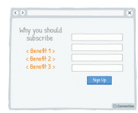
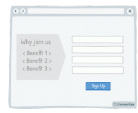
A/B Testing Idea #50 - Display clearly the 3 main benefits of registering
if you do not offer a guest checkout option, you should clearly explain to your customers the advantages of registering (to encourage them to take the time to do so). By showcasing just the 3 main …
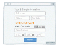
A/B Testing Idea #51 - When taking billing information ask for credit card details last
Only ask your customers for their card details once all other information has been given (name, email, delivery info, etc.) as it is better to start by asking them for easier, less disagreeable information…
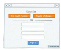
A/B Testing Idea #52 - Offer the option to register through social media
Statistics show that 1 in 4 customers abandon a purchase if they are forced to register for an account first. Today people feel like they have too many accounts and so one way of streamlining this …
A/B Testing Idea #54 - The 4 Ws "Who, What, Where, Why" - Ensure that your homepage addresses all of these
Your homepage is most usually the first page your customers will arrive on when they visit your website and so it is vital that it is clear, easy to understand and gives them as much information as they…
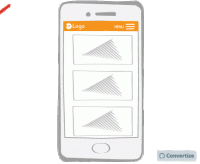
A/B Testing Idea #57 - Make your website responsive (mobile-friendly)
A mobile-friendly website is essential to ensure that you don't miss out on customers using mobile devices. A website that is mobile responsive will not only be more aesthetically pleasing but will…
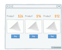
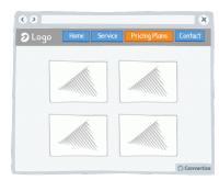
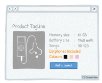
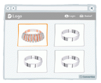
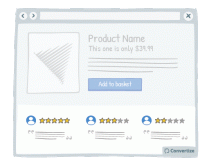
A/B Testing Idea #58 - Show more than 3 high-resolution product images
Product images are an important element of your product page. In fact, people react far more strongly to visuals than to text and it allows them to form a more emotional and personal attachment to the…
A/B Testing Idea #60 - Offer cross-selling
Cross-selling is an effective way of increasing sales by proposing related products to your customers when they are in the process of viewing or purchasing something. For example, these might be accessories…
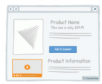
A/B Testing Idea #64 - In your product pages, include a video
Providing a video of the product will allow your visitors to see more precisely how it looks and functions, the same way they might when buying in store. Customers prefer to have as much information…
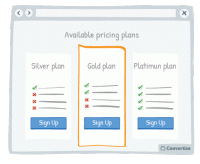
A/B Testing Idea #68 - Put your default pricing plan in the middle and make it more visible
When you have a default pricing plan (the option you would prefer people to choose) then you can influence how attractive this option is by making it stand out from the others. Placing it in the middle…
A/B Testing Idea #69 - Create a default option or add-on
If you have a particular option or add-on that you would prefer your customer to choose, then making it a default option will greatly increase the chances of them doing so. Default options are so attractive…
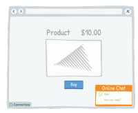
A/B Testing Idea #74 - Improve your customer service by having a live chat option
Live chat is a very effective method of communication with your site visitors. Offering an immediate and direct link to another human being will give your customers confidence and reassurance not only…
A/B Testing Idea #79 - High-end products should not be bundled with low-end ones
The price of a product is not only based on its value itself but on the perception that users have of it. When you sell products together, by making a bundled offer for example, do not mix…
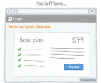
A/B Testing Idea #83 - Ensure to have a page dedicated to your pricing plans
Creating a page that is dedicated solely to your pricing schemes and offers has many benefits. Firstly, it's a simple, clear and effective way of displaying all your prices to your visitor meaning…
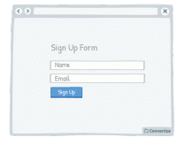
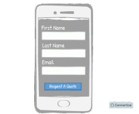
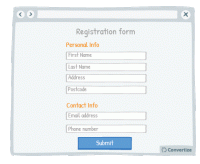
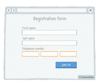
A/B Testing Idea #85 - Decrease the number of fields necessary to complete a form
Don't ask your customers for too much information in your initial sign up form. This is likely to put them off as they won't want to spend the time or the mental energy on filling out multiple…
A/B Testing Idea #86 - Prioritise, whenever possible, single-column forms
People like to process things quickly and easily, and will be put off by anything that complicates this cognitive fluency. Using single column forms not only makes them look cleaner and easier to navigate…

A/B Testing Idea #87 - Embed in your call-to-action some of your value propositions
Your Call-to-Action text is important as it is the final step before the conversion and so is the final point at which you can convince customers to follow through and click on that button. Use the…

A/B Testing Idea #88 - Add human pictures to your testimonials
Adding human pictures to your testimonials and will lend them an extra credibility and therefore lead users to place more trust in them. People are likely to connect more immediately with a visual …

A/B Testing Idea #89 - Follow a simple rule: 1 Call-to-action 1: direct message 1: unique selling proposition
People respond best to clear, direct and easy-to-understand information and are easily distracted or put off by extraneous information or demands on their attention. To avoid this, try following the…
A/B Testing Idea #92 - Indicate your primary Call-to-action twice or more
It is almost always better to display your Call-to-Action (CTA) as a button rather than a simple link as it will both attract your user's attention and make it clear that it is a CTA ready to be clicked…
A/B Testing Idea #94 - Ensure that your call-to-action appears above the fold
The "fold" is the line that separates the visible part of your webpage from the part that will only be visible once your visitor scrolls down. Your Call-To-Action (CTA) button should always …
A/B Testing Idea #96 - Create urgency by giving a limited timeframe for fast delivery
Offering fast delivery time is a strong motivator for your customers to complete a purchase as we always prefer to take an option that results in quicker gratification. What's more, as you'…
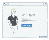
A/B Testing Idea #98 - Ask yourself if your call-to-action is persuasive enough
You want your Call-to-Action (CTA) text to tell people immediately why they should click on it and to help persuade your visitors to proceed forward with a positive action. Using engaging and persuasive…
A/B Testing Idea #99 - Leverage the power of visual cues such as imagery to focus attention towards your call-to-action
Using clean, clear imagery is a great way to draw attention to your Call-to-Action (CTA). As in the example above, adding an additional simple visual stimulus that stands out through colour or another…
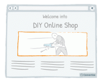
A/B Testing Idea #103 - Create a sense of trust by focusing users' attention to pictures they can relate to
Don't simply use random images on your website; it is best to encourage your customers to identify with the image. For instance, if you sell DIY products to private individuals, the most effective…
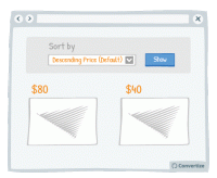
A/B Testing Idea #112 - Use "Descending Price" as your default sorting option
People often use an initial piece of information to make subsequent judgements so if you have "Descending Price" as your default sorting option, people will see your highest priced items first…
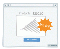
A/B Testing Idea #116 - When price is below 100 ($,£,€) show discounts in percentage form rather than in absolute value
By displaying discounts in percentage rather than in value when product price is below 100 (£/$/€), you make your promotions seem as attractive as possible by altering the way you frame…
A/B Testing Idea #125 - Utilize your customer's details to customize your content offering
Your customer will feel more involved in and connected with your content if you make use of their name to give it a personalised touch. A natural tendency we experience is "implicit egotism"…

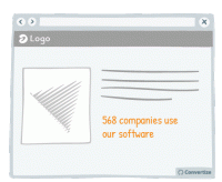
A/B Testing Idea #128 - Leverage the strength in displaying numbers rather than percentages to indicate amounts of individuals
Your visitors will perceive the same information in different ways depending on how you present it to them, It's therefore important to ensure you present information using appropriate values or framing…
A/B Testing Idea #135 - Contextualise product pictures in the ideal situation in which they should be used
If your customer can visualise themselves using your product then they'll feel more inclined to buy it. You can ensure this by setting your product images in such a way as to increase the chances…
A/B Testing Idea #136 - When appropriate, employ charismatic models
Using attractive models on your site can be very effective in the right context. Studies have shown that using a model to market a product increases its credibility, how much attention people pay to…
A/B Testing Idea #138 - Focus on the multitude characteristics of your products rather than on listing the technical specifications
On your product page, it is best to list all available features rather than just choosing to display a few of the main ones. People are generally more drawn towards products with lots of features and…
A/B Testing Idea #142 - Continuously reassure your customer in their decision
Reassuring your customer about the choice they've made to select or purchase a certain product from your site can greatly influence how satisfied they are with that choice. To aid customer satisfaction…
A/B Testing Idea #144 - Utilize a multi-step (at least 2) opt-in
Whilst is might seem counter-intuitive, two-step opt-ins are actually more powerful than one-step opt-ins. A One-Step Opt-In consists of simply presenting input fields directly on the page, whilst a Two…
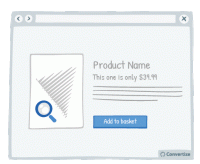
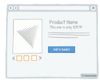
A/B Testing Idea #145 - Provide the option of enlarging product pictures
If the primary selling feature of your product is visual, you should provide the possibility of enlarging or zooming in on the image so that the customer can see the product in more detail, as they would…
A/B Testing Idea #146 - Show customers' feedback near offering or Call-to-action
Showing potential customers the positive feedback from others who have already purchased a product, used a service or signed up for membership etc. is an effective persuasion technique. Not only does…
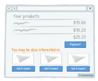
A/B Testing Idea #149 - Suggest complimentary products at the check-out
Cross-selling is a good way of increasing the user's basket before they complete the purchase. When a user is in the checkout process, it is a good time to display other products that may interest…
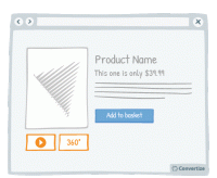
A/B Testing Idea #152 - Offer 360 degrees videos of your product
The more information a user has access to about a product, the more likely they are to buy it. You can take advantage of this by offering your user more extensive views of it. There are various different…

A/B Testing Idea #156 - Facilitate your user's thoughts before asking them to choose
Whilst offering a default choice is often very effective because it allows people to make a decision in a passive manner - which is often preferred as it requires less mental effort - there are some cases…
A/B Testing Idea #159 - Prioritise your most luxurious products
If you display your most beautiful and luxurious product first, your visitors will use it as a point of reference to evaluate the following products. This first element will stay anchored in their minds…
A/B Testing Idea #163 - Use pictograms to help visitors visualise the simplicity of a process or task
The more your visitor is convinced of the simplicity of an action on your site (for example your purchase or registration process), the more motivated they will be to complete it. Using simple, clear …
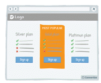
A/B Testing Idea #164 - Indicate "Most Popular" as your desired plan to be chosen
Marking your target plan as "Most Popular" is an effective persuasion technique to encourage customers to choose it. Research has shown that we have a strong tendency to copy others' …
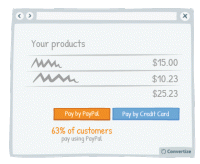
A/B Testing Idea #166 - Nudge your users to use a particular payment method by indicating how many users have used it
If you have a method of payment that you would prefer your customers use for any reason (reduced fees, easier management, etc.) then you can steer them towards this option through showing the percentage…
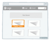
A/B Testing Idea #167 - Mark your best products as "Popular Choice"
Marking your best products as a "Popular Choice" is an effective persuasion technique to encourage more people to make the same purchase. Research has shown that we have a strong tendency…

A/B Testing Idea #168 - Display on specialised and expert reviews for your products' endorsements
Displaying expert reviews or testimonials is an effective way of endorsing your products. The positive feedback and opinions of customer's peers is incredibly important as we often rely on this "…
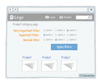
A/B Testing Idea #170 - Prioritise your most crucial filters
Re-ordering the filter options and putting the most relevant and important filters first will make for an easier and more pleasurable site experience for your visitors. Research has shown that people…

A/B Testing Idea #174 - Display specific Unique Selling Propositions (USPs) based on your target customer
Studies have shown that most people associate positively with themselves and things that are either connected to them or that they can identify with. This is why it is so important to ensure that you…
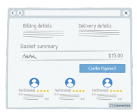
A/B Testing Idea #177 - In the check-out page, indicate testimonials from customers who also bought the same product below the call-to-action
By placing testimonials from other customers who have previously bought your product or service just before the final stage of payment, you are offering reassurance to your customers by showing them how…
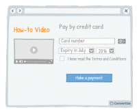
A/B Testing Idea #178 - Display "how-to" videos related to products on the checkout page
By placing instructional and informative "how-to" videos just before the final stage of payment, you are offering reassurance to your customers by showing them how easy to use and interesting…
A/B Testing Idea #179 - Seek a gradual engagement, over a hurried signup
Making a form easy and fun to fill in will encourage people to complete it and convert. Starting your form by asking for a lot of personal information will annoy people and they are more likely to abandon…
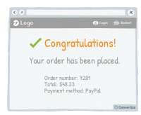
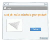
A/B Testing Idea #180 - Congratulate your customers on their booking or purchase
Congratulating your clients on the purchase or booking they have just made will induce positive feelings and help to therefore reassure them on their choice to complete this transaction. The happier you…
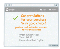
A/B Testing Idea #183 - Congratulate your user's decisions at every step of your funnel
Don't hesitate to congratulate your customers on their purchases. This constant confirmation that they are making a good choice will cement feelings of positivity and satisfaction around their purchase…

A/B Testing Idea #184 - Ask your customer to share feedback
If you want to build up your social media community and generate organic publicity then asking customers to share feedback on products they've purchased from you can be very effective. Once we&#…

A/B Testing Idea #186 - Frame your products in the best light possible: "number 1", "best selling", "fastest growing"
Studies have shown that individuals tend to follow others' choices or behaviour when trying to make decisions. We automatically presume that if lots of our peers are doing something or buying a…
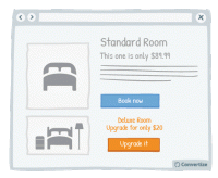
A/B Testing Idea #188 - Upsell by highlighting how small the extra cost would be
Upselling is a technique whereby you offer your client a superior and more expensive product than the one he was considering. By highlighting how small the price difference is between the two products…

A/B Testing Idea #189 - Display groups of testimonials rather than just one solitary testimonial
It's always better to display multiple testimonials together rather than just one on its own. Firstly, your customers will be much more likely to feel confident in these testimonials if there are …
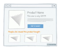
A/B Testing Idea #191 - Include a section: "People who browsed this product, also bought:"
Adding a “People who viewed this product bought...” feature is an effective persuasion technique. Research has shown that we have a strong tendency to copy others' choices when we are…

A/B Testing Idea #195 - Add “as featured in” or “recommended by” content
Lending authority to your marketing can be really effective. Certainly in today's society, people are so bombarded with marketing messages that they don't necessarily place a lot of trust in what…
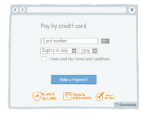
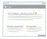
A/B Testing Idea #196 - Provide reassurance by displaying trust symbols
Trust symbols are a great and immediately impactful way to reassure your customers by showing that they can make a payment securely. Even a small factor of uncertainty can disrupt the payment process…
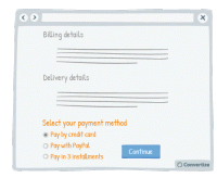
A/B Testing Idea #197 - Enable more than one means to pay
Offering multiple payment methods offers customers the possibility to make a purchase in the way they feel most confident and secure, increasing the likelihood of them finalising payment. People also…
A/B Testing Idea #198 - Show a progress bar
Displaying a progress bar is a great visual way to help users follow their progress in the purchase process and will not only stimulate their desire to continue to the end of the process but also gives…
A/B Testing Idea #199 - Remove exit points from checkout page
Studies have shown that if you remove any distractions when people are purchasing something, they are more likely to complete the purchase. Removing all distractions from your checkout pages will allow…
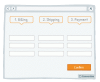
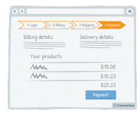
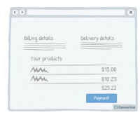
A/B Testing Idea #200 - Test a multi-page checkout process against a single one
To reduce bounce rate during the checkout process, test using a one-page solution: that is to say, display all the different steps - billing, shipping and payment - on one page rather than having a new…
A/B Testing Idea #202 - Don't ask for any non-essential information during the checkout process
When your visitors are in the process of completing their checkout then you don't want to do anything to distract them from this. Don't therefore ask for any non-essential information during this…
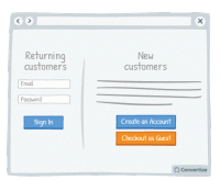
A/B Testing Idea #203 - Enable the possibility to checkout as a guest, without needing to create an account
Your customers will appreciate having the choice of when to register on your website as this induces the positive feeling of having the autonomy to influence the purchasing process. T his also gives…
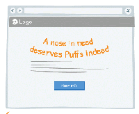
A/B Testing Idea #258 - Whenever possible, convey messages using rhymes as they will be more easily remembered
"A nose in need deserves Puffs indeed", "If the glove doesn’t fit, you must acquit". You know these slogans and better you will easily remember it. Indeed, these slogans have…
A/B Testing Idea #260 - Prioritise pictures, visual elements over lone text
“A picture paints a thousand words”. Indeed, the human brain learns and retains information much better when it comes in the form of images rather than words. Images do not require translation…
A/B Testing Idea #261 - Instead of trying too hard to sell, be more specific in your sales argument
Arguments or tag-lines that are too fluffy and reminiscent of an unfounded sales pitch - such as "our customers love us" or "our software is very reliable" - can be effective in the…
A/B Testing Idea #264 - Do not shy away from mentioning some fall backs
On most websites, negative reviews or drawbacks are invisible while on others (e.g. Amazon), those are clearly displayed alongside the pros. Believe it or not, but hiding your drawbacks is not the solution…
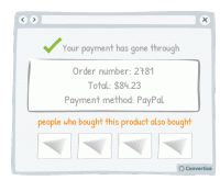
A/B Testing Idea #269 - To create a double funnel within the check-out, show a section which indicates: "people who bought this, also bought: ..."
On the confirmation page after purchase, display "people who bought this product also bought ..." to create a double funnel. This will encourage your customers to make a second purchase after…
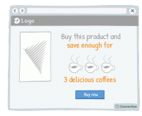
A/B Testing Idea #273 - Contextualise savings with real-life applications
The way you frame a saving can greatly influence the effect it will have on your customers. Imagine a bank, for instance, which announces on its landing page: "With us, you don't pay bank charges…
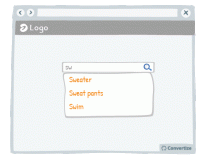
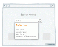
A/B Testing Idea #275 - Allow users, with your search bar, to jump to suggestions based on what they typed
In order to increase conversion rates, simply help your customer to find what they are looking for as quickly and easily as possible. Offering suggestions in the search bar based on what the customer …
A/B Testing Idea #276 - Bring attention to a popular product to facilitate the visitor to make a decision
Studies have shown that individuals tend to follow others' choices or behaviour when trying to make decisions. We automatically presume that if lots of our peers are doing something or buying a particular…
A/B Testing Idea #277 - Avoid showing your Call-to-action more than once on the same page
Don't be tempted to display the same information twice in two different locations on your page (if it is a one-screen page that doesn't require any scrolling) because this will make it too busy…
A/B Testing Idea #278 - Emphasise your users, rather than yourself, who have used and endorsed your products
Studies have shown that individuals tend to follow others' choices or behaviour when trying to make decisions. We automatically presume that if lots of our peers are doing something or buying a particular…
A/B Testing Idea #280 - Separate your form into smaller sections
When you want someone to complete a form, it is best not to discourage them by presenting that form in one large block that will immediately seem dense, unclear and long. By separating your form into …
A/B Testing Idea #281 - Be careful when using special characters, faults could decrease your credibility
When you create a web page, be careful that you don't have any accidental character faults due to coding problems or lack of care. The kind of symbols that are often seen on web pages, such as ▢ &…

A/B Testing Idea #284 - Include more than one individual, or more than one product within your visual marketing material
People are more inclined to want to buy a product when it is shown in a way which helps them to visualise themselves using it. Therefore, to reduce the mental effort required on the part of your customer…

A/B Testing Idea #290 - Whenever possible, prioritise single and vertical columns
Using a two-column layout on your site could disturb the fluency with which the reader absorbs your content as you are splitting their attention between two areas. Rather than leading your visitor'…
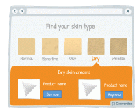
A/B Testing Idea #297 - Allow users to identify themselves with a certain category of people, and then show them content based on their choice
Allow users to identify themselves with a certain category of people and then submit introduce the products that match with their needs can have several advantages. First, your customer feels included…
A/B Testing Idea #304 - With forms, offer fields which match the required information
Matching your field layout to whichever input format is required will improve user experience by giving assistance and avoiding errors or frustration. For example, when asking for a phone number you should…
A/B Testing Idea #311 - After users leave a page, return them to where they left off
Sending the user directly back to the page or position in a sequence where they left off will help to minimise the negative effects of leaving a site or page. By sending them straight back to where they…
A/B Testing Idea #313 - Add hyperlinks for main menus, and any relevant categories
Users are not perfect, they make mistakes regularly. Indeed, it is common to see people click on areas that are not clickable. Do not try to fight against those mistakes, instead, add clickable functionality…
A/B Testing Idea #314 - When displaying error messages, include relevant indicators
When displaying error messages, make sure that you clearly explain the reason for the error. If your user is getting error messages without anything to tell them why it can't be validated and how …
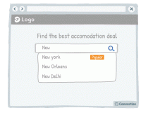
A/B Testing Idea #315 - Indicate what your visitor has most recently researched in a drop-down menu
When a user begins a search, start by showing them previous searches they have made that correspond. Displaying these first and perhaps in a different colour to really distinguish them is a good way of…
A/B Testing Idea #318 - Simplify your customer's thinking process by doing any calculations for them
People strongly prefer and feel more positive about things that are easy and quick for us to understand. If you want your customer to respond well to information you provide and to feel happy using your…
A/B Testing Idea #320 - Mention the location of your physical store
One of the biggest issues for making sales online can be the lack of security some shoppers associate with online eCommerce sites. Therefore, if you also have physical stores, it can be very effective…
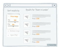
A/B Testing Idea #322 - Suggest a criteria option instead of a filter option for sorting search results
When you display search results, it is important to help your customers find what they are looking for as quickly and easily as possible. This will avoid them becoming overwhelmed by choice and quitting…
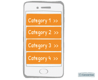
A/B Testing Idea #326 - Make your menus responsive for mobile
It is important these days to ensure your website is mobile responsive. When designing the interface for this though, it is advisable to use one-window drilldowns. That is to say, present each section…


Oops, you have reached your limit of 1 free tactic per hour
To get unlimited access to our 250+ tactics,
Join our FREE mailing list
Or wait 00:59:59
Congratulations!
You have unlocked our library of 250 tactics.
Keep learning or sign up to Convertize.com to start
implementing them directly in your webste.