Home
5 A/B Testing Ideas Used By Skype
This is the ultimate library of the Best A/B Testing Ideas: We have compiled 250 A/B Testing Ideas that you can try on your website to optimize your conversion rates and increase your revenues.

A/B Testing Idea #17 - Blur or fade images to reduce the emphasis on them
By blurring or fading images, you can place emphasis on something else instead. People are more likely to notice and remember an element that stands out. Your visitors will immediately be attracted…

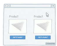
A/B Testing Idea #99 - Leverage the power of visual cues such as imagery to focus attention towards your call-to-action
Using clean, clear imagery is a great way to draw attention to your Call-to-Action (CTA). As in the example above, adding an additional simple visual stimulus that stands out through colour or another…

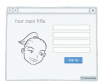
A/B Testing Idea #102 - If human pictures are used, the gaze should point towards crucial parts of your website
As humans, we have a natural, innate tendency to follow's others' gazes. It is an important social stimulus and often the way we learn about the world as we are growing up. This can therefore…

A/B Testing Idea #143 - Alter the aesthetics of your Call-to-action when your user hoover over it
Simply making it so that your Call-to-Action button alters in some way when the cursor hovers over it will clearly distinguish it as a button that is there to be clicked on. A visual effect to indicate…

A/B Testing Idea #148 - Nudge your visitor to your Call-to-action through arrows and visual cues
Your visitor's brains will be immediately drawn towards familiar visual elements (like arrows) as they notice and understand these visuals more quickly than any other information on the page. Utilising…

Oops, you have reached your limit of 1 free tactic per hour
To get unlimited access to our 250+ tactics,
Join our FREE mailing list
Or wait 00:59:59


