Home
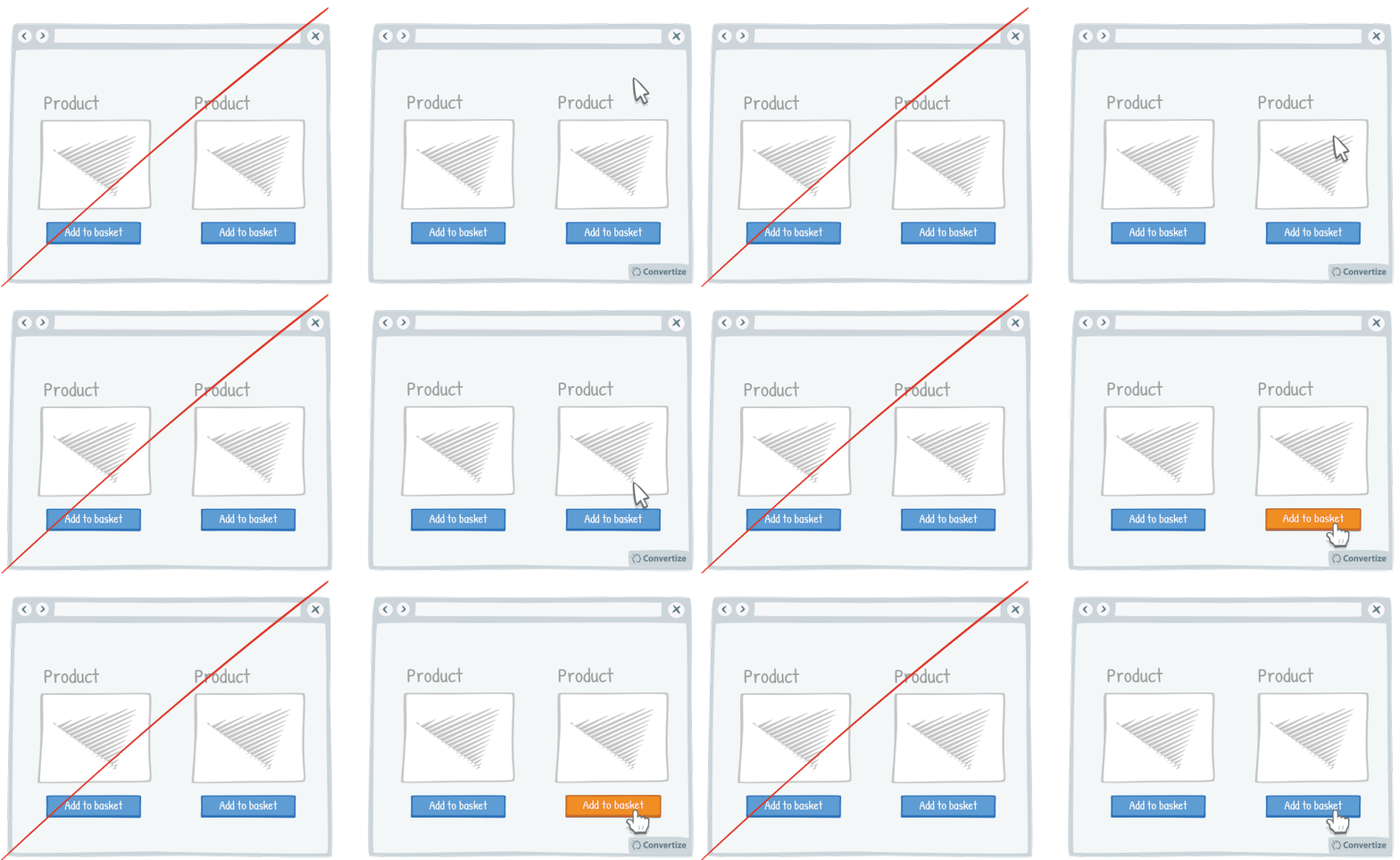
A/B Testing Idea #143 - Alter the aesthetics of your Call-to-action when your user hoover over it

Description
Simply making it so that your Call-to-Action button alters in some way when the cursor hovers over it will clearly distinguish it as a button that is there to be clicked on.
A visual effect to indicate that it is clickable will make it much easier for people to see automatically which parts of the page are interactive and will lead them to engage without any frustration.
Inspired by Nick Kolenda
Principles
- Representativeness Heuristic (Kahneman & Tversky, 1972)
The Research
Representativeness Heuristic
People have a tendency to judge the probability of an event through relying on information from the occurrence of similar events - or, more generally, to make biased predictions and generalisations by counting on similar models and happenings.
Browse A/B Testing Ideas bycategories
Browse A/B Testing Ideas bytype of website
Browse A/B Testing Ideas bypage type
Browse A/B Testing Ideas bybrands
Browse A/B Testing Ideas bydefinitions

Oops, you have reached your limit of 1 free tactic per hour
To get unlimited access to our 250+ tactics,
Join our FREE mailing list
*
Or wait 00:59:59


