Home
17 A/B Testing Ideas Used By Nike
This is the ultimate library of the Best A/B Testing Ideas: We have compiled 250 A/B Testing Ideas that you can try on your website to optimize your conversion rates and increase your revenues.
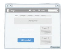
A/B Testing Idea #3 - Reduce the number of default products on your homepage
Displaying fewer default products on your homepage will help your visitors make better decisions, and feel less overwhelmed. Research shows that information overload results in less effective and satisfying…
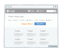
A/B Testing Idea #18 - Reduce the number of default filter options
Offering fewer default filter options on your homepage will help your visitors to make better decisions and feel less overwhelmed. Research shows that information overload results in less effective…
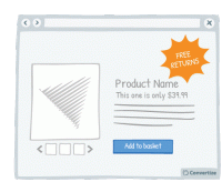
A/B Testing Idea #22 - Offer free returns
By offering free returns, your customers will be less likely to feel the "pain of buying" as acutely as they know that they have the option of returning the item if it is not what they …
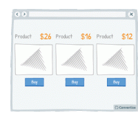
A/B Testing Idea #34 - Display a higher price first
People often use an initial piece of information to make subsequent judgements so if you display a higher price first, it will be the first one your customers read and they will use it as an anchor to…
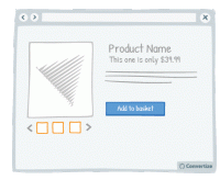
A/B Testing Idea #58 - Show more than 3 high-resolution product images
Product images are an important element of your product page. In fact, people react far more strongly to visuals than to text and it allows them to form a more emotional and personal attachment to the…
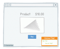
A/B Testing Idea #74 - Improve your customer service by having a live chat option
Live chat is a very effective method of communication with your site visitors. Offering an immediate and direct link to another human being will give your customers confidence and reassurance not only…
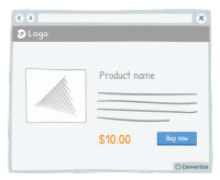
A/B Testing Idea #75 - Place your price at the bottom left corner of the screen
It has been proven that our perception of the value of a price can be influenced by the way it is visually presented to us. People tend to think of numbers on an imaginary horizontal line, with numbers…
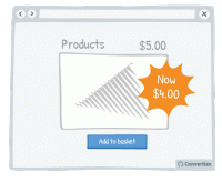
A/B Testing Idea #118 - Give discounts which are simple to calculate
Using precise, non-rounded numbers is a good way of making your prices seem smaller but one occasion when you don't want to do this is when you're offering discounts. You want your discounts to…
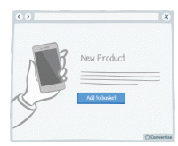
A/B Testing Idea #135 - Contextualise product pictures in the ideal situation in which they should be used
If your customer can visualise themselves using your product then they'll feel more inclined to buy it. You can ensure this by setting your product images in such a way as to increase the chances…
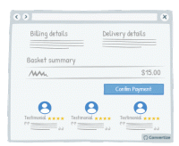
A/B Testing Idea #177 - In the check-out page, indicate testimonials from customers who also bought the same product below the call-to-action
By placing testimonials from other customers who have previously bought your product or service just before the final stage of payment, you are offering reassurance to your customers by showing them how…

A/B Testing Idea #189 - Display groups of testimonials rather than just one solitary testimonial
It's always better to display multiple testimonials together rather than just one on its own. Firstly, your customers will be much more likely to feel confident in these testimonials if there are …
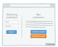
A/B Testing Idea #203 - Enable the possibility to checkout as a guest, without needing to create an account
Your customers will appreciate having the choice of when to register on your website as this induces the positive feeling of having the autonomy to influence the purchasing process. T his also gives…
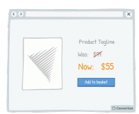
A/B Testing Idea #214 - When displaying promotions, exhibit the previous prices, to accentuate them
When offering discounted prices, it is essential to always still display the previous higher prices as well (crossed out is advisable to avoid confusion). Studies have shown that people tend to use…
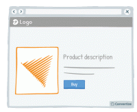
A/B Testing Idea #260 - Prioritise pictures, visual elements over lone text
“A picture paints a thousand words”. Indeed, the human brain learns and retains information much better when it comes in the form of images rather than words. Images do not require translation…
A/B Testing Idea #282 - Use a recognisable phone number for your customer service and add your opening hours
If you use a special service phone number then your customers will automatically think twice about calling as they will be expecting high call charges and long wait times. This will make your business…
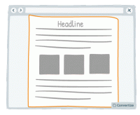
A/B Testing Idea #290 - Whenever possible, prioritise single and vertical columns
Using a two-column layout on your site could disturb the fluency with which the reader absorbs your content as you are splitting their attention between two areas. Rather than leading your visitor'…
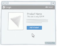
A/B Testing Idea #301 - Limit human error by disabling or replacing your call-to-action after users select it
Once your customer clicks on a Call-to-Action, disable or remove it to indicate that they have already clicked once and the action has been performed. This will prevent your customer from being tempted…

Oops, you have reached your limit of 1 free tactic per hour
To get unlimited access to our 250+ tactics,
Join our FREE mailing list
Or wait 00:59:59


