Home
69 Best Visual Elements A/B Testing Ideas
This is the ultimate library of the Best A/B Testing Ideas: We have compiled 250 A/B Testing Ideas that you can try on your website to optimize your conversion rates and increase your revenues.
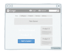
A/B Testing Idea #3 - Reduce the number of default products on your homepage
Displaying fewer default products on your homepage will help your visitors make better decisions, and feel less overwhelmed. Research shows that information overload results in less effective and satisfying…
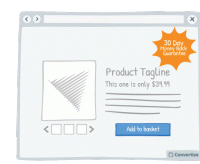
A/B Testing Idea #6 - Offer & clearly display an attractive guarantee or refund policy
By clearly offering an attractive guarantee or refund policy, customers won't find the process of paying as difficult, or negative, as they will feel that they will be able to return the product…
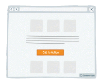
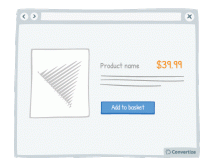
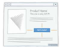
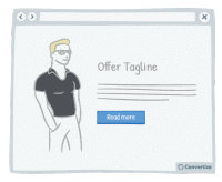
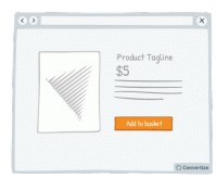
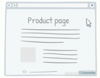
A/B Testing Idea #7 - Choose a contrasting button colour and size for your Call-to-Action
The objective of a Call-to-Action (CTA) button is to encourage your visitors to do something specific. Choosing a contrasting button colour and size will make it more prominent on your page so that…
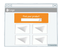
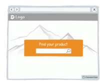
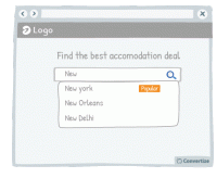
A/B Testing Idea #11 - Emphasise your search bar
If you notice that your site visitors are using the search bar often, make it more prominent by varying its colour, size and position on your page. People are more likely to notice and remember…
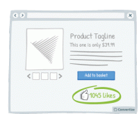
A/B Testing Idea #14 - Display the number of "likes" next to your product
Displaying the number of people who have already "liked" your product is an effective persuasion tool. Research has shown that we have a strong tendency to copy others' choices and behaviour…
A/B Testing Idea #17 - Blur or fade images to reduce the emphasis on them
By blurring or fading images, you can place emphasis on something else instead. People are more likely to notice and remember an element that stands out. Your visitors will immediately be attracted…
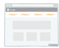
A/B Testing Idea #19 - Reduce the number of categories and menu options displayed
Offering fewer categories and/or menu options will help your visitors make better decisions and feel less overwhelmed. Research shows that information overload results in less effective and satisfying…

A/B Testing Idea #26 - Use a higher pricing plan as a decoy
Displaying a new pricing plan that is much higher than the others currently offered could be an efficient decoy, worth testing on your site. Offering a pricing plan that is significantly higher…
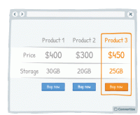
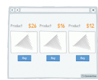
A/B Testing Idea #27 - Create a decoy-effect by displaying an extra product
Displaying a decoy product at a higher price will change people's perception of the perceived value of your other products on offer. Offering three options instead of two, with the highest price…
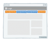
A/B Testing Idea #28 - Restructure your navigation menu
Re-ordering your navigation menu by putting the most important links at the beginning and the end of your menu will help to ensure visitors notice and click on them. Research has shown that people recall…
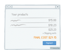
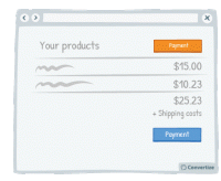
A/B Testing Idea #31 - Display the final price in the shopping basket before final checkout
Your customers want to have all information relevant to payment before proceeding with the purchase and, if they feel unsure about what they are going to be charged, they are more likely to abandon the…
A/B Testing Idea #34 - Display a higher price first
People often use an initial piece of information to make subsequent judgements so if you display a higher price first, it will be the first one your customers read and they will use it as an anchor to…
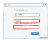
A/B Testing Idea #38 - Display an error-message for important fields which were incorrectly filled in or missing
By immediately showing your customers any issues with information they are entering, you will avoid any added stress or misunderstandings. Creating an easy process for your customers is key as they will…
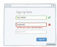
A/B Testing Idea #39 - Offer immediate feedback on completed fields
Letting your customer know instantly whether information they have entered is correct or incorrect will help to make the whole process clearer and easier. Research has shown that people are more motivated…
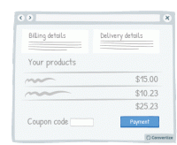
A/B Testing Idea #48 - Bring less attention to your discount/coupon code
Making your "coupon / promo code" section less visible on the page will reduce the likelihood that those who don't have a code to enter will notice it and suddenly feel as though they'…

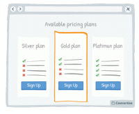
A/B Testing Idea #68 - Put your default pricing plan in the middle and make it more visible
When you have a default pricing plan (the option you would prefer people to choose) then you can influence how attractive this option is by making it stand out from the others. Placing it in the middle…
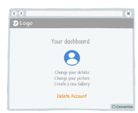
A/B Testing Idea #69 - Create a default option or add-on
If you have a particular option or add-on that you would prefer your customer to choose, then making it a default option will greatly increase the chances of them doing so. Default options are so attractive…

A/B Testing Idea #72 - Add strikethroughs for absent features
Adding strikethroughs for absent features on lower cost pricing plans is a great way of showing people what they'll be missing out on. Research shows that people strongly prefer avoiding losses…

A/B Testing Idea #73 - Make the free plan less visible
By making the free plan less visible, you will automatically draw attention to the other (paid) plans offered as they will stand out visually on the page. It is important to display your free offer…
A/B Testing Idea #75 - Place your price at the bottom left corner of the screen
It has been proven that our perception of the value of a price can be influenced by the way it is visually presented to us. People tend to think of numbers on an imaginary horizontal line, with numbers…
A/B Testing Idea #76 - Utilize smaller font sizes to indicate price to pay
Using a smaller font size for your pricing is doubly effective. Firstly, it of course makes the price more subtle and so doesn't automatically draw people's attention towards the fact of paying…

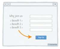
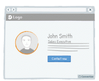
A/B Testing Idea #88 - Add human pictures to your testimonials
Adding human pictures to your testimonials and will lend them an extra credibility and therefore lead users to place more trust in them. People are likely to connect more immediately with a visual …
A/B Testing Idea #91 - Use a smaller font when displaying large quantities of stock (more than 5)
When you have more than 5 in stock of any given product, it's worth displaying this fact as discreetly as possible as it could deter visitors from rushing to make a purchase; if there is a large number…
A/B Testing Idea #92 - Indicate your primary Call-to-action twice or more
It is almost always better to display your Call-to-Action (CTA) as a button rather than a simple link as it will both attract your user's attention and make it clear that it is a CTA ready to be clicked…

A/B Testing Idea #93 - As a user visits your website, alter the Call-to-actions
In order to draw attention to your Call-to-Action, try setting it to alter whilst your visitor is on the page. We are naturally drawn to those things which stand out from their environment and something…
A/B Testing Idea #94 - Ensure that your call-to-action appears above the fold
The "fold" is the line that separates the visible part of your webpage from the part that will only be visible once your visitor scrolls down. Your Call-To-Action (CTA) button should always …
A/B Testing Idea #97 - Add white space around your call-to-action
Increasing the amount of white space around your Call-to-Action (CTA) will draw attention to it and make for a much more pleasing visual experience for the user. Equally, making sure there isn't an…
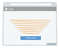
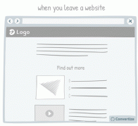
A/B Testing Idea #99 - Leverage the power of visual cues such as imagery to focus attention towards your call-to-action
Using clean, clear imagery is a great way to draw attention to your Call-to-Action (CTA). As in the example above, adding an additional simple visual stimulus that stands out through colour or another…

A/B Testing Idea #102 - If human pictures are used, the gaze should point towards crucial parts of your website
As humans, we have a natural, innate tendency to follow's others' gazes. It is an important social stimulus and often the way we learn about the world as we are growing up. This can therefore…
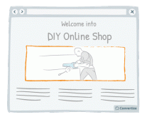
A/B Testing Idea #103 - Create a sense of trust by focusing users' attention to pictures they can relate to
Don't simply use random images on your website; it is best to encourage your customers to identify with the image. For instance, if you sell DIY products to private individuals, the most effective…
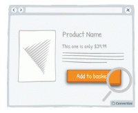
A/B Testing Idea #111 - When prices change, make the change stand out by displaying them with different font sizes
Displaying a previous, higher price alongside your current price is a great way of convincing people that what you're offering is good value. One easy and effective way to enhance this though is to…
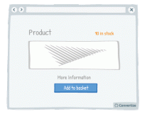
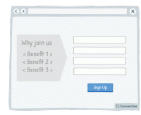
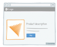
A/B Testing Idea #133 - Provide a "more info" button for every product
Your customers will feel like the more information they are given in order to make a decision, then the better that decision will be. So the more information you can give them about the product (in…
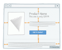
A/B Testing Idea #134 - Place graphs, visuals and pictures on the left-and side of the screen
Visual elements positioned on the left are processed by the right hemisphere of the brain, which is better suited for image processing. Therefore, people will "digest" the page more quickly …
A/B Testing Idea #135 - Contextualise product pictures in the ideal situation in which they should be used
If your customer can visualise themselves using your product then they'll feel more inclined to buy it. You can ensure this by setting your product images in such a way as to increase the chances…
A/B Testing Idea #136 - When appropriate, employ charismatic models
Using attractive models on your site can be very effective in the right context. Studies have shown that using a model to market a product increases its credibility, how much attention people pay to…
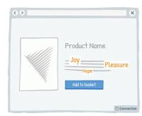
A/B Testing Idea #137 - Increase the size of terms which convey sentiments
Words that convey emotion are important parts of your content as these are trigger words that will elicit a response and engagement from your visitor. Studies have shown that we pay more attention …
A/B Testing Idea #139 - Enhance your Call-to-action by altering its aesthetics thanks to border, levels or shadows
Your Call-to-Action (CTA) is a button - you need it to look like one! Adding depth to your CTA through using a border, bevel or shadowing will help to clearly distinguish it as a button that is there …
A/B Testing Idea #140 - Convey movement by adding an arrow to your Call-to-Action button
Your Call-to-Action (CTA) is a button - you need it to look like one! Adding an arrow to your CTA will help to clearly distinguish it as a button that is there to be clicked on to move on to the next …
A/B Testing Idea #143 - Alter the aesthetics of your Call-to-action when your user hoover over it
Simply making it so that your Call-to-Action button alters in some way when the cursor hovers over it will clearly distinguish it as a button that is there to be clicked on. A visual effect to indicate…
A/B Testing Idea #147 - Add more white space in your pages
A lot of websites consider white space to be lost space but they couldn't be more wrong! Increasing the amount of white space makes for a much clearer page and therefore a more pleasing visual experience…
A/B Testing Idea #148 - Nudge your visitor to your Call-to-action through arrows and visual cues
Your visitor's brains will be immediately drawn towards familiar visual elements (like arrows) as they notice and understand these visuals more quickly than any other information on the page. Utilising…
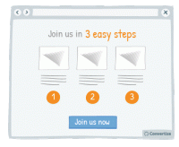
A/B Testing Idea #163 - Use pictograms to help visitors visualise the simplicity of a process or task
The more your visitor is convinced of the simplicity of an action on your site (for example your purchase or registration process), the more motivated they will be to complete it. Using simple, clear …

A/B Testing Idea #164 - Indicate "Most Popular" as your desired plan to be chosen
Marking your target plan as "Most Popular" is an effective persuasion technique to encourage customers to choose it. Research has shown that we have a strong tendency to copy others' …
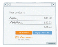
A/B Testing Idea #166 - Nudge your users to use a particular payment method by indicating how many users have used it
If you have a method of payment that you would prefer your customers use for any reason (reduced fees, easier management, etc.) then you can steer them towards this option through showing the percentage…
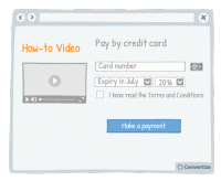
A/B Testing Idea #178 - Display "how-to" videos related to products on the checkout page
By placing instructional and informative "how-to" videos just before the final stage of payment, you are offering reassurance to your customers by showing them how easy to use and interesting…

A/B Testing Idea #189 - Display groups of testimonials rather than just one solitary testimonial
It's always better to display multiple testimonials together rather than just one on its own. Firstly, your customers will be much more likely to feel confident in these testimonials if there are …
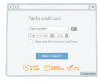
A/B Testing Idea #196 - Provide reassurance by displaying trust symbols
Trust symbols are a great and immediately impactful way to reassure your customers by showing that they can make a payment securely. Even a small factor of uncertainty can disrupt the payment process…
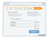
A/B Testing Idea #198 - Show a progress bar
Displaying a progress bar is a great visual way to help users follow their progress in the purchase process and will not only stimulate their desire to continue to the end of the process but also gives…
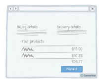
A/B Testing Idea #199 - Remove exit points from checkout page
Studies have shown that if you remove any distractions when people are purchasing something, they are more likely to complete the purchase. Removing all distractions from your checkout pages will allow…

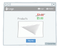
A/B Testing Idea #214 - When displaying promotions, exhibit the previous prices, to accentuate them
When offering discounted prices, it is essential to always still display the previous higher prices as well (crossed out is advisable to avoid confusion). Studies have shown that people tend to use…

A/B Testing Idea #257 - Avoid facial distraction by using face images to direct attention to the call-to-action
Beware of images! On the one hand, it's true that a user retains what is contained in an image more than in text. But be careful - if you use an image of a face that is looking directly at the user…
A/B Testing Idea #260 - Prioritise pictures, visual elements over lone text
“A picture paints a thousand words”. Indeed, the human brain learns and retains information much better when it comes in the form of images rather than words. Images do not require translation…
A/B Testing Idea #267 - Display pictures of your team members to enhance their trustworthiness
Obviously you want your site to look professional, but using photos taken from a database showing suited and booted workers with sparkling white smiles will ring as untrue to most customers. Instead, …
A/B Testing Idea #274 - Display text in such a manner that it focuses the attention to the Call-to-action
Our brains form the majority of the images we “see” and like to be given direction about what to focus on so using visual cues help to draw attention towards certain elements. Lead your visitor…
A/B Testing Idea #276 - Bring attention to a popular product to facilitate the visitor to make a decision
Studies have shown that individuals tend to follow others' choices or behaviour when trying to make decisions. We automatically presume that if lots of our peers are doing something or buying a particular…
A/B Testing Idea #277 - Avoid showing your Call-to-action more than once on the same page
Don't be tempted to display the same information twice in two different locations on your page (if it is a one-screen page that doesn't require any scrolling) because this will make it too busy…
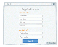
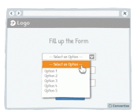
A/B Testing Idea #280 - Separate your form into smaller sections
When you want someone to complete a form, it is best not to discourage them by presenting that form in one large block that will immediately seem dense, unclear and long. By separating your form into …

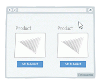
A/B Testing Idea #284 - Include more than one individual, or more than one product within your visual marketing material
People are more inclined to want to buy a product when it is shown in a way which helps them to visualise themselves using it. Therefore, to reduce the mental effort required on the part of your customer…
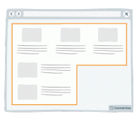
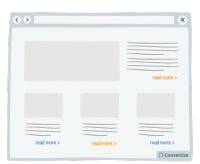
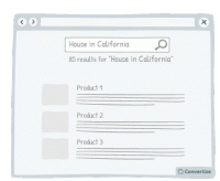
A/B Testing Idea #289 - Condense your content to avoid losing the attention of your user
Make your blocks of content compact. That is to say, you should avoid trapping negative (i.e. useless, empty) space within your layout. For example, in the left-hand image above, you can see that there…

A/B Testing Idea #291 - Nudge users to read your page by slightly overlapping design elements and images
If you completely separate the design of each content block then you won't give your visitor the encouragement they need to continue on reading down. Rather, after reading only the first block they…
A/B Testing Idea #298 - Display your call-to-action as a visual animation
Introducing a Call-To-Action (CTA) using a floating animation that appears after a few moments could help increase conversions. Drawing attention to the Call-To-Action is essential for getting people …
A/B Testing Idea #299 - Make your call-to-action dynamic and delay it
Delaying your call-to-action can have its advantages. It allows the customer to absorb all the content on your page without any distraction and then will more strongly draw their eye due to its sudden…
A/B Testing Idea #306 - Visually distinguish between important functions using colour, size and space
To avoid grave slip-ups, make sure that important functions are highlighted by separating them and using a different colour. This will ensure that the user's attention is drawn to it and they won&#…
A/B Testing Idea #309 - Limit frustrations by enabling the possibility to leave a field blank, even after it has been selected
It can often happen that a customer might click into an option or function from a drop down list only to realise that they don't want to select anything but find themselves stuck as they are unable…
A/B Testing Idea #316 - Display links already used with a dissimilar colour
Clearly show which links a user has already clicked on by displaying them in a different colour. Using another colour will help those links to stand out, which will help the user to keep track of what…
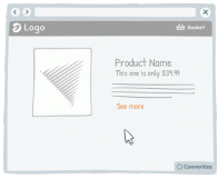
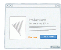
A/B Testing Idea #325 - Increase the clickable zone of your call-to-action if it is small
If your website contains small Call-to-Actions like the "see more" in the drawing above, add a transparent border around it in order to expand the clickable area. Users will not necessarily …
A/B Testing Idea #327 - Avoid showing pop-up windows at the wrong time
Do not set up your pop-ups or overlays to trigger at the wrong times. Having a pop-up triggered as soon as you load a website can be extremely irritating to a user. Some will simply close the website …
A/B Testing Idea #328 - Avoid placing advertising on top of lists of products
It is best to make sure that your customer's attention is fully focused on the main factors that will lead to conversion. Therefore it isn't advisable to have ad banners places above your product…

A/B Testing Idea #329 - On mobile devices, ensure that you have easily clickable areas
On smaller screens, such as on mobile or tablet, it is common for users to experience frustration and unease when trying to click options as the hit areas can be too imprecise. When we are using our fingers…


Oops, you have reached your limit of 1 free tactic per hour
To get unlimited access to our 250+ tactics,
Join our FREE mailing list
Or wait 00:59:59
Congratulations!
You have unlocked our library of 250 tactics.
Keep learning or sign up to Convertize.com to start
implementing them directly in your webste.