Home
27 A/B Testing Ideas Used By Amazon
This is the ultimate library of the Best A/B Testing Ideas: We have compiled 250 A/B Testing Ideas that you can try on your website to optimize your conversion rates and increase your revenues.
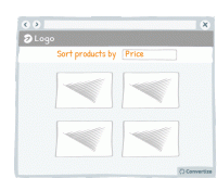
A/B Testing Idea #16 - Enable the possibility to filter options
Adding a sorting option will allow visitors to see the products that interest them without having to spend too much time and effort working out differences in features and costs. The easier and 'smoother…
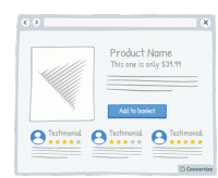
A/B Testing Idea #35 - Display customer testimonials right under the product
If you have positive reviews about your products or services then make sure they are clearly displayed; showing this "social proof" from your customer's peers is an effective persuasion …
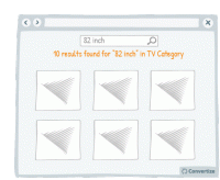
A/B Testing Idea #36 - Create a dedicated search bar within a specific range of products
Research shows that information overload and too much choice results in less effective and satisfying decisions than when less information is presented or fewer options are on offer. It can also lead …
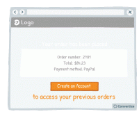
A/B Testing Idea #47 - Offer visitors the option to create an account AFTER checking out
There’s nothing more aggravating than being presented with the “Register to Create an Account!” pop-up before you can complete your order. This can often put people off continuing with…
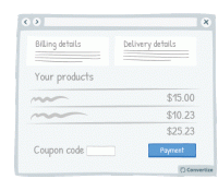
A/B Testing Idea #48 - Bring less attention to your discount/coupon code
Making your "coupon / promo code" section less visible on the page will reduce the likelihood that those who don't have a code to enter will notice it and suddenly feel as though they'…
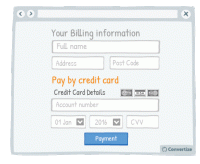
A/B Testing Idea #51 - When taking billing information ask for credit card details last
Only ask your customers for their card details once all other information has been given (name, email, delivery info, etc.) as it is better to start by asking them for easier, less disagreeable information…
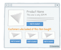
A/B Testing Idea #60 - Offer cross-selling
Cross-selling is an effective way of increasing sales by proposing related products to your customers when they are in the process of viewing or purchasing something. For example, these might be accessories…
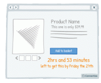
A/B Testing Idea #96 - Create urgency by giving a limited timeframe for fast delivery
Offering fast delivery time is a strong motivator for your customers to complete a purchase as we always prefer to take an option that results in quicker gratification. What's more, as you'…
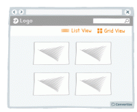
A/B Testing Idea #105 - Visually display in a list format rather than a grid
Simply changing the way in which your products are displayed can make a significant difference to how comfortable your users feel interacting with your site. If you have good quality images, using a grid…
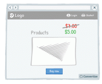
A/B Testing Idea #111 - When prices change, make the change stand out by displaying them with different font sizes
Displaying a previous, higher price alongside your current price is a great way of convincing people that what you're offering is good value. One easy and effective way to enhance this though is to…
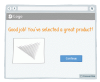
A/B Testing Idea #142 - Continuously reassure your customer in their decision
Reassuring your customer about the choice they've made to select or purchase a certain product from your site can greatly influence how satisfied they are with that choice. To aid customer satisfaction…
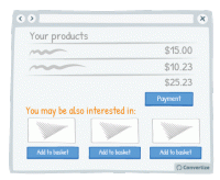
A/B Testing Idea #149 - Suggest complimentary products at the check-out
Cross-selling is a good way of increasing the user's basket before they complete the purchase. When a user is in the checkout process, it is a good time to display other products that may interest…
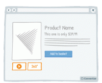
A/B Testing Idea #152 - Offer 360 degrees videos of your product
The more information a user has access to about a product, the more likely they are to buy it. You can take advantage of this by offering your user more extensive views of it. There are various different…
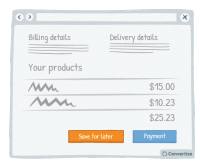
A/B Testing Idea #162 - Offer a "save for later" button on your basket page
Your customers will appreciate having the choice between making their purchase immediately or saving their items to complete purchase later. People like to feel as though they are in control of their…
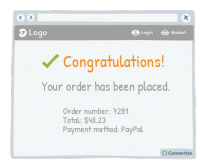
A/B Testing Idea #180 - Congratulate your customers on their booking or purchase
Congratulating your clients on the purchase or booking they have just made will induce positive feelings and help to therefore reassure them on their choice to complete this transaction. The happier you…
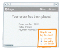
A/B Testing Idea #182 - Follow up with a post-purchase question asking them what led to their decision
Asking your customers why they bought your product is a good way of making them think about those reasons and this in turn will reassure them of the purchase they have just made. The happier you can help…
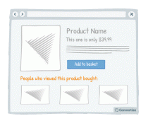
A/B Testing Idea #191 - Include a section: "People who browsed this product, also bought:"
Adding a “People who viewed this product bought...” feature is an effective persuasion technique. Research has shown that we have a strong tendency to copy others' choices when we are…
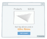
A/B Testing Idea #193 - Add a countdown timer for earliest delivery times
By adding a countdown timer showing how long they have left to purchase a product in order to get it delivered at the earliest possible time, a sense of urgency is added which will make the customer more…
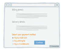
A/B Testing Idea #197 - Enable more than one means to pay
Offering multiple payment methods offers customers the possibility to make a purchase in the way they feel most confident and secure, increasing the likelihood of them finalising payment. People also…
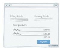
A/B Testing Idea #199 - Remove exit points from checkout page
Studies have shown that if you remove any distractions when people are purchasing something, they are more likely to complete the purchase. Removing all distractions from your checkout pages will allow…
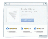
A/B Testing Idea #264 - Do not shy away from mentioning some fall backs
On most websites, negative reviews or drawbacks are invisible while on others (e.g. Amazon), those are clearly displayed alongside the pros. Believe it or not, but hiding your drawbacks is not the solution…
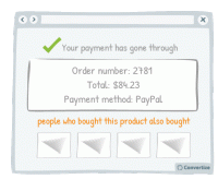
A/B Testing Idea #269 - To create a double funnel within the check-out, show a section which indicates: "people who bought this, also bought: ..."
On the confirmation page after purchase, display "people who bought this product also bought ..." to create a double funnel. This will encourage your customers to make a second purchase after…
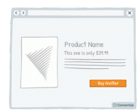
A/B Testing Idea #305 - Give a friendly reminder after items have already been placed in the basket
Making the purchasing process as fluid and easy as possible is important to encourage your visitors to follow through to completion and convert. By altering the Call-to-Action of a product to clearly …
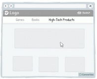
A/B Testing Idea #312 - Make sure you facilitate the user experience of drop-down menus and pop-up windows
Your users aren't perfect, they will regularly make mistakes with the cursor (as do we all!). For this reason, you need to create interfaces that are flexible and forgiving. Visitors are often confronted…
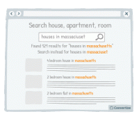
A/B Testing Idea #317 - Ensure that your fields are reactive to errors, antonyms and other syntax differences
Making sure your site visitors have a user experience that is as fluid and easy as possible is important to encourage your visitors to enjoy using your site and ultimately find what they are looking for…
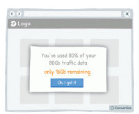
A/B Testing Idea #318 - Simplify your customer's thinking process by doing any calculations for them
People strongly prefer and feel more positive about things that are easy and quick for us to understand. If you want your customer to respond well to information you provide and to feel happy using your…
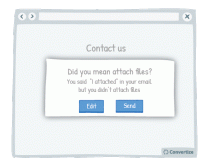
A/B Testing Idea #324 - Utilize written content which slightly contradicts what the user wants to do
The more confident you user feels in navigating your website and completing tasks, the better experience they will have and the more likely they will be to convert. Report potential errors to your customers…

Oops, you have reached your limit of 1 free tactic per hour
To get unlimited access to our 250+ tactics,
Join our FREE mailing list
Or wait 00:59:59


