Home
19 A/B Testing Ideas Used By Asos
This is the ultimate library of the Best A/B Testing Ideas: We have compiled 250 A/B Testing Ideas that you can try on your website to optimize your conversion rates and increase your revenues.
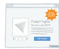
A/B Testing Idea #6 - Offer & clearly display an attractive guarantee or refund policy
By clearly offering an attractive guarantee or refund policy, customers won't find the process of paying as difficult, or negative, as they will feel that they will be able to return the product…
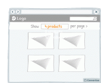
A/B Testing Idea #15 - Include an option to adjust the number of items displayed per page
Adding an option to adjust the number of items displayed per page allows your visitor to feel more in control of how they spend time on your site. This will allow also them to adjust the layout to…
A/B Testing Idea #40 - Whenever possible, pre-fill fields whilst ensuring that users are able to alter them
Making forms as simple and quick to fill in as possible will encourage your customers to complete the desired actions. Where possible - and applicable - it will be helpful therefore to pre-fill form fields…
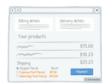
A/B Testing Idea #44 - Offer multiple delivery options, including Express
Offering multiple delivery options is important both to offer choice to the customer but also for the possibility of further profit made on that purchase. Customers like to have a sense of control …
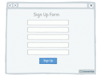
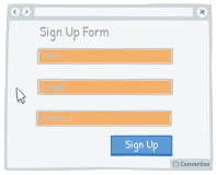
A/B Testing Idea #86 - Prioritise, whenever possible, single-column forms
People like to process things quickly and easily, and will be put off by anything that complicates this cognitive fluency. Using single column forms not only makes them look cleaner and easier to navigate…

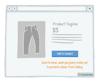
A/B Testing Idea #87 - Embed in your call-to-action some of your value propositions
Your Call-to-Action text is important as it is the final step before the conversion and so is the final point at which you can convince customers to follow through and click on that button. Use the…

A/B Testing Idea #93 - As a user visits your website, alter the Call-to-actions
In order to draw attention to your Call-to-Action, try setting it to alter whilst your visitor is on the page. We are naturally drawn to those things which stand out from their environment and something…
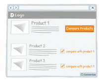
A/B Testing Idea #151 - Add a compare products option/tickbox
Adding a product comparison option to your site will allow visitors to see the products that interest them without having to expend too much effort working out differences in features and costs. The easier…
A/B Testing Idea #154 - Be consistent with your product images throughout your site
It's common knowledge that users lack patience when surfing the web. When they are on an eCommerce website they want to be able to see products quickly and easily. A good way of doing this is to…
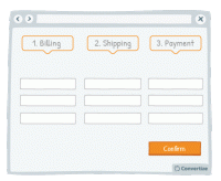
A/B Testing Idea #200 - Test a multi-page checkout process against a single one
To reduce bounce rate during the checkout process, test using a one-page solution: that is to say, display all the different steps - billing, shipping and payment - on one page rather than having a new…
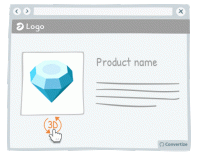
A/B Testing Idea #268 - Use interactive images rather than static ones
Research has shown that consumers are generally more drawn to interactive images than static ones. The interactive images provide a "fun" aspect to the user experience thanks, for example, to…

A/B Testing Idea #271 - Clarify any intrigue created to bring the customer to your website
Humans tend to desire closure and don't like to be kept in the dark. This is why it can be very effective to engage your customer through first presenting an intriguing statement, and immediately …
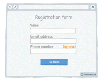
A/B Testing Idea #279 - On a form, specify which fields are optional rather than which are mandatory
When you ask your customers to fill in a form, specify which fields are optional rather than which are mandatory. On many websites we see asterisks or other visual cues to indicate if a field is mandatory…
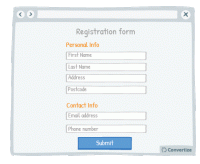
A/B Testing Idea #280 - Separate your form into smaller sections
When you want someone to complete a form, it is best not to discourage them by presenting that form in one large block that will immediately seem dense, unclear and long. By separating your form into …

A/B Testing Idea #284 - Include more than one individual, or more than one product within your visual marketing material
People are more inclined to want to buy a product when it is shown in a way which helps them to visualise themselves using it. Therefore, to reduce the mental effort required on the part of your customer…
A/B Testing Idea #287 - Do not shy away from sharing crucial information for no compensation
It is proven that we are more likely to give something to someone if they have given something to us already - the desire to reciprocate such behaviour is strong and can certainly lead to action and conversion…
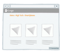
A/B Testing Idea #319 - Display navigation categories (breadcrumbs) to indicate the location of the user on your website
To help your visitor feel at ease with the logic and layout of your site, clearly display a breadcrumb trail (or other sequence map) so they can quickly see where they are on your site and how they arrived…
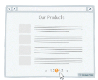
A/B Testing Idea #321 - Use page numbers or ‘Load More’ options rather than infinite scrolling
On eCommerce product pages, it is essential that you choose the right way to display your products to provide your customers with the most effective base to start making choices. People tend to become…

A/B Testing Idea #329 - On mobile devices, ensure that you have easily clickable areas
On smaller screens, such as on mobile or tablet, it is common for users to experience frustration and unease when trying to click options as the hit areas can be too imprecise. When we are using our fingers…


Oops, you have reached your limit of 1 free tactic per hour
To get unlimited access to our 250+ tactics,
Join our FREE mailing list
Or wait 00:59:58
Congratulations!
You have unlocked our library of 250 tactics.
Keep learning or sign up to Convertize.com to start
implementing them directly in your webste.