Home
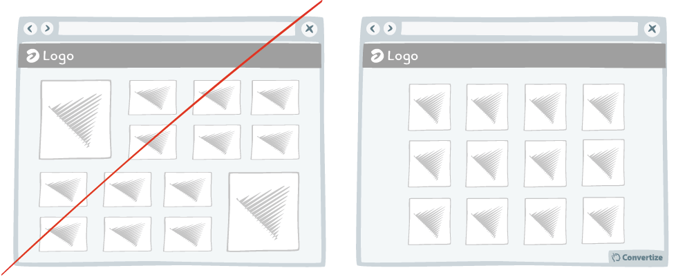
A/B Testing Idea #154 - Be consistent with your product images throughout your site

Description
It's common knowledge that users lack patience when surfing the web. When they are on an eCommerce website they want to be able to see products quickly and easily.
A good way of doing this is to have a uniform category page on which all products have the same image size, font and text size. Don't be tempted to highlight certain products by making them bigger on this type of page. Having them all the same size is good for users as it helps them scan your products easily.
Principles
- Processing Efficacy (Jacoby & Dallas, 1981)
- Cognitive Friction (Sweller, 1988)
The Research
Processing Efficacy
We tend to prefer things that are simple for us to understand or use.
Cognitive Friction
Learning happens best under conditions that are aligned with human cognitive architecture.
Browse A/B Testing Ideas bycategories
Browse A/B Testing Ideas bytype of website
Browse A/B Testing Ideas bypage type
Browse A/B Testing Ideas bybrands
Browse A/B Testing Ideas bydefinitions

Oops, you have reached your limit of 1 free tactic per hour
To get unlimited access to our 250+ tactics,
Join our FREE mailing list
*
Or wait 00:59:59


