Home
16 A/B Testing Ideas Used By Dropbox
This is the ultimate library of the Best A/B Testing Ideas: We have compiled 250 A/B Testing Ideas that you can try on your website to optimize your conversion rates and increase your revenues.
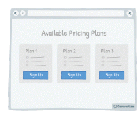
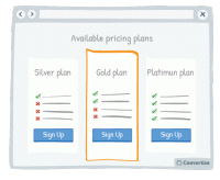
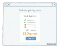
A/B Testing Idea #5 - Reduce the number of pricing plans available to no more than 3
Offering a maximum of 3 pricing plans will help your visitors to make better decisions and feel less overwhelmed. Research shows that information overload results in less effective and satisfying decisions…
A/B Testing Idea #33 - Display the daily or monthly price to make the amount seem smaller
By showing the price per day or month rather than the total price, it can often seem like less. Your customer will tend to use this smaller amount as an anchor to decide whether the purchase is good…
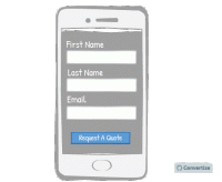
A/B Testing Idea #57 - Make your website responsive (mobile-friendly)
A mobile-friendly website is essential to ensure that you don't miss out on customers using mobile devices. A website that is mobile responsive will not only be more aesthetically pleasing but will…
A/B Testing Idea #65 - Reduce the left digit by one and minimise the digits after the decimal
Reducing your price by one cent or penny can make all the difference when it results in the left digit going down by one. Whereas $3.89 to $3.87 wouldn't be of any consequence $4.00 to $3.99 definitely…
A/B Testing Idea #69 - Create a default option or add-on
If you have a particular option or add-on that you would prefer your customer to choose, then making it a default option will greatly increase the chances of them doing so. Default options are so attractive…
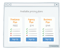
A/B Testing Idea #82 - Give your pricing plans relatable, helpful names
The names you use for your pricing plans can really make a difference. By using names that your customers are familiar with, you will trigger an immediate emotional response that will enhance their positivity…
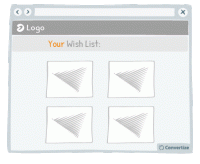
A/B Testing Idea #90 - Combine functions which are similar
People respond best to clear, direct and easy-to-understand information and are easily distracted or put off by extraneous information or demands on their attention. To avoid this, make sure you streamline…
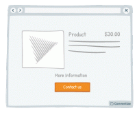
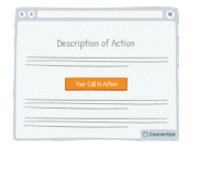
A/B Testing Idea #92 - Indicate your primary Call-to-action twice or more
It is almost always better to display your Call-to-Action (CTA) as a button rather than a simple link as it will both attract your user's attention and make it clear that it is a CTA ready to be clicked…
A/B Testing Idea #94 - Ensure that your call-to-action appears above the fold
The "fold" is the line that separates the visible part of your webpage from the part that will only be visible once your visitor scrolls down. Your Call-To-Action (CTA) button should always …
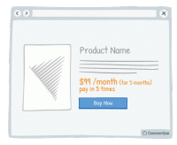
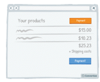
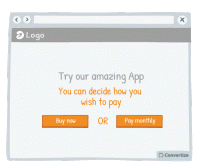
A/B Testing Idea #106 - Give the possibility to pay in instalments
The way in which a price is presented to your customer can greatly influence how they perceive the value of it. For example, offering people the option to pay in installments will subconsciously make …
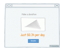
A/B Testing Idea #107 - Demonstrate the per day cost of monthly or yearly plans
Rather than only showing the yearly or monthly cost of a subscription, it can be effective to also display the daily equivalent. Studies have shown that we use a first piece of information as an anchoring…
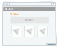
A/B Testing Idea #125 - Utilize your customer's details to customize your content offering
Your customer will feel more involved in and connected with your content if you make use of their name to give it a personalised touch. A natural tendency we experience is "implicit egotism"…
A/B Testing Idea #131 - If you don't know their name, use "you" or "your" to personalise the message
By using a personal pronoun instead of an impersonal form, you immediately involve your customer in the situation or product you're referencing, which will trigger a subtle emotional response and …
A/B Testing Idea #263 - Do not offer customers only one possibility.
A unique and effective tool of persuasion can in fact be to remind your customers that they have the freedom to choose what to do. Incorporating wording in your copy that emphasises to your customers …
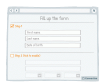
A/B Testing Idea #303 - As a user completes a form, unlock other sections
Rather than giving your customer access to an entire form in block layout, split your form into steps that they can unlock themselves. This will make the form seem less daunting and more bite-sized and…
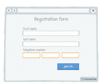
A/B Testing Idea #304 - With forms, offer fields which match the required information
Matching your field layout to whichever input format is required will improve user experience by giving assistance and avoiding errors or frustration. For example, when asking for a phone number you should…


Oops, you have reached your limit of 1 free tactic per hour
To get unlimited access to our 250+ tactics,
Join our FREE mailing list
Or wait 00:59:59
Congratulations!
You have unlocked our library of 250 tactics.
Keep learning or sign up to Convertize.com to start
implementing them directly in your webste.