Home
8 A/B Testing Ideas Used By Airbnb
This is the ultimate library of the Best A/B Testing Ideas: We have compiled 250 A/B Testing Ideas that you can try on your website to optimize your conversion rates and increase your revenues.
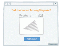
A/B Testing Idea #114 - Emphasise the experiential advantages over the monetary ones
It's a good idea to avoid references to money when presenting your products to customers and instead to place emphasis on the experience that they will enjoy using them. People place more value…
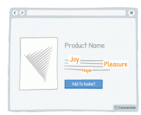
A/B Testing Idea #137 - Increase the size of terms which convey sentiments
Words that convey emotion are important parts of your content as these are trigger words that will elicit a response and engagement from your visitor. Studies have shown that we pay more attention …
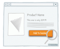
A/B Testing Idea #139 - Enhance your Call-to-action by altering its aesthetics thanks to border, levels or shadows
Your Call-to-Action (CTA) is a button - you need it to look like one! Adding depth to your CTA through using a border, bevel or shadowing will help to clearly distinguish it as a button that is there …
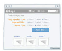
A/B Testing Idea #170 - Prioritise your most crucial filters
Re-ordering the filter options and putting the most relevant and important filters first will make for an easier and more pleasurable site experience for your visitors. Research has shown that people…
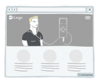
A/B Testing Idea #295 - Prioritise uncommon landing pages
We tend to better remember the things that affects us directly. Thus the fact of creating a landing page that emotionally affects your customers or create an original landing page is a good way to stay…
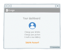
A/B Testing Idea #306 - Visually distinguish between important functions using colour, size and space
To avoid grave slip-ups, make sure that important functions are highlighted by separating them and using a different colour. This will ensure that the user's attention is drawn to it and they won&#…
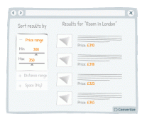
A/B Testing Idea #322 - Suggest a criteria option instead of a filter option for sorting search results
When you display search results, it is important to help your customers find what they are looking for as quickly and easily as possible. This will avoid them becoming overwhelmed by choice and quitting…
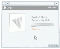
A/B Testing Idea #325 - Increase the clickable zone of your call-to-action if it is small
If your website contains small Call-to-Actions like the "see more" in the drawing above, add a transparent border around it in order to expand the clickable area. Users will not necessarily …

Oops, you have reached your limit of 1 free tactic per hour
To get unlimited access to our 250+ tactics,
Join our FREE mailing list
Or wait 00:59:59


