Home
A/B Testing Idea #325 - Increase the clickable zone of your call-to-action if it is small
Description
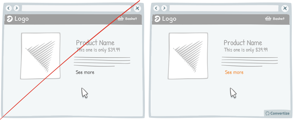
If your website contains small Call-to-Actions like the "see more" in the drawing above, add a transparent border around it in order to expand the clickable area. Users will not necessarily be very accurate with their mouse cursor. Failing to perform a simple task can be very frustrating on a website and can even lead visitors to quit your site before completing their intended action. By expanding the clickable area around the button you reduce the likelihood of this happening by ensuring that your visitors can complete their action without needing to be very precise with their mouse movements.
Inspired by Nick Kolenda
Principles
- Aesthetic-Usability Effect (Bloch, 1983; Donald Norman, 2002)
- Processing Efficacy (Jacoby & Dallas, 1981)
The Research
Aesthetic-Usability Effect
Aesthetic designs are perceived as easier to use than less-aesthetic designs, and are more likely to be purchased regardless of functionality.
Processing Efficacy
We tend to prefer things that are simple for us to understand or use.


Oops, you have reached your limit of 1 free tactic per hour
To get unlimited access to our 250+ tactics,
Join our FREE mailing list
Or wait 00:59:59
Congratulations!
You have unlocked our library of 250 tactics.
Keep learning or sign up to Convertize.com to start
implementing them directly in your webste.