Home
4 A/B Testing Ideas Used By Skyscanner
This is the ultimate library of the Best A/B Testing Ideas: We have compiled 250 A/B Testing Ideas that you can try on your website to optimize your conversion rates and increase your revenues.

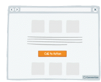
A/B Testing Idea #7 - Choose a contrasting button colour and size for your Call-to-Action
The objective of a Call-to-Action (CTA) button is to encourage your visitors to do something specific. Choosing a contrasting button colour and size will make it more prominent on your page so that…

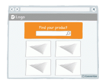
A/B Testing Idea #11 - Emphasise your search bar
If you notice that your site visitors are using the search bar often, make it more prominent by varying its colour, size and position on your page. People are more likely to notice and remember…

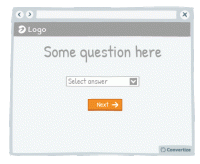
A/B Testing Idea #140 - Convey movement by adding an arrow to your Call-to-Action button
Your Call-to-Action (CTA) is a button - you need it to look like one! Adding an arrow to your CTA will help to clearly distinguish it as a button that is there to be clicked on to move on to the next …

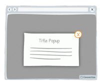
A/B Testing Idea #310 - Offer a clear and simple manner to close pop-up windows
Ensure you give your customer the power to close any pop-ups or other boxes on your site. Showing an immediately recognisable cross in the top-right of all boxes will allow customers to easily close them…

Oops, you have reached your limit of 1 free tactic per hour
To get unlimited access to our 250+ tactics,
Join our FREE mailing list
Or wait 00:59:59


