Home
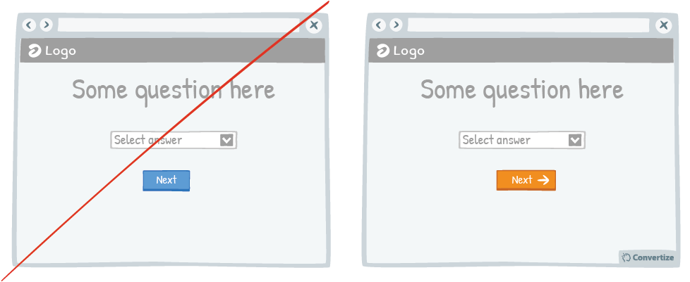
A/B Testing Idea #140 - Convey movement by adding an arrow to your Call-to-Action button

Description
Your Call-to-Action (CTA) is a button - you need it to look like one! Adding an arrow to your CTA will help to clearly distinguish it as a button that is there to be clicked on to move on to the next step or page.
Indicating in this way that a CTA is clickable will make it much easier for people to see automatically which parts of the page are interactive and will lead them to engage without any frustration.
Using an arrow conveys a sense of moving forwards and progressing in the process which will also give people a sense of satisfaction as well as encourage them to commit to the task.
Inspired by Nick Kolenda
Principles
- Representativeness Heuristic (Kahneman & Tversky, 1972)
The Research
Representativeness Heuristic
People have a tendency to judge the probability of an event through relying on information from the occurrence of similar events - or, more generally, to make biased predictions and generalisations by counting on similar models and happenings.

Oops, you have reached your limit of 1 free tactic per hour
To get unlimited access to our 250+ tactics,
Join our FREE mailing list
Or wait 00:59:59


