Home
92 A/B Testing Ideas For Your Article Page
This is the ultimate library of the Best A/B Testing Ideas: We have compiled 250 A/B Testing Ideas that you can try on your website to optimize your conversion rates and increase your revenues.
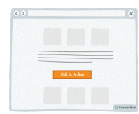
A/B Testing Idea #7 - Choose a contrasting button colour and size for your Call-to-Action
The objective of a Call-to-Action (CTA) button is to encourage your visitors to do something specific. Choosing a contrasting button colour and size will make it more prominent on your page so that…
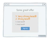
A/B Testing Idea #8 - List the strongest benefits first
Re-ordering the benefits of your offer by putting the strongest ones first will more easily capture your visistors' attention, and make a better impression. Research has shown that people recall…
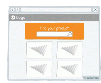
A/B Testing Idea #11 - Emphasise your search bar
If you notice that your site visitors are using the search bar often, make it more prominent by varying its colour, size and position on your page. People are more likely to notice and remember…
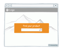
A/B Testing Idea #17 - Blur or fade images to reduce the emphasis on them
By blurring or fading images, you can place emphasis on something else instead. People are more likely to notice and remember an element that stands out. Your visitors will immediately be attracted…
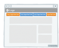
A/B Testing Idea #28 - Restructure your navigation menu
Re-ordering your navigation menu by putting the most important links at the beginning and the end of your menu will help to ensure visitors notice and click on them. Research has shown that people recall…
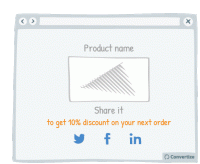
A/B Testing Idea #49 - Provide an incentive to share on social media
Offering an incentive to your visitors to share your content or their purchases on social media will obviously increase the chances of encouraging them to do so. This incentive could be anything from…
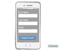
A/B Testing Idea #57 - Make your website responsive (mobile-friendly)
A mobile-friendly website is essential to ensure that you don't miss out on customers using mobile devices. A website that is mobile responsive will not only be more aesthetically pleasing but will…

A/B Testing Idea #87 - Embed in your call-to-action some of your value propositions
Your Call-to-Action text is important as it is the final step before the conversion and so is the final point at which you can convince customers to follow through and click on that button. Use the…
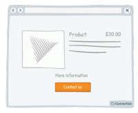
A/B Testing Idea #90 - Combine functions which are similar
People respond best to clear, direct and easy-to-understand information and are easily distracted or put off by extraneous information or demands on their attention. To avoid this, make sure you streamline…
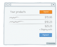
A/B Testing Idea #92 - Indicate your primary Call-to-action twice or more
It is almost always better to display your Call-to-Action (CTA) as a button rather than a simple link as it will both attract your user's attention and make it clear that it is a CTA ready to be clicked…
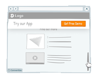
A/B Testing Idea #93 - As a user visits your website, alter the Call-to-actions
In order to draw attention to your Call-to-Action, try setting it to alter whilst your visitor is on the page. We are naturally drawn to those things which stand out from their environment and something…
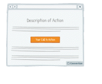
A/B Testing Idea #94 - Ensure that your call-to-action appears above the fold
The "fold" is the line that separates the visible part of your webpage from the part that will only be visible once your visitor scrolls down. Your Call-To-Action (CTA) button should always …
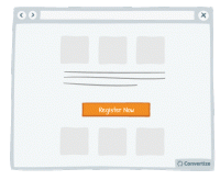
A/B Testing Idea #95 - Limit the numbers of words in your call-to-action to 2
The simpler and more attention-grabbing you can make your Call-to-Action (CTA) the better. Customers prefer to use less mental energy and want to be led with ease around your site. Using only 2 words…
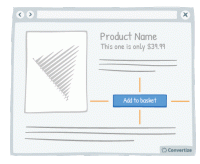
A/B Testing Idea #97 - Add white space around your call-to-action
Increasing the amount of white space around your Call-to-Action (CTA) will draw attention to it and make for a much more pleasing visual experience for the user. Equally, making sure there isn't an…
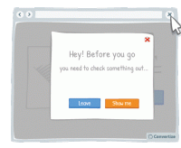
A/B Testing Idea #98 - Ask yourself if your call-to-action is persuasive enough
You want your Call-to-Action (CTA) text to tell people immediately why they should click on it and to help persuade your visitors to proceed forward with a positive action. Using engaging and persuasive…
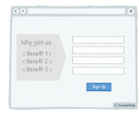
A/B Testing Idea #99 - Leverage the power of visual cues such as imagery to focus attention towards your call-to-action
Using clean, clear imagery is a great way to draw attention to your Call-to-Action (CTA). As in the example above, adding an additional simple visual stimulus that stands out through colour or another…
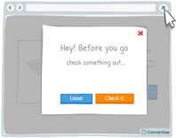
A/B Testing Idea #100 - Display an exit pop-up when your visitor goes to close the page
It happens all too often that your users leave your website because they did not find what they wanted. Perhaps they only visited one or two pages. Therefore, by setting up an "exit pop-up…
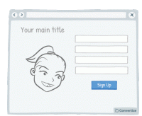
A/B Testing Idea #102 - If human pictures are used, the gaze should point towards crucial parts of your website
As humans, we have a natural, innate tendency to follow's others' gazes. It is an important social stimulus and often the way we learn about the world as we are growing up. This can therefore…
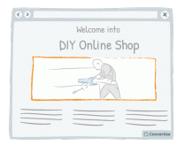
A/B Testing Idea #103 - Create a sense of trust by focusing users' attention to pictures they can relate to
Don't simply use random images on your website; it is best to encourage your customers to identify with the image. For instance, if you sell DIY products to private individuals, the most effective…

A/B Testing Idea #109 - Expose your users to large numbers
Exposing website visitors to any high numbers before displaying your product prices can be very effective in influencing their perception of your price value. Studies have shown that people tend to…
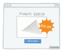
A/B Testing Idea #116 - When price is below 100 ($,£,€) show discounts in percentage form rather than in absolute value
By displaying discounts in percentage rather than in value when product price is below 100 (£/$/€), you make your promotions seem as attractive as possible by altering the way you frame…
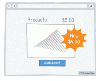
A/B Testing Idea #118 - Give discounts which are simple to calculate
Using precise, non-rounded numbers is a good way of making your prices seem smaller but one occasion when you don't want to do this is when you're offering discounts. You want your discounts to…
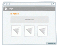
A/B Testing Idea #125 - Utilize your customer's details to customize your content offering
Your customer will feel more involved in and connected with your content if you make use of their name to give it a personalised touch. A natural tendency we experience is "implicit egotism"…
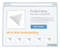
A/B Testing Idea #126 - Draw in your customer by using "we"
By using a personal pronoun instead of an impersonal form, you immediately involve your customer in the situation or product you're referencing, which will trigger a subtle emotional response and …

A/B Testing Idea #127 - Frame intangible concepts with iconic phrasing to make them more tangible
Metaphorical language is a compelling form of communication that can allow you, in certain cases, to better convey your message. It can help to better attract your customer's attention and allow them…

A/B Testing Idea #128 - Leverage the strength in displaying numbers rather than percentages to indicate amounts of individuals
Your visitors will perceive the same information in different ways depending on how you present it to them, It's therefore important to ensure you present information using appropriate values or framing…
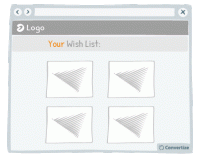
A/B Testing Idea #131 - If you don't know their name, use "you" or "your" to personalise the message
By using a personal pronoun instead of an impersonal form, you immediately involve your customer in the situation or product you're referencing, which will trigger a subtle emotional response and …
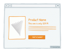
A/B Testing Idea #134 - Place graphs, visuals and pictures on the left-and side of the screen
Visual elements positioned on the left are processed by the right hemisphere of the brain, which is better suited for image processing. Therefore, people will "digest" the page more quickly …
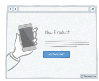
A/B Testing Idea #135 - Contextualise product pictures in the ideal situation in which they should be used
If your customer can visualise themselves using your product then they'll feel more inclined to buy it. You can ensure this by setting your product images in such a way as to increase the chances…
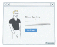
A/B Testing Idea #136 - When appropriate, employ charismatic models
Using attractive models on your site can be very effective in the right context. Studies have shown that using a model to market a product increases its credibility, how much attention people pay to…
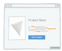
A/B Testing Idea #137 - Increase the size of terms which convey sentiments
Words that convey emotion are important parts of your content as these are trigger words that will elicit a response and engagement from your visitor. Studies have shown that we pay more attention …
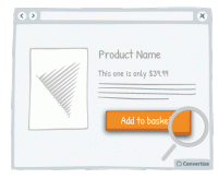
A/B Testing Idea #139 - Enhance your Call-to-action by altering its aesthetics thanks to border, levels or shadows
Your Call-to-Action (CTA) is a button - you need it to look like one! Adding depth to your CTA through using a border, bevel or shadowing will help to clearly distinguish it as a button that is there …
A/B Testing Idea #140 - Convey movement by adding an arrow to your Call-to-Action button
Your Call-to-Action (CTA) is a button - you need it to look like one! Adding an arrow to your CTA will help to clearly distinguish it as a button that is there to be clicked on to move on to the next …
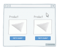
A/B Testing Idea #143 - Alter the aesthetics of your Call-to-action when your user hoover over it
Simply making it so that your Call-to-Action button alters in some way when the cursor hovers over it will clearly distinguish it as a button that is there to be clicked on. A visual effect to indicate…
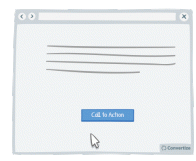
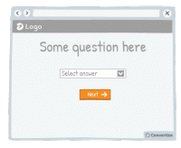
A/B Testing Idea #144 - Utilize a multi-step (at least 2) opt-in
Whilst is might seem counter-intuitive, two-step opt-ins are actually more powerful than one-step opt-ins. A One-Step Opt-In consists of simply presenting input fields directly on the page, whilst a Two…
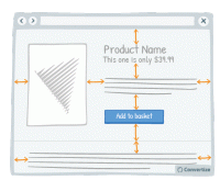
A/B Testing Idea #147 - Add more white space in your pages
A lot of websites consider white space to be lost space but they couldn't be more wrong! Increasing the amount of white space makes for a much clearer page and therefore a more pleasing visual experience…
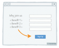
A/B Testing Idea #148 - Nudge your visitor to your Call-to-action through arrows and visual cues
Your visitor's brains will be immediately drawn towards familiar visual elements (like arrows) as they notice and understand these visuals more quickly than any other information on the page. Utilising…
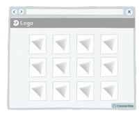
A/B Testing Idea #154 - Be consistent with your product images throughout your site
It's common knowledge that users lack patience when surfing the web. When they are on an eCommerce website they want to be able to see products quickly and easily. A good way of doing this is to…
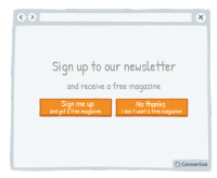
A/B Testing Idea #156 - Facilitate your user's thoughts before asking them to choose
Whilst offering a default choice is often very effective because it allows people to make a decision in a passive manner - which is often preferred as it requires less mental effort - there are some cases…
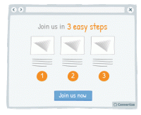
A/B Testing Idea #163 - Use pictograms to help visitors visualise the simplicity of a process or task
The more your visitor is convinced of the simplicity of an action on your site (for example your purchase or registration process), the more motivated they will be to complete it. Using simple, clear …
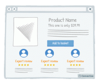
A/B Testing Idea #168 - Display on specialised and expert reviews for your products' endorsements
Displaying expert reviews or testimonials is an effective way of endorsing your products. The positive feedback and opinions of customer's peers is incredibly important as we often rely on this "…
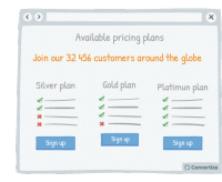
A/B Testing Idea #169 - Indicate the number of users who have already created an account
Displaying the number of people who have already signed up to your website or newsletter is an effective persuasion tool. Research has shown that we have a strong tendency to copy others' choices…
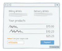
A/B Testing Idea #171 - Customize your discount promotions by integrating your user's name/details
Your customer will feel more involved in and connected with your coupon code - and therefore be more likely to use it - if you make use of their name to give it a personalised touch. A natural tendency…
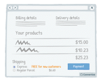
A/B Testing Idea #173 - Offer a FREE upgrade to a better delivery option with first purchase or referal
Providing a free upgrade to express delivery for new customers is a strategy based on the "give and take" idea: you provide your client with something of value (free express delivery) so that…
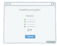
A/B Testing Idea #175 - Delete up to 10% of features but maintain previous, identical pricing
People are unlikely to notice changes as long as these are kept below 10% so you are able to reduce the content and features offered in your pricing plans by 5 to 10% without many visitors noticing that…

A/B Testing Idea #189 - Display groups of testimonials rather than just one solitary testimonial
It's always better to display multiple testimonials together rather than just one on its own. Firstly, your customers will be much more likely to feel confident in these testimonials if there are …
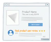
A/B Testing Idea #190 - Feature testimonials from target audience peers rather than celebrities
The main objective of displaying testimonials is to help your site visitors to identify with these, place trust in them and therefore decide to become customers as well. We're more likely to identify…

A/B Testing Idea #195 - Add “as featured in” or “recommended by” content
Lending authority to your marketing can be really effective. Certainly in today's society, people are so bombarded with marketing messages that they don't necessarily place a lot of trust in what…
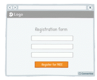
A/B Testing Idea #254 - Add the word "Free" directly to your Call-To-Action
It has been proven that spending money actually activates the areas in our brain that are associated with physical pain and feelings of disgust. On the contrary, the term "free" causes us a …
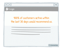
A/B Testing Idea #255 - Utilize numerical values to convey more persuasive messages
Most people have a strong tendency to ignore generic and basic information and prefer to focus on recent or specific information. Therefore, in your content and titles, insist on statistics or specific…
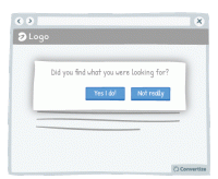
A/B Testing Idea #256 - Engage your users with a simple task or question
Place your customers in a positive frame of mind by giving them a small "victory". Indeed, ask your client to perform a simple task before you can ask then for something longer and more complicated…
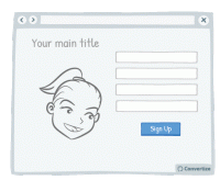
A/B Testing Idea #257 - Avoid facial distraction by using face images to direct attention to the call-to-action
Beware of images! On the one hand, it's true that a user retains what is contained in an image more than in text. But be careful - if you use an image of a face that is looking directly at the user…
A/B Testing Idea #259 - Prioritise active over passive voice
Make simple, concise sentences in the active voice to simplify the understanding and impact of your message. A grammatically complex sentence will not have the same immediate effect on the mind of your…
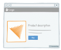
A/B Testing Idea #260 - Prioritise pictures, visual elements over lone text
“A picture paints a thousand words”. Indeed, the human brain learns and retains information much better when it comes in the form of images rather than words. Images do not require translation…
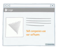
A/B Testing Idea #261 - Instead of trying too hard to sell, be more specific in your sales argument
Arguments or tag-lines that are too fluffy and reminiscent of an unfounded sales pitch - such as "our customers love us" or "our software is very reliable" - can be effective in the…
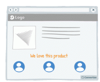
A/B Testing Idea #262 - Prioritise 1st person pronouns
The power of "we" or "our" is not to be underestimated. We are social and group-dwelling beings, people, and we feel most comfortable and positive when we are included as part of a…
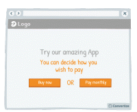
A/B Testing Idea #263 - Do not offer customers only one possibility.
A unique and effective tool of persuasion can in fact be to remind your customers that they have the freedom to choose what to do. Incorporating wording in your copy that emphasises to your customers …
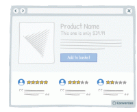
A/B Testing Idea #264 - Do not shy away from mentioning some fall backs
On most websites, negative reviews or drawbacks are invisible while on others (e.g. Amazon), those are clearly displayed alongside the pros. Believe it or not, but hiding your drawbacks is not the solution…
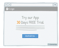
A/B Testing Idea #265 - Utilize numbers in your header
It has been shown that a title containing numbers attract our look more often and therefore would increase the conversion rate. These figures don't need to be very sophisticated. "30-day free…

A/B Testing Idea #267 - Display pictures of your team members to enhance their trustworthiness
Obviously you want your site to look professional, but using photos taken from a database showing suited and booted workers with sparkling white smiles will ring as untrue to most customers. Instead, …
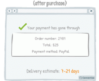
A/B Testing Idea #270 - Accurately indicate delivery time frames, including restrictions
To display delivery time in weeks or in days? That is the question... The answer is actually pretty simple. During the purchase process the customer will focus on the numbers themselves and they will …
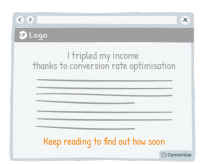
A/B Testing Idea #271 - Clarify any intrigue created to bring the customer to your website
Humans tend to desire closure and don't like to be kept in the dark. This is why it can be very effective to engage your customer through first presenting an intriguing statement, and immediately …
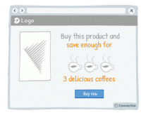
A/B Testing Idea #273 - Contextualise savings with real-life applications
The way you frame a saving can greatly influence the effect it will have on your customers. Imagine a bank, for instance, which announces on its landing page: "With us, you don't pay bank charges…
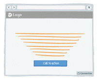
A/B Testing Idea #274 - Display text in such a manner that it focuses the attention to the Call-to-action
Our brains form the majority of the images we “see” and like to be given direction about what to focus on so using visual cues help to draw attention towards certain elements. Lead your visitor…
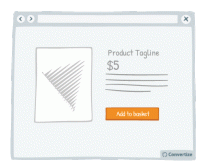
A/B Testing Idea #277 - Avoid showing your Call-to-action more than once on the same page
Don't be tempted to display the same information twice in two different locations on your page (if it is a one-screen page that doesn't require any scrolling) because this will make it too busy…
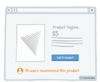
A/B Testing Idea #278 - Emphasise your users, rather than yourself, who have used and endorsed your products
Studies have shown that individuals tend to follow others' choices or behaviour when trying to make decisions. We automatically presume that if lots of our peers are doing something or buying a particular…
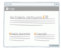
A/B Testing Idea #281 - Be careful when using special characters, faults could decrease your credibility
When you create a web page, be careful that you don't have any accidental character faults due to coding problems or lack of care. The kind of symbols that are often seen on web pages, such as ▢ &…
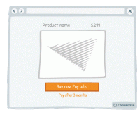
A/B Testing Idea #285 - Offer the possibility to postpone payment
Offering the possibility to postpone payment of a purchase will make the price of the item become less relevant to the buyer. Instead of thinking about the price, they will be thinking about the fact …
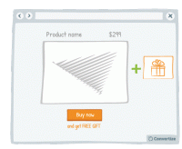
A/B Testing Idea #286 - Hand out free gifts with products bought
The promise of a free gift is a strong incentive to get people to buy. Studies have shown that people are likely to feel compelled to give something back when they receive something for free (it's…
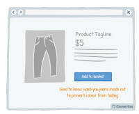
A/B Testing Idea #287 - Do not shy away from sharing crucial information for no compensation
It is proven that we are more likely to give something to someone if they have given something to us already - the desire to reciprocate such behaviour is strong and can certainly lead to action and conversion…
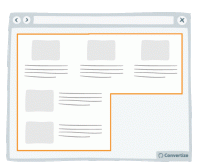
A/B Testing Idea #289 - Condense your content to avoid losing the attention of your user
Make your blocks of content compact. That is to say, you should avoid trapping negative (i.e. useless, empty) space within your layout. For example, in the left-hand image above, you can see that there…
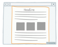
A/B Testing Idea #290 - Whenever possible, prioritise single and vertical columns
Using a two-column layout on your site could disturb the fluency with which the reader absorbs your content as you are splitting their attention between two areas. Rather than leading your visitor'…
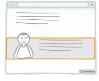
A/B Testing Idea #291 - Nudge users to read your page by slightly overlapping design elements and images
If you completely separate the design of each content block then you won't give your visitor the encouragement they need to continue on reading down. Rather, after reading only the first block they…
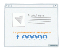
A/B Testing Idea #296 - If connected via Facebook, indicate how many friends have purchased or signed up
If you offer your customers the option to sign in using Facebook then make the most of this advantage. Indeed, using Facebook is a good way to quickly access data about a customer but that's not the…
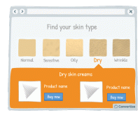
A/B Testing Idea #297 - Allow users to identify themselves with a certain category of people, and then show them content based on their choice
Allow users to identify themselves with a certain category of people and then submit introduce the products that match with their needs can have several advantages. First, your customer feels included…
A/B Testing Idea #298 - Display your call-to-action as a visual animation
Introducing a Call-To-Action (CTA) using a floating animation that appears after a few moments could help increase conversions. Drawing attention to the Call-To-Action is essential for getting people …
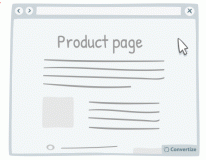
A/B Testing Idea #299 - Make your call-to-action dynamic and delay it
Delaying your call-to-action can have its advantages. It allows the customer to absorb all the content on your page without any distraction and then will more strongly draw their eye due to its sudden…
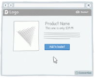
A/B Testing Idea #301 - Limit human error by disabling or replacing your call-to-action after users select it
Once your customer clicks on a Call-to-Action, disable or remove it to indicate that they have already clicked once and the action has been performed. This will prevent your customer from being tempted…
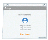
A/B Testing Idea #306 - Visually distinguish between important functions using colour, size and space
To avoid grave slip-ups, make sure that important functions are highlighted by separating them and using a different colour. This will ensure that the user's attention is drawn to it and they won&#…
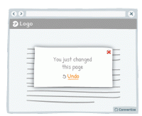
A/B Testing Idea #308 - After small changes, allow users to undo the move rather than to continuously confirm
Rather than asking your customers to confirm changes they make by clicking on "yes" or "no", offer them the possibility to undo what they've already done. Although slight, the …
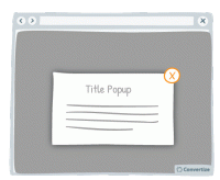
A/B Testing Idea #310 - Offer a clear and simple manner to close pop-up windows
Ensure you give your customer the power to close any pop-ups or other boxes on your site. Showing an immediately recognisable cross in the top-right of all boxes will allow customers to easily close them…
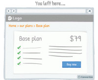
A/B Testing Idea #311 - After users leave a page, return them to where they left off
Sending the user directly back to the page or position in a sequence where they left off will help to minimise the negative effects of leaving a site or page. By sending them straight back to where they…
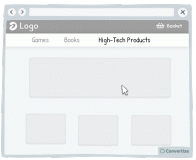
A/B Testing Idea #312 - Make sure you facilitate the user experience of drop-down menus and pop-up windows
Your users aren't perfect, they will regularly make mistakes with the cursor (as do we all!). For this reason, you need to create interfaces that are flexible and forgiving. Visitors are often confronted…
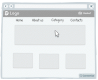
A/B Testing Idea #313 - Add hyperlinks for main menus, and any relevant categories
Users are not perfect, they make mistakes regularly. Indeed, it is common to see people click on areas that are not clickable. Do not try to fight against those mistakes, instead, add clickable functionality…
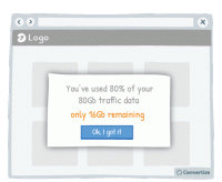
A/B Testing Idea #318 - Simplify your customer's thinking process by doing any calculations for them
People strongly prefer and feel more positive about things that are easy and quick for us to understand. If you want your customer to respond well to information you provide and to feel happy using your…
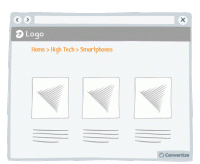
A/B Testing Idea #319 - Display navigation categories (breadcrumbs) to indicate the location of the user on your website
To help your visitor feel at ease with the logic and layout of your site, clearly display a breadcrumb trail (or other sequence map) so they can quickly see where they are on your site and how they arrived…
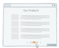
A/B Testing Idea #321 - Use page numbers or ‘Load More’ options rather than infinite scrolling
On eCommerce product pages, it is essential that you choose the right way to display your products to provide your customers with the most effective base to start making choices. People tend to become…
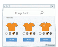
A/B Testing Idea #323 - When a customer selects a filter, ensure that it is automatically applied to the rest of your products
Often a customer types the colour of the desired product in the search bar. But often when typing, say, "red sofa", the search results will be all sofas, red or not red. To avoid discouraging…
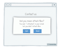
A/B Testing Idea #324 - Utilize written content which slightly contradicts what the user wants to do
The more confident you user feels in navigating your website and completing tasks, the better experience they will have and the more likely they will be to convert. Report potential errors to your customers…
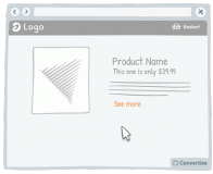
A/B Testing Idea #325 - Increase the clickable zone of your call-to-action if it is small
If your website contains small Call-to-Actions like the "see more" in the drawing above, add a transparent border around it in order to expand the clickable area. Users will not necessarily …
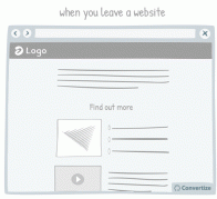
A/B Testing Idea #327 - Avoid showing pop-up windows at the wrong time
Do not set up your pop-ups or overlays to trigger at the wrong times. Having a pop-up triggered as soon as you load a website can be extremely irritating to a user. Some will simply close the website …
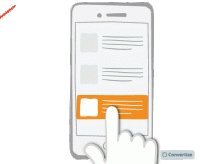
A/B Testing Idea #329 - On mobile devices, ensure that you have easily clickable areas
On smaller screens, such as on mobile or tablet, it is common for users to experience frustration and unease when trying to click options as the hit areas can be too imprecise. When we are using our fingers…

Oops, you have reached your limit of 1 free tactic per hour
To get unlimited access to our 250+ tactics,
Join our FREE mailing list
Or wait 00:59:59


