Home
78 Best Intermediate A/B Testing Ideas
This is the ultimate library of the Best A/B Testing Ideas: We have compiled 250 A/B Testing Ideas that you can try on your website to optimize your conversion rates and increase your revenues.
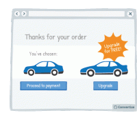
A/B Testing Idea #1 - Offer a free upgrade
Providing a free upgrade is a strategy based on the "give and take" idea: you provide your client with something of value (a free upgrade) so that they are more likely to give something in return…
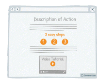
A/B Testing Idea #4 - To demonstrate how easy your site is to use, offer 'how-to' pages and prioritise video format
If you show your visitors how easy it is for them to act (i.e. to complete an action on your website, or to utilise one of your products, or services) by providing "how-to" pages and videos…
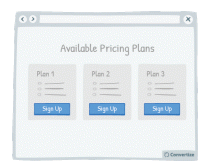
A/B Testing Idea #5 - Reduce the number of pricing plans available to no more than 3
Offering a maximum of 3 pricing plans will help your visitors to make better decisions and feel less overwhelmed. Research shows that information overload results in less effective and satisfying decisions…
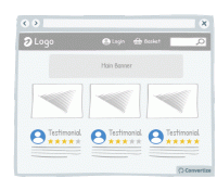
A/B Testing Idea #10 - Include testimonials (with name, logo and face) on your home page
If you have positive reviews about your products or services then display them on your homepage. Having this "social proof" as one of the first things visitors will see is a proven and&…
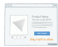
A/B Testing Idea #12 - Display low stock availability
Displaying the number of items left in stock will motivate people to make their purchase more quickly in order to avoid missing out. The more difficult or urgent it is to acquire an item, or the more…
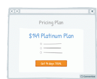
A/B Testing Idea #13 - Offer free trials
Offering a free trial enables potential customers to experience the benefits of your product or service without making them commit. This cuts out the negative feelings associated with making a payment…
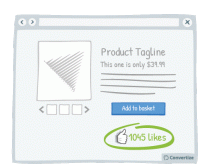
A/B Testing Idea #14 - Display the number of "likes" next to your product
Displaying the number of people who have already "liked" your product is an effective persuasion tool. Research has shown that we have a strong tendency to copy others' choices and behaviour…
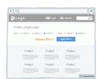
A/B Testing Idea #18 - Reduce the number of default filter options
Offering fewer default filter options on your homepage will help your visitors to make better decisions and feel less overwhelmed. Research shows that information overload results in less effective…
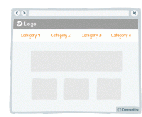
A/B Testing Idea #19 - Reduce the number of categories and menu options displayed
Offering fewer categories and/or menu options will help your visitors make better decisions and feel less overwhelmed. Research shows that information overload results in less effective and satisfying…
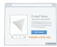
A/B Testing Idea #21 - Offer online-only products and display "Available online only"
By offering online-only products, people will be more encouraged to make purchases as the products will seem to be more scarce in comparison to those products that can also be bought in store. The idea…
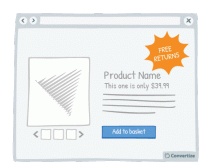
A/B Testing Idea #22 - Offer free returns
By offering free returns, your customers will be less likely to feel the "pain of buying" as acutely as they know that they have the option of returning the item if it is not what they …
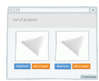
A/B Testing Idea #25 - Allow the option to 'add to basket" in 1-click
Offering a 1-click "add to basket" option speeds up the paying process, which will help customers to avoid the negative feelings associated with spending money. Indeed, research has shown…
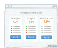
A/B Testing Idea #26 - Use a higher pricing plan as a decoy
Displaying a new pricing plan that is much higher than the others currently offered could be an efficient decoy, worth testing on your site. Offering a pricing plan that is significantly higher…
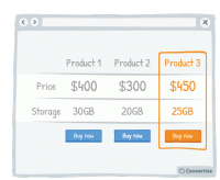
A/B Testing Idea #27 - Create a decoy-effect by displaying an extra product
Displaying a decoy product at a higher price will change people's perception of the perceived value of your other products on offer. Offering three options instead of two, with the highest price…
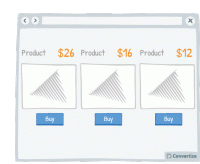
A/B Testing Idea #34 - Display a higher price first
People often use an initial piece of information to make subsequent judgements so if you display a higher price first, it will be the first one your customers read and they will use it as an anchor to…
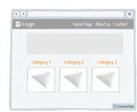
A/B Testing Idea #37 - Remove the Category drop-down menu from your homepage
The category bars and their drop-down menus are standard on most websites, but it's not always the best way to present the product category. These drop-down menus often offer a poor user experience…
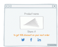
A/B Testing Idea #49 - Provide an incentive to share on social media
Offering an incentive to your visitors to share your content or their purchases on social media will obviously increase the chances of encouraging them to do so. This incentive could be anything from…
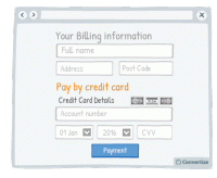
A/B Testing Idea #51 - When taking billing information ask for credit card details last
Only ask your customers for their card details once all other information has been given (name, email, delivery info, etc.) as it is better to start by asking them for easier, less disagreeable information…
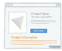
A/B Testing Idea #59 - Display all product information
Your customers will feel like the more information they are given in order to make a decision, then the better that decision will be. So the more information you can give them about the product (in…
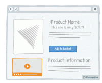
A/B Testing Idea #64 - In your product pages, include a video
Providing a video of the product will allow your visitors to see more precisely how it looks and functions, the same way they might when buying in store. Customers prefer to have as much information…
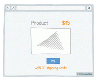
A/B Testing Idea #67 - Separate delivery and handling costs from the main product price
Separating the product price from other surcharges - such as delivery costs or handling fees - will help to give the impression of a lower overall price. The first price seen will act as an anchor …
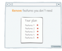
A/B Testing Idea #70 - Offer the possibility to remove rather than to add elements when users make their own personalised plan
If you are offering your customers the chance to create their own custom plan then it is better to offer by default the plan including all available features. Firstly, studies have shown that we are…
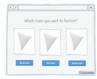
A/B Testing Idea #71 - Simplify and restrict options available to customers to choose from
People will often not chose a product if they are presented with a wide range of products to choose from. There is a risk of them being overwhelmed and thus not choosing anything. In order to avoid this…
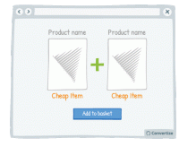
A/B Testing Idea #79 - High-end products should not be bundled with low-end ones
The price of a product is not only based on its value itself but on the perception that users have of it. When you sell products together, by making a bundled offer for example, do not mix…
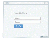
A/B Testing Idea #85 - Decrease the number of fields necessary to complete a form
Don't ask your customers for too much information in your initial sign up form. This is likely to put them off as they won't want to spend the time or the mental energy on filling out multiple…
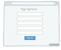
A/B Testing Idea #86 - Prioritise, whenever possible, single-column forms
People like to process things quickly and easily, and will be put off by anything that complicates this cognitive fluency. Using single column forms not only makes them look cleaner and easier to navigate…
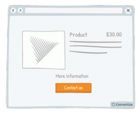
A/B Testing Idea #90 - Combine functions which are similar
People respond best to clear, direct and easy-to-understand information and are easily distracted or put off by extraneous information or demands on their attention. To avoid this, make sure you streamline…
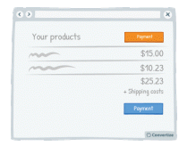
A/B Testing Idea #92 - Indicate your primary Call-to-action twice or more
It is almost always better to display your Call-to-Action (CTA) as a button rather than a simple link as it will both attract your user's attention and make it clear that it is a CTA ready to be clicked…
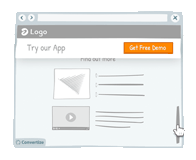
A/B Testing Idea #93 - As a user visits your website, alter the Call-to-actions
In order to draw attention to your Call-to-Action, try setting it to alter whilst your visitor is on the page. We are naturally drawn to those things which stand out from their environment and something…
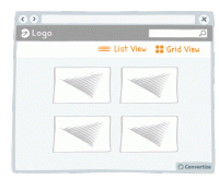
A/B Testing Idea #105 - Visually display in a list format rather than a grid
Simply changing the way in which your products are displayed can make a significant difference to how comfortable your users feel interacting with your site. If you have good quality images, using a grid…
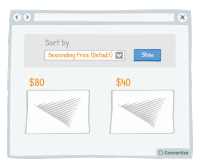
A/B Testing Idea #112 - Use "Descending Price" as your default sorting option
People often use an initial piece of information to make subsequent judgements so if you have "Descending Price" as your default sorting option, people will see your highest priced items first…

A/B Testing Idea #116 - When price is below 100 ($,£,€) show discounts in percentage form rather than in absolute value
By displaying discounts in percentage rather than in value when product price is below 100 (£/$/€), you make your promotions seem as attractive as possible by altering the way you frame…
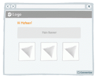
A/B Testing Idea #125 - Utilize your customer's details to customize your content offering
Your customer will feel more involved in and connected with your content if you make use of their name to give it a personalised touch. A natural tendency we experience is "implicit egotism"…

A/B Testing Idea #127 - Frame intangible concepts with iconic phrasing to make them more tangible
Metaphorical language is a compelling form of communication that can allow you, in certain cases, to better convey your message. It can help to better attract your customer's attention and allow them…
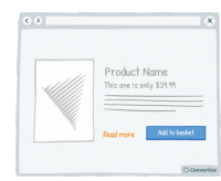
A/B Testing Idea #133 - Provide a "more info" button for every product
Your customers will feel like the more information they are given in order to make a decision, then the better that decision will be. So the more information you can give them about the product (in…
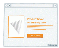
A/B Testing Idea #134 - Place graphs, visuals and pictures on the left-and side of the screen
Visual elements positioned on the left are processed by the right hemisphere of the brain, which is better suited for image processing. Therefore, people will "digest" the page more quickly …
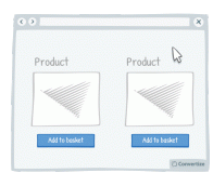
A/B Testing Idea #143 - Alter the aesthetics of your Call-to-action when your user hoover over it
Simply making it so that your Call-to-Action button alters in some way when the cursor hovers over it will clearly distinguish it as a button that is there to be clicked on. A visual effect to indicate…
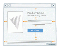
A/B Testing Idea #147 - Add more white space in your pages
A lot of websites consider white space to be lost space but they couldn't be more wrong! Increasing the amount of white space makes for a much clearer page and therefore a more pleasing visual experience…
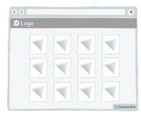
A/B Testing Idea #154 - Be consistent with your product images throughout your site
It's common knowledge that users lack patience when surfing the web. When they are on an eCommerce website they want to be able to see products quickly and easily. A good way of doing this is to…
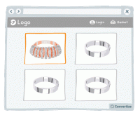
A/B Testing Idea #159 - Prioritise your most luxurious products
If you display your most beautiful and luxurious product first, your visitors will use it as a point of reference to evaluate the following products. This first element will stay anchored in their minds…
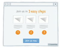
A/B Testing Idea #163 - Use pictograms to help visitors visualise the simplicity of a process or task
The more your visitor is convinced of the simplicity of an action on your site (for example your purchase or registration process), the more motivated they will be to complete it. Using simple, clear …
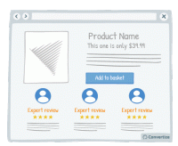
A/B Testing Idea #168 - Display on specialised and expert reviews for your products' endorsements
Displaying expert reviews or testimonials is an effective way of endorsing your products. The positive feedback and opinions of customer's peers is incredibly important as we often rely on this "…
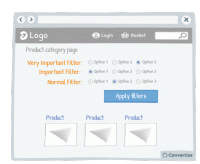
A/B Testing Idea #170 - Prioritise your most crucial filters
Re-ordering the filter options and putting the most relevant and important filters first will make for an easier and more pleasurable site experience for your visitors. Research has shown that people…

A/B Testing Idea #174 - Display specific Unique Selling Propositions (USPs) based on your target customer
Studies have shown that most people associate positively with themselves and things that are either connected to them or that they can identify with. This is why it is so important to ensure that you…
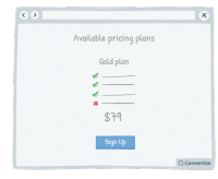
A/B Testing Idea #175 - Delete up to 10% of features but maintain previous, identical pricing
People are unlikely to notice changes as long as these are kept below 10% so you are able to reduce the content and features offered in your pricing plans by 5 to 10% without many visitors noticing that…
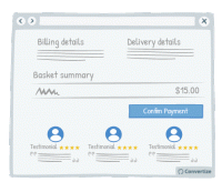
A/B Testing Idea #177 - In the check-out page, indicate testimonials from customers who also bought the same product below the call-to-action
By placing testimonials from other customers who have previously bought your product or service just before the final stage of payment, you are offering reassurance to your customers by showing them how…
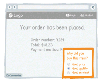
A/B Testing Idea #182 - Follow up with a post-purchase question asking them what led to their decision
Asking your customers why they bought your product is a good way of making them think about those reasons and this in turn will reassure them of the purchase they have just made. The happier you can help…

A/B Testing Idea #184 - Ask your customer to share feedback
If you want to build up your social media community and generate organic publicity then asking customers to share feedback on products they've purchased from you can be very effective. Once we&#…
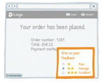
A/B Testing Idea #185 - Use exit surveys to get feedback and boost your likability
It's proven that people enjoy giving their opinion and to be asked for feedback. What's more if you ask for this using simply a short, easy-to-complete survey then you really increase your chances…

A/B Testing Idea #186 - Frame your products in the best light possible: "number 1", "best selling", "fastest growing"
Studies have shown that individuals tend to follow others' choices or behaviour when trying to make decisions. We automatically presume that if lots of our peers are doing something or buying a…
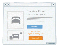
A/B Testing Idea #188 - Upsell by highlighting how small the extra cost would be
Upselling is a technique whereby you offer your client a superior and more expensive product than the one he was considering. By highlighting how small the price difference is between the two products…

A/B Testing Idea #192 - Display contextual details (such as location) to allow users to identify with the reviewer
Featured testimonials will be more credible if your users can identify with the reviewers and view them as real people rather than just disconnected words on the screen. Contextual details like location…

A/B Testing Idea #195 - Add “as featured in” or “recommended by” content
Lending authority to your marketing can be really effective. Certainly in today's society, people are so bombarded with marketing messages that they don't necessarily place a lot of trust in what…
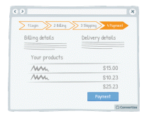
A/B Testing Idea #198 - Show a progress bar
Displaying a progress bar is a great visual way to help users follow their progress in the purchase process and will not only stimulate their desire to continue to the end of the process but also gives…

A/B Testing Idea #201 - Offer promotions in a format of a range, e.g. 15% to 60% discounts
Studies have shown that a variable rewards system can be very effective as a motivational tool. The "task" in question becomes altogether more exciting and interesting when there is a variable…
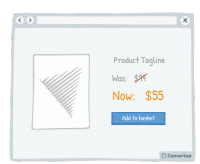
A/B Testing Idea #214 - When displaying promotions, exhibit the previous prices, to accentuate them
When offering discounted prices, it is essential to always still display the previous higher prices as well (crossed out is advisable to avoid confusion). Studies have shown that people tend to use…
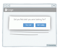
A/B Testing Idea #256 - Engage your users with a simple task or question
Place your customers in a positive frame of mind by giving them a small "victory". Indeed, ask your client to perform a simple task before you can ask then for something longer and more complicated…
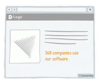
A/B Testing Idea #261 - Instead of trying too hard to sell, be more specific in your sales argument
Arguments or tag-lines that are too fluffy and reminiscent of an unfounded sales pitch - such as "our customers love us" or "our software is very reliable" - can be effective in the…
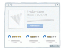
A/B Testing Idea #264 - Do not shy away from mentioning some fall backs
On most websites, negative reviews or drawbacks are invisible while on others (e.g. Amazon), those are clearly displayed alongside the pros. Believe it or not, but hiding your drawbacks is not the solution…
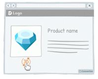
A/B Testing Idea #268 - Use interactive images rather than static ones
Research has shown that consumers are generally more drawn to interactive images than static ones. The interactive images provide a "fun" aspect to the user experience thanks, for example, to…
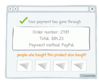
A/B Testing Idea #269 - To create a double funnel within the check-out, show a section which indicates: "people who bought this, also bought: ..."
On the confirmation page after purchase, display "people who bought this product also bought ..." to create a double funnel. This will encourage your customers to make a second purchase after…
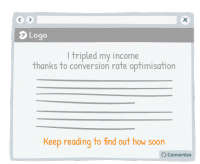
A/B Testing Idea #271 - Clarify any intrigue created to bring the customer to your website
Humans tend to desire closure and don't like to be kept in the dark. This is why it can be very effective to engage your customer through first presenting an intriguing statement, and immediately …
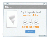
A/B Testing Idea #273 - Contextualise savings with real-life applications
The way you frame a saving can greatly influence the effect it will have on your customers. Imagine a bank, for instance, which announces on its landing page: "With us, you don't pay bank charges…
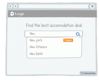
A/B Testing Idea #276 - Bring attention to a popular product to facilitate the visitor to make a decision
Studies have shown that individuals tend to follow others' choices or behaviour when trying to make decisions. We automatically presume that if lots of our peers are doing something or buying a particular…
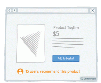
A/B Testing Idea #278 - Emphasise your users, rather than yourself, who have used and endorsed your products
Studies have shown that individuals tend to follow others' choices or behaviour when trying to make decisions. We automatically presume that if lots of our peers are doing something or buying a particular…
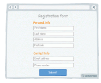
A/B Testing Idea #280 - Separate your form into smaller sections
When you want someone to complete a form, it is best not to discourage them by presenting that form in one large block that will immediately seem dense, unclear and long. By separating your form into …
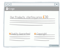
A/B Testing Idea #281 - Be careful when using special characters, faults could decrease your credibility
When you create a web page, be careful that you don't have any accidental character faults due to coding problems or lack of care. The kind of symbols that are often seen on web pages, such as ▢ &…
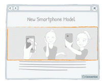
A/B Testing Idea #284 - Include more than one individual, or more than one product within your visual marketing material
People are more inclined to want to buy a product when it is shown in a way which helps them to visualise themselves using it. Therefore, to reduce the mental effort required on the part of your customer…
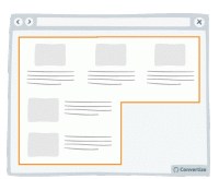
A/B Testing Idea #289 - Condense your content to avoid losing the attention of your user
Make your blocks of content compact. That is to say, you should avoid trapping negative (i.e. useless, empty) space within your layout. For example, in the left-hand image above, you can see that there…
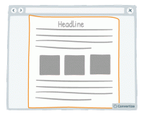
A/B Testing Idea #290 - Whenever possible, prioritise single and vertical columns
Using a two-column layout on your site could disturb the fluency with which the reader absorbs your content as you are splitting their attention between two areas. Rather than leading your visitor'…
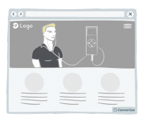
A/B Testing Idea #295 - Prioritise uncommon landing pages
We tend to better remember the things that affects us directly. Thus the fact of creating a landing page that emotionally affects your customers or create an original landing page is a good way to stay…
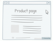
A/B Testing Idea #299 - Make your call-to-action dynamic and delay it
Delaying your call-to-action can have its advantages. It allows the customer to absorb all the content on your page without any distraction and then will more strongly draw their eye due to its sudden…
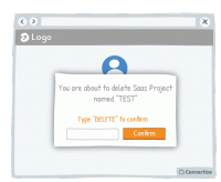
A/B Testing Idea #307 - Add conditions before letting users enact irreversible changes, such as deleting their account
For instance, do not allow your customers to accidentally delete their project on your SaaS platform. Indeed, it is happening often that a person unintentionally deletes his work. Prevent this by asking…
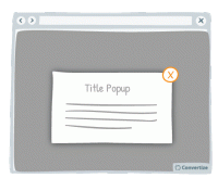
A/B Testing Idea #310 - Offer a clear and simple manner to close pop-up windows
Ensure you give your customer the power to close any pop-ups or other boxes on your site. Showing an immediately recognisable cross in the top-right of all boxes will allow customers to easily close them…
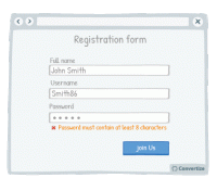
A/B Testing Idea #314 - When displaying error messages, include relevant indicators
When displaying error messages, make sure that you clearly explain the reason for the error. If your user is getting error messages without anything to tell them why it can't be validated and how …
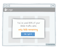
A/B Testing Idea #318 - Simplify your customer's thinking process by doing any calculations for them
People strongly prefer and feel more positive about things that are easy and quick for us to understand. If you want your customer to respond well to information you provide and to feel happy using your…
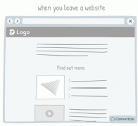
A/B Testing Idea #327 - Avoid showing pop-up windows at the wrong time
Do not set up your pop-ups or overlays to trigger at the wrong times. Having a pop-up triggered as soon as you load a website can be extremely irritating to a user. Some will simply close the website …
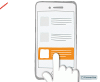
A/B Testing Idea #329 - On mobile devices, ensure that you have easily clickable areas
On smaller screens, such as on mobile or tablet, it is common for users to experience frustration and unease when trying to click options as the hit areas can be too imprecise. When we are using our fingers…

Oops, you have reached your limit of 1 free tactic per hour
To get unlimited access to our 250+ tactics,
Join our FREE mailing list
Or wait 00:59:59


