Home
A/B Testing Idea #198 - Show a progress bar

Description
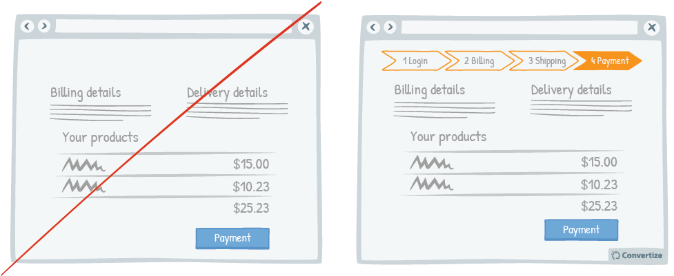
Displaying a progress bar is a great visual way to help users follow their progress in the purchase process and will not only stimulate their desire to continue to the end of the process but also gives an important sense of closure once it is completed.
People will become more invested and interested in a task if they can see clearly the steps they need to take before it is finished and they will stay focused on your progress bar as encouragement for completing their order. Having this sense of direction helps to assist easy cognitive functioning and also the visual closure at the end is proven to help customers feel more satisfied with the purchase they've made.
Inspired by Nick Kolenda
Principles
- Choice Closure (Gu; Botti & Faro, 2013; Johnson, 2007)
- Zeigarnik Effect (Zeigarnik, 1920)
The Research
Choice Closure
Choice Closure is a concept that describes how being able to complete a physical act of closure after making a choice helps the decision-maker to be much more satisfied with their choice.
Zeigarnik Effect
Incomplete tasks stick in your mind more than ones you have completed.

Oops, you have reached your limit of 1 free tactic per hour
To get unlimited access to our 250+ tactics,
Join our FREE mailing list
Or wait 00:59:59


