Home
17 A/B Testing Ideas Used By Urban Outfitters
This is the ultimate library of the Best A/B Testing Ideas: We have compiled 250 A/B Testing Ideas that you can try on your website to optimize your conversion rates and increase your revenues.
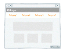
A/B Testing Idea #19 - Reduce the number of categories and menu options displayed
Offering fewer categories and/or menu options will help your visitors make better decisions and feel less overwhelmed. Research shows that information overload results in less effective and satisfying…
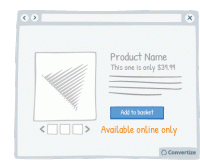
A/B Testing Idea #21 - Offer online-only products and display "Available online only"
By offering online-only products, people will be more encouraged to make purchases as the products will seem to be more scarce in comparison to those products that can also be bought in store. The idea…
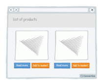
A/B Testing Idea #25 - Allow the option to 'add to basket" in 1-click
Offering a 1-click "add to basket" option speeds up the paying process, which will help customers to avoid the negative feelings associated with spending money. Indeed, research has shown…
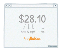
A/B Testing Idea #29 - Select a price which has the smallest amount of letters possible
Choosing a price with fewer syllables removes a little of the cognitive strain from your customer and things which are quicker and easier to understand are instantly more familiar. The clearer you can…
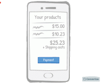
A/B Testing Idea #30 - Make your checkout page responsive for mobile devices
A mobile-friendly checkout page is essential to ensure that people follow through with their purchase. A checkout page that is mobile responsive will not only be more aesthetically pleasing but will be…
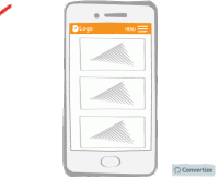
A/B Testing Idea #32 - Make your menu responsive (mobile-friendly)
A mobile-friendly menu is essential to ensure that you don't miss out on customers using mobile devices. Having a menu that is mobile responsive will not only be more aesthetically pleasing but will…
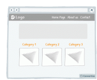
A/B Testing Idea #37 - Remove the Category drop-down menu from your homepage
The category bars and their drop-down menus are standard on most websites, but it's not always the best way to present the product category. These drop-down menus often offer a poor user experience…
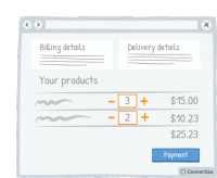
A/B Testing Idea #41 - Allow customers to update their basket
Allowing customers to clearly update the items that they have in their basket is important as it allows them the opportunity to review their purchases prior to making a final decision, the same way they…
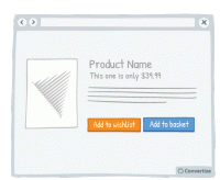
A/B Testing Idea #43 - Let a user save an item for later (wishlist)
Your customers will appreciate having the choice between buying the product immediately or saving it for another time. People like to feel as though they are in control of their shopping experience…
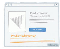
A/B Testing Idea #59 - Display all product information
Your customers will feel like the more information they are given in order to make a decision, then the better that decision will be. So the more information you can give them about the product (in…
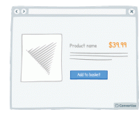
A/B Testing Idea #76 - Utilize smaller font sizes to indicate price to pay
Using a smaller font size for your pricing is doubly effective. Firstly, it of course makes the price more subtle and so doesn't automatically draw people's attention towards the fact of paying…
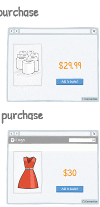
A/B Testing Idea #104 - Emotion and rational purchasing decisions: implications for rounding prices
Our brains process prices differently depending on whether a purchase is guided by rationality (for example for non-luxury, necessary goods) or by emotions (those products which we buy to make us happy…
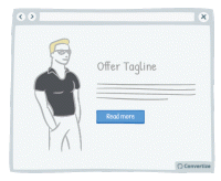
A/B Testing Idea #136 - When appropriate, employ charismatic models
Using attractive models on your site can be very effective in the right context. Studies have shown that using a model to market a product increases its credibility, how much attention people pay to…
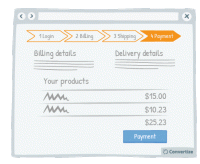
A/B Testing Idea #198 - Show a progress bar
Displaying a progress bar is a great visual way to help users follow their progress in the purchase process and will not only stimulate their desire to continue to the end of the process but also gives…

A/B Testing Idea #201 - Offer promotions in a format of a range, e.g. 15% to 60% discounts
Studies have shown that a variable rewards system can be very effective as a motivational tool. The "task" in question becomes altogether more exciting and interesting when there is a variable…
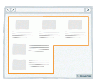
A/B Testing Idea #289 - Condense your content to avoid losing the attention of your user
Make your blocks of content compact. That is to say, you should avoid trapping negative (i.e. useless, empty) space within your layout. For example, in the left-hand image above, you can see that there…
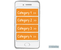
A/B Testing Idea #326 - Make your menus responsive for mobile
It is important these days to ensure your website is mobile responsive. When designing the interface for this though, it is advisable to use one-window drilldowns. That is to say, present each section…

Oops, you have reached your limit of 1 free tactic per hour
To get unlimited access to our 250+ tactics,
Join our FREE mailing list
Or wait 00:59:59


