Home
A/B Testing Idea #289 - Condense your content to avoid losing the attention of your user

Description
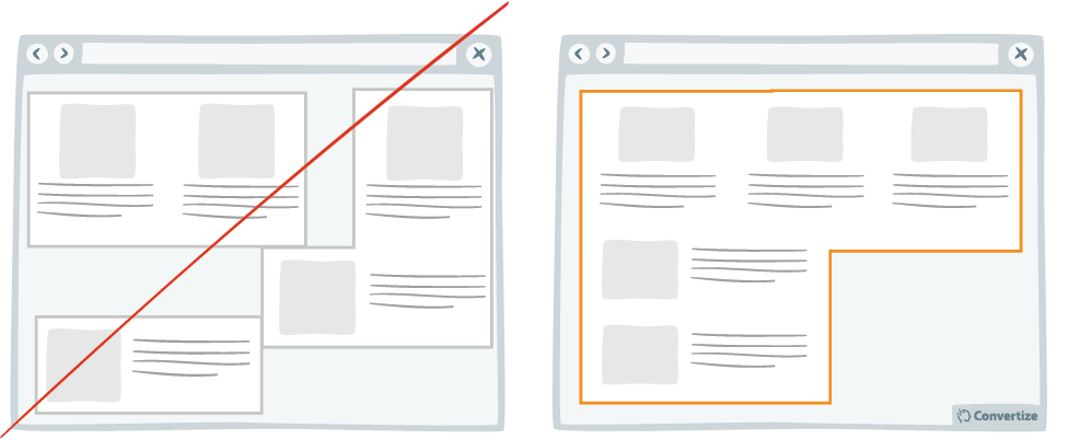
Make your blocks of content compact. That is to say, you should avoid trapping negative (i.e. useless, empty) space within your layout. For example, in the left-hand image above, you can see that there are lots of empty spaces between the blocks of content that serve no purpose and causes the layout to lack hierarchy and organisation. In the right-hand image, the content is clearly laid out, which will make it easier to process and more appealing for the visitor to read. The easier and more pleasant you can make it for visitors to process your information, the more likely they are to stick on the page and ultimately convert.
Inspired by Nick Kolenda
Principles
- Processing Efficacy (Jacoby & Dallas, 1981)
The Research
Processing Efficacy
We tend to prefer things that are simple for us to understand or use.

Oops, you have reached your limit of 1 free tactic per hour
To get unlimited access to our 250+ tactics,
Join our FREE mailing list
Or wait 00:59:59


