Home
24 Best Low A/B Testing Ideas
This is the ultimate library of the Best A/B Testing Ideas: We have compiled 250 A/B Testing Ideas that you can try on your website to optimize your conversion rates and increase your revenues.
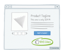
A/B Testing Idea #14 - Display the number of "likes" next to your product
Displaying the number of people who have already "liked" your product is an effective persuasion tool. Research has shown that we have a strong tendency to copy others' choices and behaviour…
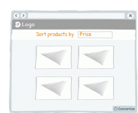
A/B Testing Idea #16 - Enable the possibility to filter options
Adding a sorting option will allow visitors to see the products that interest them without having to spend too much time and effort working out differences in features and costs. The easier and 'smoother…
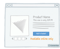
A/B Testing Idea #21 - Offer online-only products and display "Available online only"
By offering online-only products, people will be more encouraged to make purchases as the products will seem to be more scarce in comparison to those products that can also be bought in store. The idea…
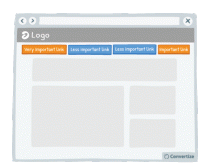
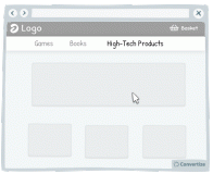
A/B Testing Idea #28 - Restructure your navigation menu
Re-ordering your navigation menu by putting the most important links at the beginning and the end of your menu will help to ensure visitors notice and click on them. Research has shown that people recall…
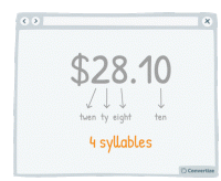
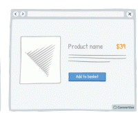
A/B Testing Idea #29 - Select a price which has the smallest amount of letters possible
Choosing a price with fewer syllables removes a little of the cognitive strain from your customer and things which are quicker and easier to understand are instantly more familiar. The clearer you can…
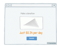
A/B Testing Idea #33 - Display the daily or monthly price to make the amount seem smaller
By showing the price per day or month rather than the total price, it can often seem like less. Your customer will tend to use this smaller amount as an anchor to decide whether the purchase is good…
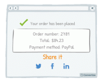
A/B Testing Idea #55 - Display social sharing buttons after customers have finalised their purchase
It's important not to miss an opportunity to offer your clients the chance to share your content or their actions on your site on social media as this can greatly boost awareness and popularity. …
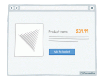
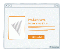
A/B Testing Idea #65 - Reduce the left digit by one and minimise the digits after the decimal
Reducing your price by one cent or penny can make all the difference when it results in the left digit going down by one. Whereas $3.89 to $3.87 wouldn't be of any consequence $4.00 to $3.99 definitely…
A/B Testing Idea #75 - Place your price at the bottom left corner of the screen
It has been proven that our perception of the value of a price can be influenced by the way it is visually presented to us. People tend to think of numbers on an imaginary horizontal line, with numbers…
A/B Testing Idea #76 - Utilize smaller font sizes to indicate price to pay
Using a smaller font size for your pricing is doubly effective. Firstly, it of course makes the price more subtle and so doesn't automatically draw people's attention towards the fact of paying…
A/B Testing Idea #77 - When possible, get rid of the decimal point in the price tag
Whenever possible, remove the decimal point from your pricing as it is not necessary and adds a little extra cognitive strain for your customer. The clearer you can make things the better as people want…
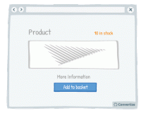
A/B Testing Idea #91 - Use a smaller font when displaying large quantities of stock (more than 5)
When you have more than 5 in stock of any given product, it's worth displaying this fact as discreetly as possible as it could deter visitors from rushing to make a purchase; if there is a large number…
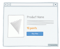
A/B Testing Idea #115 - Offer your very own method of paying or currency
Using a custom currency (credits, points, etc.) will reduce the pain of paying (the negative feelings associated with spending money). Indeed, research has shown that the act of paying really disrupts…
A/B Testing Idea #134 - Place graphs, visuals and pictures on the left-and side of the screen
Visual elements positioned on the left are processed by the right hemisphere of the brain, which is better suited for image processing. Therefore, people will "digest" the page more quickly …
A/B Testing Idea #154 - Be consistent with your product images throughout your site
It's common knowledge that users lack patience when surfing the web. When they are on an eCommerce website they want to be able to see products quickly and easily. A good way of doing this is to…
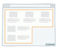
A/B Testing Idea #289 - Condense your content to avoid losing the attention of your user
Make your blocks of content compact. That is to say, you should avoid trapping negative (i.e. useless, empty) space within your layout. For example, in the left-hand image above, you can see that there…
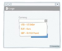
A/B Testing Idea #294 - Display often-used options at the top of drop down lists
Everyone hates filling out information online - the easier and quicker you can make that for your customers, the more likely they are to follow through, complete an action and ultimately convert. One …
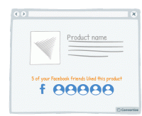
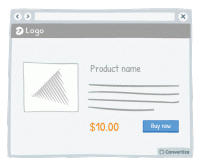
A/B Testing Idea #296 - If connected via Facebook, indicate how many friends have purchased or signed up
If you offer your customers the option to sign in using Facebook then make the most of this advantage. Indeed, using Facebook is a good way to quickly access data about a customer but that's not the…
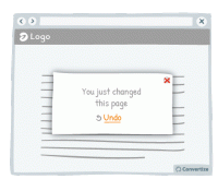
A/B Testing Idea #308 - After small changes, allow users to undo the move rather than to continuously confirm
Rather than asking your customers to confirm changes they make by clicking on "yes" or "no", offer them the possibility to undo what they've already done. Although slight, the …
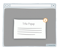
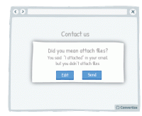
A/B Testing Idea #310 - Offer a clear and simple manner to close pop-up windows
Ensure you give your customer the power to close any pop-ups or other boxes on your site. Showing an immediately recognisable cross in the top-right of all boxes will allow customers to easily close them…
A/B Testing Idea #312 - Make sure you facilitate the user experience of drop-down menus and pop-up windows
Your users aren't perfect, they will regularly make mistakes with the cursor (as do we all!). For this reason, you need to create interfaces that are flexible and forgiving. Visitors are often confronted…
A/B Testing Idea #316 - Display links already used with a dissimilar colour
Clearly show which links a user has already clicked on by displaying them in a different colour. Using another colour will help those links to stand out, which will help the user to keep track of what…
A/B Testing Idea #324 - Utilize written content which slightly contradicts what the user wants to do
The more confident you user feels in navigating your website and completing tasks, the better experience they will have and the more likely they will be to convert. Report potential errors to your customers…
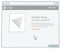
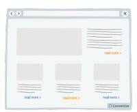
A/B Testing Idea #325 - Increase the clickable zone of your call-to-action if it is small
If your website contains small Call-to-Actions like the "see more" in the drawing above, add a transparent border around it in order to expand the clickable area. Users will not necessarily …


Oops, you have reached your limit of 1 free tactic per hour
To get unlimited access to our 250+ tactics,
Join our FREE mailing list
Or wait 00:59:59
Congratulations!
You have unlocked our library of 250 tactics.
Keep learning or sign up to Convertize.com to start
implementing them directly in your webste.