Home
A/B Testing Idea #279 - On a form, specify which fields are optional rather than which are mandatory

Description
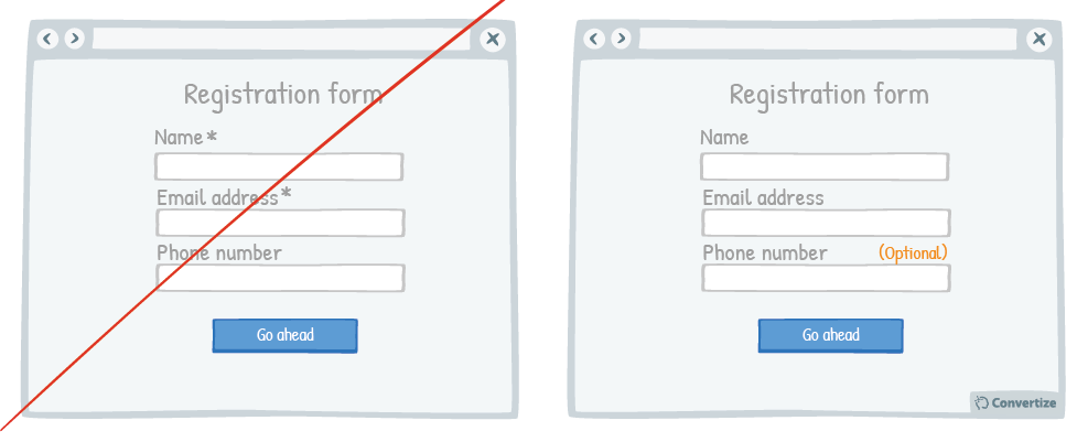
When you ask your customers to fill in a form, specify which fields are optional rather than which are mandatory. On many websites we see asterisks or other visual cues to indicate if a field is mandatory but this can discourage users as it is immediately obvious how much they need to fill in and how much time that might take (especially on larger forms). It is important that people feel comfortable about the task you are requesting them to perform (in this case, filling out a form) and that they recognise they can easily carry it out. Therefore, ensuring that optional fields are clearly marked out will make the form seem both clear and obvious but also give the impression that it will be quicker to complete.
Principles
- Cognitive Ease (Khaneman, 2011)
- Autonomy bias (Deci, 1971; Ryan, 2008)
The Research
Cognitive Ease
The ease with which our brain processes information and how the level of ease impacts how positively we feel about something.
Autonomy bias
We prefer situations that we have control over.

Oops, you have reached your limit of 1 free tactic per hour
To get unlimited access to our 250+ tactics,
Join our FREE mailing list
Or wait 00:59:58


