Home
A/B Testing Idea #302 - Limit human error and frustration by only offering possible inputs in fields

Description
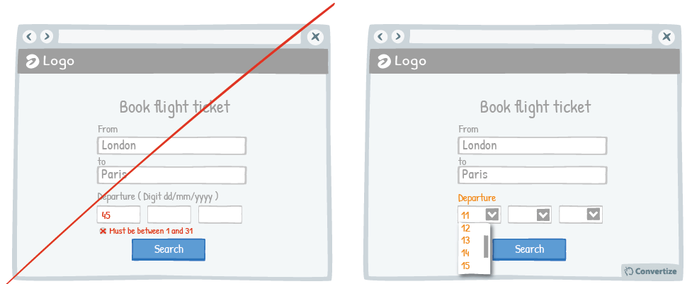
In order to avoid preventable errors and possible frustration on the part of your customer, don't give them the ability to enter incorrect information. For example, as in the above drawing, when someone is required to input a date, make sure they can only select from a list of relevant information. This will make user experience much clearer and more intuitive, and the easier and more pleasant your customer finds your site to use, the more likely they will be to convert.
Inspired by Nick Kolenda
Principles
- Cognitive Ease (Khaneman, 2011)
- Cognitive Friction (Sweller, 1988)
- Autonomy bias (Deci, 1971; Ryan, 2008)
The Research
Cognitive Ease
The ease with which our brain processes information and how the level of ease impacts how positively we feel about something.
Cognitive Friction
Learning happens best under conditions that are aligned with human cognitive architecture.
Autonomy bias
We prefer situations that we have control over.

Oops, you have reached your limit of 1 free tactic per hour
To get unlimited access to our 250+ tactics,
Join our FREE mailing list
Or wait 00:59:59


