Home
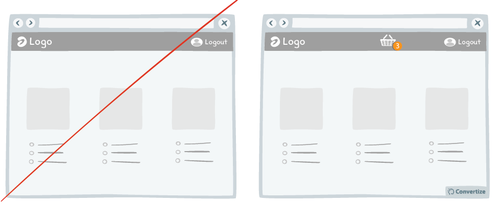
A/B Testing Idea #266 - Render the user's basket continuously accessible through out your funnel

Description
It is a good idea to give customers the opportunity to view the contents of their basket at all times by displaying a basket icon on all pages that shows what is already saved in there when hovered over. This way the customer can see quickly and easily the details of what has already been added to their basket without needing to change page. This prevents the need to quit the page they are browsing to go into the basket page, and then return to the previous page to add more products etc., all of which makes the process more complex and runs the risk of funnel leaks. Visitors will also feel comforted by the fact that they can access this information at all times, and it will give them a feeling of transparency and control that will make them more likely to have confidence in making purchases from your site.
Principles
- Processing Efficacy (Jacoby & Dallas, 1981)
- Information Bias (Baron; Beattie & Hershey, 1988)
- Illusion of Control (Ellen Langer, 1975)
The Research
Processing Efficacy
We tend to prefer things that are simple for us to understand or use.
Information Bias
The tendency to seek out information, thinking that it will lead us to make a better decision, even when that information is of no real help.
Illusion of Control
The Illusion of Control is the tendency to believe that we can control (or at least influence) our environment and, in particular, random phenomenons.

Oops, you have reached your limit of 1 free tactic per hour
To get unlimited access to our 250+ tactics,
Join our FREE mailing list
Or wait 00:59:59


