Home
13 A/B Testing Ideas Using The 'Anchoring Effect' Principle
This is the ultimate library of the Best A/B Testing Ideas: We have compiled 250 A/B Testing Ideas that you can try on your website to optimize your conversion rates and increase your revenues.
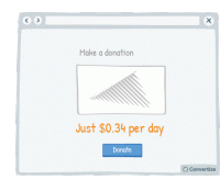
A/B Testing Idea #33 - Display the daily or monthly price to make the amount seem smaller
By showing the price per day or month rather than the total price, it can often seem like less. Your customer will tend to use this smaller amount as an anchor to decide whether the purchase is good…
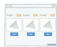
A/B Testing Idea #34 - Display a higher price first
People often use an initial piece of information to make subsequent judgements so if you display a higher price first, it will be the first one your customers read and they will use it as an anchor to…
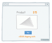
A/B Testing Idea #67 - Separate delivery and handling costs from the main product price
Separating the product price from other surcharges - such as delivery costs or handling fees - will help to give the impression of a lower overall price. The first price seen will act as an anchor …
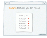
A/B Testing Idea #70 - Offer the possibility to remove rather than to add elements when users make their own personalised plan
If you are offering your customers the chance to create their own custom plan then it is better to offer by default the plan including all available features. Firstly, studies have shown that we are…
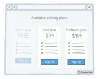
A/B Testing Idea #73 - Make the free plan less visible
By making the free plan less visible, you will automatically draw attention to the other (paid) plans offered as they will stand out visually on the page. It is important to display your free offer…
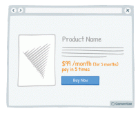
A/B Testing Idea #106 - Give the possibility to pay in instalments
The way in which a price is presented to your customer can greatly influence how they perceive the value of it. For example, offering people the option to pay in installments will subconsciously make …
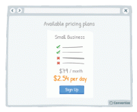
A/B Testing Idea #107 - Demonstrate the per day cost of monthly or yearly plans
Rather than only showing the yearly or monthly cost of a subscription, it can be effective to also display the daily equivalent. Studies have shown that we use a first piece of information as an anchoring…

A/B Testing Idea #109 - Expose your users to large numbers
Exposing website visitors to any high numbers before displaying your product prices can be very effective in influencing their perception of your price value. Studies have shown that people tend to…
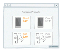
A/B Testing Idea #110 - As your products become older, increase their price
Your customers don't judge prices in terms of "absolute values" (as they don't really know the exact value of things) but instead using a set of references constructed through looking…
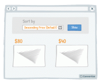
A/B Testing Idea #112 - Use "Descending Price" as your default sorting option
People often use an initial piece of information to make subsequent judgements so if you have "Descending Price" as your default sorting option, people will see your highest priced items first…
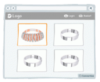
A/B Testing Idea #159 - Prioritise your most luxurious products
If you display your most beautiful and luxurious product first, your visitors will use it as a point of reference to evaluate the following products. This first element will stay anchored in their minds…
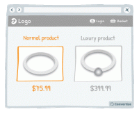
A/B Testing Idea #176 - Show lower-quality products near higher-quality ones
To make your higher-end products seem even more attractive, display them alongside your lower-end products so that customers can compare the two together. The difference in quality will be larger and …
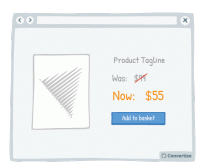
A/B Testing Idea #214 - When displaying promotions, exhibit the previous prices, to accentuate them
When offering discounted prices, it is essential to always still display the previous higher prices as well (crossed out is advisable to avoid confusion). Studies have shown that people tend to use…

Oops, you have reached your limit of 1 free tactic per hour
To get unlimited access to our 250+ tactics,
Join our FREE mailing list
Or wait 00:59:58


