Home
3 A/B Testing Ideas Using The 'Representativeness Heuristic' Principle
This is the ultimate library of the Best A/B Testing Ideas: We have compiled 250 A/B Testing Ideas that you can try on your website to optimize your conversion rates and increase your revenues.

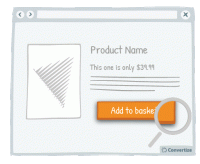
A/B Testing Idea #139 - Enhance your Call-to-action by altering its aesthetics thanks to border, levels or shadows
Your Call-to-Action (CTA) is a button - you need it to look like one! Adding depth to your CTA through using a border, bevel or shadowing will help to clearly distinguish it as a button that is there …

A/B Testing Idea #140 - Convey movement by adding an arrow to your Call-to-Action button
Your Call-to-Action (CTA) is a button - you need it to look like one! Adding an arrow to your CTA will help to clearly distinguish it as a button that is there to be clicked on to move on to the next …

A/B Testing Idea #143 - Alter the aesthetics of your Call-to-action when your user hoover over it
Simply making it so that your Call-to-Action button alters in some way when the cursor hovers over it will clearly distinguish it as a button that is there to be clicked on. A visual effect to indicate…

Oops, you have reached your limit of 1 free tactic per hour
To get unlimited access to our 250+ tactics,
Join our FREE mailing list
Or wait 00:59:59


