Home
3 A/B Testing Ideas Using The 'Mere Exposure Effect' Principle
This is the ultimate library of the Best A/B Testing Ideas: We have compiled 250 A/B Testing Ideas that you can try on your website to optimize your conversion rates and increase your revenues.

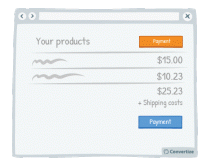
A/B Testing Idea #92 - Indicate your primary Call-to-action twice or more
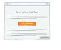
It is almost always better to display your Call-to-Action (CTA) as a button rather than a simple link as it will both attract your user's attention and make it clear that it is a CTA ready to be clicked…

A/B Testing Idea #94 - Ensure that your call-to-action appears above the fold
The "fold" is the line that separates the visible part of your webpage from the part that will only be visible once your visitor scrolls down. Your Call-To-Action (CTA) button should always …

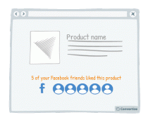
A/B Testing Idea #296 - If connected via Facebook, indicate how many friends have purchased or signed up
If you offer your customers the option to sign in using Facebook then make the most of this advantage. Indeed, using Facebook is a good way to quickly access data about a customer but that's not the…

Oops, you have reached your limit of 1 free tactic per hour
To get unlimited access to our 250+ tactics,
Join our FREE mailing list
Or wait 00:59:59


