Home
7 A/B Testing Ideas Using The 'Aesthetic Usability Effect' Principle
This is the ultimate library of the Best A/B Testing Ideas: We have compiled 250 A/B Testing Ideas that you can try on your website to optimize your conversion rates and increase your revenues.
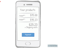
A/B Testing Idea #30 - Make your checkout page responsive for mobile devices
A mobile-friendly checkout page is essential to ensure that people follow through with their purchase. A checkout page that is mobile responsive will not only be more aesthetically pleasing but will be…
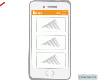
A/B Testing Idea #32 - Make your menu responsive (mobile-friendly)
A mobile-friendly menu is essential to ensure that you don't miss out on customers using mobile devices. Having a menu that is mobile responsive will not only be more aesthetically pleasing but will…
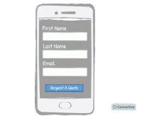
A/B Testing Idea #57 - Make your website responsive (mobile-friendly)
A mobile-friendly website is essential to ensure that you don't miss out on customers using mobile devices. A website that is mobile responsive will not only be more aesthetically pleasing but will…
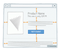
A/B Testing Idea #147 - Add more white space in your pages
A lot of websites consider white space to be lost space but they couldn't be more wrong! Increasing the amount of white space makes for a much clearer page and therefore a more pleasing visual experience…
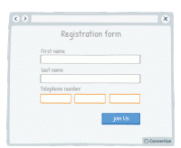
A/B Testing Idea #304 - With forms, offer fields which match the required information
Matching your field layout to whichever input format is required will improve user experience by giving assistance and avoiding errors or frustration. For example, when asking for a phone number you should…
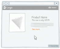
A/B Testing Idea #325 - Increase the clickable zone of your call-to-action if it is small
If your website contains small Call-to-Actions like the "see more" in the drawing above, add a transparent border around it in order to expand the clickable area. Users will not necessarily …
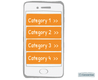
A/B Testing Idea #326 - Make your menus responsive for mobile
It is important these days to ensure your website is mobile responsive. When designing the interface for this though, it is advisable to use one-window drilldowns. That is to say, present each section…

Oops, you have reached your limit of 1 free tactic per hour
To get unlimited access to our 250+ tactics,
Join our FREE mailing list
Or wait 00:59:59


