Home
8 A/B Testing Ideas Using The 'Illusion Of Control' Principle
This is the ultimate library of the Best A/B Testing Ideas: We have compiled 250 A/B Testing Ideas that you can try on your website to optimize your conversion rates and increase your revenues.
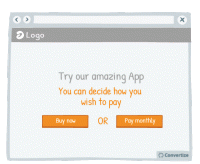
A/B Testing Idea #263 - Do not offer customers only one possibility.
A unique and effective tool of persuasion can in fact be to remind your customers that they have the freedom to choose what to do. Incorporating wording in your copy that emphasises to your customers …
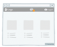
A/B Testing Idea #266 - Render the user's basket continuously accessible through out your funnel
It is a good idea to give customers the opportunity to view the contents of their basket at all times by displaying a basket icon on all pages that shows what is already saved in there when hovered over…
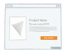
A/B Testing Idea #305 - Give a friendly reminder after items have already been placed in the basket
Making the purchasing process as fluid and easy as possible is important to encourage your visitors to follow through to completion and convert. By altering the Call-to-Action of a product to clearly …
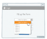
A/B Testing Idea #309 - Limit frustrations by enabling the possibility to leave a field blank, even after it has been selected
It can often happen that a customer might click into an option or function from a drop down list only to realise that they don't want to select anything but find themselves stuck as they are unable…
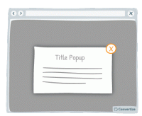
A/B Testing Idea #310 - Offer a clear and simple manner to close pop-up windows
Ensure you give your customer the power to close any pop-ups or other boxes on your site. Showing an immediately recognisable cross in the top-right of all boxes will allow customers to easily close them…
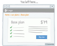
A/B Testing Idea #311 - After users leave a page, return them to where they left off
Sending the user directly back to the page or position in a sequence where they left off will help to minimise the negative effects of leaving a site or page. By sending them straight back to where they…
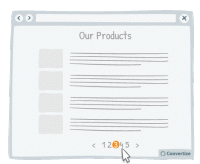
A/B Testing Idea #321 - Use page numbers or ‘Load More’ options rather than infinite scrolling
On eCommerce product pages, it is essential that you choose the right way to display your products to provide your customers with the most effective base to start making choices. People tend to become…
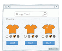
A/B Testing Idea #323 - When a customer selects a filter, ensure that it is automatically applied to the rest of your products
Often a customer types the colour of the desired product in the search bar. But often when typing, say, "red sofa", the search results will be all sofas, red or not red. To avoid discouraging…

Oops, you have reached your limit of 1 free tactic per hour
To get unlimited access to our 250+ tactics,
Join our FREE mailing list
Or wait 00:59:59


