Home
12 A/B Testing Ideas Using The 'Loss Aversion' Principle
This is the ultimate library of the Best A/B Testing Ideas: We have compiled 250 A/B Testing Ideas that you can try on your website to optimize your conversion rates and increase your revenues.

A/B Testing Idea #9 - Appeal to people's fear of loss (Loss Aversion) rather than emphasising potential gains
Loss aversion is the scientific term that explains how the pain of losing is 'felt' about twice as much as the pleasure of gaining. In general, people will be more motivated to act if they …
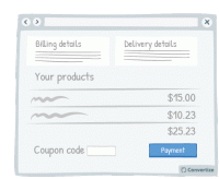
A/B Testing Idea #48 - Bring less attention to your discount/coupon code
Making your "coupon / promo code" section less visible on the page will reduce the likelihood that those who don't have a code to enter will notice it and suddenly feel as though they'…
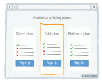
A/B Testing Idea #69 - Create a default option or add-on
If you have a particular option or add-on that you would prefer your customer to choose, then making it a default option will greatly increase the chances of them doing so. Default options are so attractive…
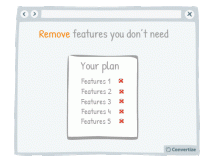
A/B Testing Idea #70 - Offer the possibility to remove rather than to add elements when users make their own personalised plan
If you are offering your customers the chance to create their own custom plan then it is better to offer by default the plan including all available features. Firstly, studies have shown that we are…
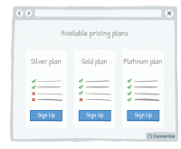
A/B Testing Idea #72 - Add strikethroughs for absent features
Adding strikethroughs for absent features on lower cost pricing plans is a great way of showing people what they'll be missing out on. Research shows that people strongly prefer avoiding losses…
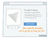
A/B Testing Idea #96 - Create urgency by giving a limited timeframe for fast delivery
Offering fast delivery time is a strong motivator for your customers to complete a purchase as we always prefer to take an option that results in quicker gratification. What's more, as you'…
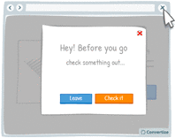
A/B Testing Idea #100 - Display an exit pop-up when your visitor goes to close the page
It happens all too often that your users leave your website because they did not find what they wanted. Perhaps they only visited one or two pages. Therefore, by setting up an "exit pop-up…
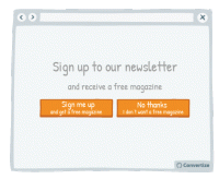
A/B Testing Idea #156 - Facilitate your user's thoughts before asking them to choose
Whilst offering a default choice is often very effective because it allows people to make a decision in a passive manner - which is often preferred as it requires less mental effort - there are some cases…
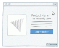
A/B Testing Idea #187 - Display an exit pop-up when people try to leave their basket before completing the checkout process
If your customers have made it to the basket or payment page of your checkout funnel then they've already invested a certain amount of time on your site. The exit pop-up is a good idea to try and …

A/B Testing Idea #272 - Offer feature-by-feature comparisons
Providing a comparison table will allow your customers to immediately access all the information required for decision-making. Studies have shown that our perceptions are formed by using comparison techniques…
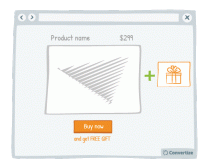
A/B Testing Idea #286 - Hand out free gifts with products bought
The promise of a free gift is a strong incentive to get people to buy. Studies have shown that people are likely to feel compelled to give something back when they receive something for free (it's…
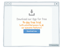
A/B Testing Idea #300 - Carefully select the period and constraints of your "free trials"
To encourage maximum conversion it is important to pick the right trial length and limitations to play into the idea of scarcity and urgency. Offering a free trial period that is too long can mean that…

Oops, you have reached your limit of 1 free tactic per hour
To get unlimited access to our 250+ tactics,
Join our FREE mailing list
Or wait 00:59:59


