Home
7 A/B Testing Ideas Using The 'Zeigarnik Effect' Principle
This is the ultimate library of the Best A/B Testing Ideas: We have compiled 250 A/B Testing Ideas that you can try on your website to optimize your conversion rates and increase your revenues.
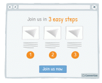
A/B Testing Idea #163 - Use pictograms to help visitors visualise the simplicity of a process or task
The more your visitor is convinced of the simplicity of an action on your site (for example your purchase or registration process), the more motivated they will be to complete it. Using simple, clear …
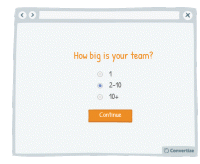
A/B Testing Idea #179 - Seek a gradual engagement, over a hurried signup
Making a form easy and fun to fill in will encourage people to complete it and convert. Starting your form by asking for a lot of personal information will annoy people and they are more likely to abandon…
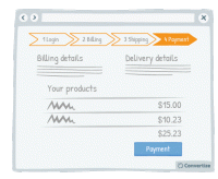
A/B Testing Idea #198 - Show a progress bar
Displaying a progress bar is a great visual way to help users follow their progress in the purchase process and will not only stimulate their desire to continue to the end of the process but also gives…
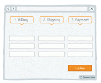
A/B Testing Idea #200 - Test a multi-page checkout process against a single one
To reduce bounce rate during the checkout process, test using a one-page solution: that is to say, display all the different steps - billing, shipping and payment - on one page rather than having a new…
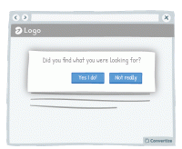
A/B Testing Idea #256 - Engage your users with a simple task or question
Place your customers in a positive frame of mind by giving them a small "victory". Indeed, ask your client to perform a simple task before you can ask then for something longer and more complicated…
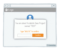
A/B Testing Idea #307 - Add conditions before letting users enact irreversible changes, such as deleting their account
For instance, do not allow your customers to accidentally delete their project on your SaaS platform. Indeed, it is happening often that a person unintentionally deletes his work. Prevent this by asking…
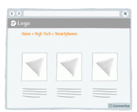
A/B Testing Idea #319 - Display navigation categories (breadcrumbs) to indicate the location of the user on your website
To help your visitor feel at ease with the logic and layout of your site, clearly display a breadcrumb trail (or other sequence map) so they can quickly see where they are on your site and how they arrived…

Oops, you have reached your limit of 1 free tactic per hour
To get unlimited access to our 250+ tactics,
Join our FREE mailing list
Or wait 00:59:58


