Home
6 A/B Testing Ideas Using The 'Split Attention Effect' Principle
This is the ultimate library of the Best A/B Testing Ideas: We have compiled 250 A/B Testing Ideas that you can try on your website to optimize your conversion rates and increase your revenues.
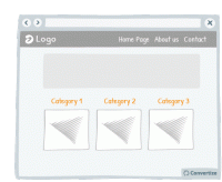
A/B Testing Idea #37 - Remove the Category drop-down menu from your homepage
The category bars and their drop-down menus are standard on most websites, but it's not always the best way to present the product category. These drop-down menus often offer a poor user experience…
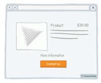
A/B Testing Idea #90 - Combine functions which are similar
People respond best to clear, direct and easy-to-understand information and are easily distracted or put off by extraneous information or demands on their attention. To avoid this, make sure you streamline…
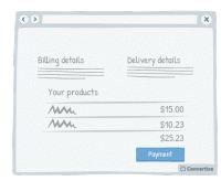
A/B Testing Idea #199 - Remove exit points from checkout page
Studies have shown that if you remove any distractions when people are purchasing something, they are more likely to complete the purchase. Removing all distractions from your checkout pages will allow…
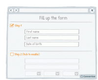
A/B Testing Idea #303 - As a user completes a form, unlock other sections
Rather than giving your customer access to an entire form in block layout, split your form into steps that they can unlock themselves. This will make the form seem less daunting and more bite-sized and…
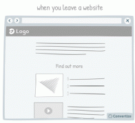
A/B Testing Idea #327 - Avoid showing pop-up windows at the wrong time
Do not set up your pop-ups or overlays to trigger at the wrong times. Having a pop-up triggered as soon as you load a website can be extremely irritating to a user. Some will simply close the website …
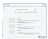
A/B Testing Idea #328 - Avoid placing advertising on top of lists of products
It is best to make sure that your customer's attention is fully focused on the main factors that will lead to conversion. Therefore it isn't advisable to have ad banners places above your product…

Oops, you have reached your limit of 1 free tactic per hour
To get unlimited access to our 250+ tactics,
Join our FREE mailing list
Or wait 00:59:59


