Home
12 A/B Testing Ideas Using The 'Von Restorff Effect' Principle
This is the ultimate library of the Best A/B Testing Ideas: We have compiled 250 A/B Testing Ideas that you can try on your website to optimize your conversion rates and increase your revenues.
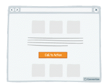
A/B Testing Idea #7 - Choose a contrasting button colour and size for your Call-to-Action
The objective of a Call-to-Action (CTA) button is to encourage your visitors to do something specific. Choosing a contrasting button colour and size will make it more prominent on your page so that…
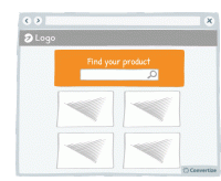
A/B Testing Idea #11 - Emphasise your search bar
If you notice that your site visitors are using the search bar often, make it more prominent by varying its colour, size and position on your page. People are more likely to notice and remember…
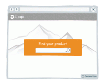
A/B Testing Idea #17 - Blur or fade images to reduce the emphasis on them
By blurring or fading images, you can place emphasis on something else instead. People are more likely to notice and remember an element that stands out. Your visitors will immediately be attracted…
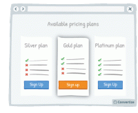
A/B Testing Idea #68 - Put your default pricing plan in the middle and make it more visible
When you have a default pricing plan (the option you would prefer people to choose) then you can influence how attractive this option is by making it stand out from the others. Placing it in the middle…

A/B Testing Idea #93 - As a user visits your website, alter the Call-to-actions
In order to draw attention to your Call-to-Action, try setting it to alter whilst your visitor is on the page. We are naturally drawn to those things which stand out from their environment and something…
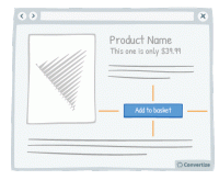
A/B Testing Idea #97 - Add white space around your call-to-action
Increasing the amount of white space around your Call-to-Action (CTA) will draw attention to it and make for a much more pleasing visual experience for the user. Equally, making sure there isn't an…
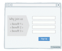
A/B Testing Idea #99 - Leverage the power of visual cues such as imagery to focus attention towards your call-to-action
Using clean, clear imagery is a great way to draw attention to your Call-to-Action (CTA). As in the example above, adding an additional simple visual stimulus that stands out through colour or another…
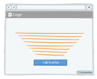
A/B Testing Idea #274 - Display text in such a manner that it focuses the attention to the Call-to-action
Our brains form the majority of the images we “see” and like to be given direction about what to focus on so using visual cues help to draw attention towards certain elements. Lead your visitor…
A/B Testing Idea #298 - Display your call-to-action as a visual animation
Introducing a Call-To-Action (CTA) using a floating animation that appears after a few moments could help increase conversions. Drawing attention to the Call-To-Action is essential for getting people …
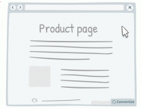
A/B Testing Idea #299 - Make your call-to-action dynamic and delay it
Delaying your call-to-action can have its advantages. It allows the customer to absorb all the content on your page without any distraction and then will more strongly draw their eye due to its sudden…

A/B Testing Idea #306 - Visually distinguish between important functions using colour, size and space
To avoid grave slip-ups, make sure that important functions are highlighted by separating them and using a different colour. This will ensure that the user's attention is drawn to it and they won&#…
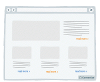
A/B Testing Idea #316 - Display links already used with a dissimilar colour
Clearly show which links a user has already clicked on by displaying them in a different colour. Using another colour will help those links to stand out, which will help the user to keep track of what…

Oops, you have reached your limit of 1 free tactic per hour
To get unlimited access to our 250+ tactics,
Join our FREE mailing list
Or wait 00:59:59


