Home
22 A/B Testing Ideas Using The 'Autonomy Bias' Principle
This is the ultimate library of the Best A/B Testing Ideas: We have compiled 250 A/B Testing Ideas that you can try on your website to optimize your conversion rates and increase your revenues.
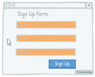
A/B Testing Idea #40 - Whenever possible, pre-fill fields whilst ensuring that users are able to alter them
Making forms as simple and quick to fill in as possible will encourage your customers to complete the desired actions. Where possible - and applicable - it will be helpful therefore to pre-fill form fields…
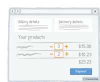
A/B Testing Idea #41 - Allow customers to update their basket
Allowing customers to clearly update the items that they have in their basket is important as it allows them the opportunity to review their purchases prior to making a final decision, the same way they…
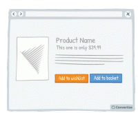
A/B Testing Idea #43 - Let a user save an item for later (wishlist)
Your customers will appreciate having the choice between buying the product immediately or saving it for another time. People like to feel as though they are in control of their shopping experience…
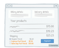
A/B Testing Idea #44 - Offer multiple delivery options, including Express
Offering multiple delivery options is important both to offer choice to the customer but also for the possibility of further profit made on that purchase. Customers like to have a sense of control …
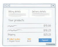
A/B Testing Idea #45 - Provide a free option for in-store pick-up
By providing a free store pick-up option, your customers will be giving customers three advantageous options: the option of avoiding delivery charges (awarding the pleasure of paying less); choosing the…
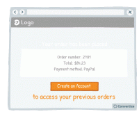
A/B Testing Idea #47 - Offer visitors the option to create an account AFTER checking out
There’s nothing more aggravating than being presented with the “Register to Create an Account!” pop-up before you can complete your order. This can often put people off continuing with…
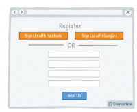
A/B Testing Idea #52 - Offer the option to register through social media
Statistics show that 1 in 4 customers abandon a purchase if they are forced to register for an account first. Today people feel like they have too many accounts and so one way of streamlining this …
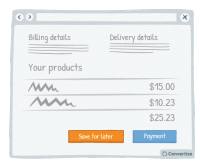
A/B Testing Idea #162 - Offer a "save for later" button on your basket page
Your customers will appreciate having the choice between making their purchase immediately or saving their items to complete purchase later. People like to feel as though they are in control of their…
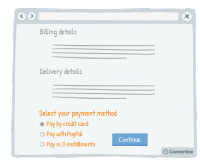
A/B Testing Idea #197 - Enable more than one means to pay
Offering multiple payment methods offers customers the possibility to make a purchase in the way they feel most confident and secure, increasing the likelihood of them finalising payment. People also…
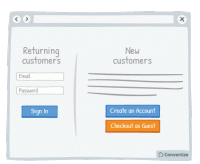
A/B Testing Idea #203 - Enable the possibility to checkout as a guest, without needing to create an account
Your customers will appreciate having the choice of when to register on your website as this induces the positive feeling of having the autonomy to influence the purchasing process. T his also gives…
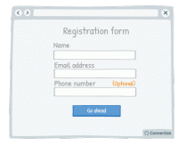
A/B Testing Idea #279 - On a form, specify which fields are optional rather than which are mandatory
When you ask your customers to fill in a form, specify which fields are optional rather than which are mandatory. On many websites we see asterisks or other visual cues to indicate if a field is mandatory…
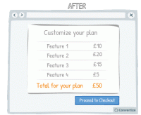
A/B Testing Idea #288 - If users have spent some resources, e.g. financial or time, in your service, indicate how much they have been spent
People are more likely to continue on in vain with a project or plans for which they have already invested money, time or effort, even if they no longer want to or there may be more potential losses to…
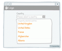
A/B Testing Idea #293 - Indicate popular options as the default ones
Everyone hates filling out information online - the easier and quicker you can make that for your users, the more likely they are to follow through, complete an action and ultimately convert. One way …
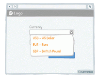
A/B Testing Idea #294 - Display often-used options at the top of drop down lists
Everyone hates filling out information online - the easier and quicker you can make that for your customers, the more likely they are to follow through, complete an action and ultimately convert. One …
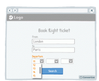
A/B Testing Idea #302 - Limit human error and frustration by only offering possible inputs in fields
In order to avoid preventable errors and possible frustration on the part of your customer, don't give them the ability to enter incorrect information. For example, as in the above drawing, when someone…
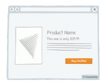
A/B Testing Idea #305 - Give a friendly reminder after items have already been placed in the basket
Making the purchasing process as fluid and easy as possible is important to encourage your visitors to follow through to completion and convert. By altering the Call-to-Action of a product to clearly …
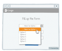
A/B Testing Idea #309 - Limit frustrations by enabling the possibility to leave a field blank, even after it has been selected
It can often happen that a customer might click into an option or function from a drop down list only to realise that they don't want to select anything but find themselves stuck as they are unable…
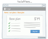
A/B Testing Idea #311 - After users leave a page, return them to where they left off
Sending the user directly back to the page or position in a sequence where they left off will help to minimise the negative effects of leaving a site or page. By sending them straight back to where they…
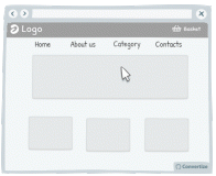
A/B Testing Idea #313 - Add hyperlinks for main menus, and any relevant categories
Users are not perfect, they make mistakes regularly. Indeed, it is common to see people click on areas that are not clickable. Do not try to fight against those mistakes, instead, add clickable functionality…
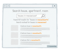
A/B Testing Idea #317 - Ensure that your fields are reactive to errors, antonyms and other syntax differences
Making sure your site visitors have a user experience that is as fluid and easy as possible is important to encourage your visitors to enjoy using your site and ultimately find what they are looking for…
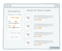
A/B Testing Idea #322 - Suggest a criteria option instead of a filter option for sorting search results
When you display search results, it is important to help your customers find what they are looking for as quickly and easily as possible. This will avoid them becoming overwhelmed by choice and quitting…
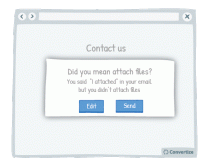
A/B Testing Idea #324 - Utilize written content which slightly contradicts what the user wants to do
The more confident you user feels in navigating your website and completing tasks, the better experience they will have and the more likely they will be to convert. Report potential errors to your customers…

Oops, you have reached your limit of 1 free tactic per hour
To get unlimited access to our 250+ tactics,
Join our FREE mailing list
Or wait 00:59:58


