Home
16 A/B Testing Ideas Using The 'Paradox Of Choice' Principle
This is the ultimate library of the Best A/B Testing Ideas: We have compiled 250 A/B Testing Ideas that you can try on your website to optimize your conversion rates and increase your revenues.
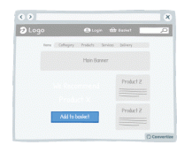
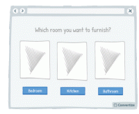
A/B Testing Idea #3 - Reduce the number of default products on your homepage
Displaying fewer default products on your homepage will help your visitors make better decisions, and feel less overwhelmed. Research shows that information overload results in less effective and satisfying…
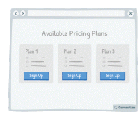
A/B Testing Idea #5 - Reduce the number of pricing plans available to no more than 3
Offering a maximum of 3 pricing plans will help your visitors to make better decisions and feel less overwhelmed. Research shows that information overload results in less effective and satisfying decisions…
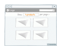
A/B Testing Idea #15 - Include an option to adjust the number of items displayed per page
Adding an option to adjust the number of items displayed per page allows your visitor to feel more in control of how they spend time on your site. This will allow also them to adjust the layout to…
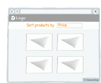
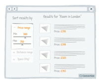
A/B Testing Idea #16 - Enable the possibility to filter options
Adding a sorting option will allow visitors to see the products that interest them without having to spend too much time and effort working out differences in features and costs. The easier and 'smoother…
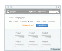
A/B Testing Idea #18 - Reduce the number of default filter options
Offering fewer default filter options on your homepage will help your visitors to make better decisions and feel less overwhelmed. Research shows that information overload results in less effective…
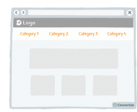
A/B Testing Idea #19 - Reduce the number of categories and menu options displayed
Offering fewer categories and/or menu options will help your visitors make better decisions and feel less overwhelmed. Research shows that information overload results in less effective and satisfying…
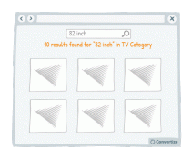
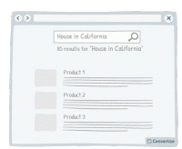
A/B Testing Idea #36 - Create a dedicated search bar within a specific range of products
Research shows that information overload and too much choice results in less effective and satisfying decisions than when less information is presented or fewer options are on offer. It can also lead …
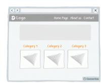
A/B Testing Idea #37 - Remove the Category drop-down menu from your homepage
The category bars and their drop-down menus are standard on most websites, but it's not always the best way to present the product category. These drop-down menus often offer a poor user experience…
A/B Testing Idea #71 - Simplify and restrict options available to customers to choose from
People will often not chose a product if they are presented with a wide range of products to choose from. There is a risk of them being overwhelmed and thus not choosing anything. In order to avoid this…
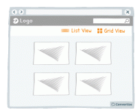
A/B Testing Idea #105 - Visually display in a list format rather than a grid
Simply changing the way in which your products are displayed can make a significant difference to how comfortable your users feel interacting with your site. If you have good quality images, using a grid…
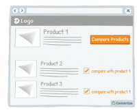
A/B Testing Idea #151 - Add a compare products option/tickbox
Adding a product comparison option to your site will allow visitors to see the products that interest them without having to expend too much effort working out differences in features and costs. The easier…
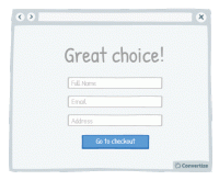
A/B Testing Idea #202 - Don't ask for any non-essential information during the checkout process
When your visitors are in the process of completing their checkout then you don't want to do anything to distract them from this. Don't therefore ask for any non-essential information during this…
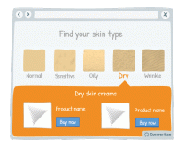
A/B Testing Idea #297 - Allow users to identify themselves with a certain category of people, and then show them content based on their choice
Allow users to identify themselves with a certain category of people and then submit introduce the products that match with their needs can have several advantages. First, your customer feels included…
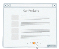
A/B Testing Idea #321 - Use page numbers or ‘Load More’ options rather than infinite scrolling
On eCommerce product pages, it is essential that you choose the right way to display your products to provide your customers with the most effective base to start making choices. People tend to become…
A/B Testing Idea #322 - Suggest a criteria option instead of a filter option for sorting search results
When you display search results, it is important to help your customers find what they are looking for as quickly and easily as possible. This will avoid them becoming overwhelmed by choice and quitting…
A/B Testing Idea #328 - Avoid placing advertising on top of lists of products
It is best to make sure that your customer's attention is fully focused on the main factors that will lead to conversion. Therefore it isn't advisable to have ad banners places above your product…


Oops, you have reached your limit of 1 free tactic per hour
To get unlimited access to our 250+ tactics,
Join our FREE mailing list
Or wait 00:59:59
Congratulations!
You have unlocked our library of 250 tactics.
Keep learning or sign up to Convertize.com to start
implementing them directly in your webste.