Home
21 A/B Testing Ideas Using The 'Cognitive Ease' Principle
This is the ultimate library of the Best A/B Testing Ideas: We have compiled 250 A/B Testing Ideas that you can try on your website to optimize your conversion rates and increase your revenues.
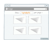
A/B Testing Idea #15 - Include an option to adjust the number of items displayed per page
Adding an option to adjust the number of items displayed per page allows your visitor to feel more in control of how they spend time on your site. This will allow also them to adjust the layout to…
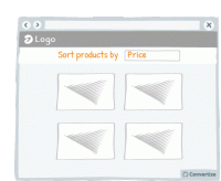
A/B Testing Idea #16 - Enable the possibility to filter options
Adding a sorting option will allow visitors to see the products that interest them without having to spend too much time and effort working out differences in features and costs. The easier and 'smoother…
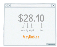
A/B Testing Idea #29 - Select a price which has the smallest amount of letters possible
Choosing a price with fewer syllables removes a little of the cognitive strain from your customer and things which are quicker and easier to understand are instantly more familiar. The clearer you can…
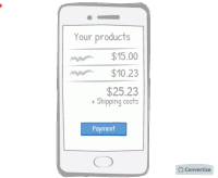
A/B Testing Idea #30 - Make your checkout page responsive for mobile devices
A mobile-friendly checkout page is essential to ensure that people follow through with their purchase. A checkout page that is mobile responsive will not only be more aesthetically pleasing but will be…
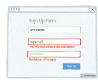
A/B Testing Idea #38 - Display an error-message for important fields which were incorrectly filled in or missing
By immediately showing your customers any issues with information they are entering, you will avoid any added stress or misunderstandings. Creating an easy process for your customers is key as they will…
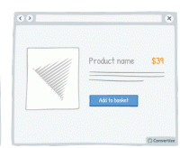
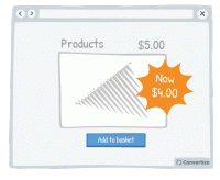
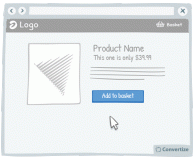
A/B Testing Idea #77 - When possible, get rid of the decimal point in the price tag
Whenever possible, remove the decimal point from your pricing as it is not necessary and adds a little extra cognitive strain for your customer. The clearer you can make things the better as people want…
A/B Testing Idea #95 - Limit the numbers of words in your call-to-action to 2
The simpler and more attention-grabbing you can make your Call-to-Action (CTA) the better. Customers prefer to use less mental energy and want to be led with ease around your site. Using only 2 words…
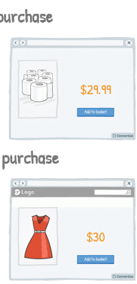
A/B Testing Idea #104 - Emotion and rational purchasing decisions: implications for rounding prices
Our brains process prices differently depending on whether a purchase is guided by rationality (for example for non-luxury, necessary goods) or by emotions (those products which we buy to make us happy…
A/B Testing Idea #118 - Give discounts which are simple to calculate
Using precise, non-rounded numbers is a good way of making your prices seem smaller but one occasion when you don't want to do this is when you're offering discounts. You want your discounts to…

A/B Testing Idea #134 - Place graphs, visuals and pictures on the left-and side of the screen
Visual elements positioned on the left are processed by the right hemisphere of the brain, which is better suited for image processing. Therefore, people will "digest" the page more quickly …
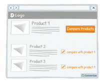
A/B Testing Idea #151 - Add a compare products option/tickbox
Adding a product comparison option to your site will allow visitors to see the products that interest them without having to expend too much effort working out differences in features and costs. The easier…
A/B Testing Idea #153 - Display pop-up information when hovering over a product
When customers hover over a product, display a pop-up product card that offers them condensed information. By showing only carefully selected information about the product in this way, customers won…
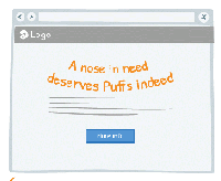
A/B Testing Idea #258 - Whenever possible, convey messages using rhymes as they will be more easily remembered
"A nose in need deserves Puffs indeed", "If the glove doesn’t fit, you must acquit". You know these slogans and better you will easily remember it. Indeed, these slogans have…

A/B Testing Idea #259 - Prioritise active over passive voice
Make simple, concise sentences in the active voice to simplify the understanding and impact of your message. A grammatically complex sentence will not have the same immediate effect on the mind of your…
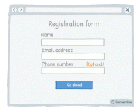
A/B Testing Idea #279 - On a form, specify which fields are optional rather than which are mandatory
When you ask your customers to fill in a form, specify which fields are optional rather than which are mandatory. On many websites we see asterisks or other visual cues to indicate if a field is mandatory…
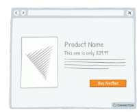
A/B Testing Idea #301 - Limit human error by disabling or replacing your call-to-action after users select it
Once your customer clicks on a Call-to-Action, disable or remove it to indicate that they have already clicked once and the action has been performed. This will prevent your customer from being tempted…
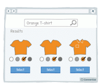
A/B Testing Idea #302 - Limit human error and frustration by only offering possible inputs in fields
In order to avoid preventable errors and possible frustration on the part of your customer, don't give them the ability to enter incorrect information. For example, as in the above drawing, when someone…
A/B Testing Idea #305 - Give a friendly reminder after items have already been placed in the basket
Making the purchasing process as fluid and easy as possible is important to encourage your visitors to follow through to completion and convert. By altering the Call-to-Action of a product to clearly …
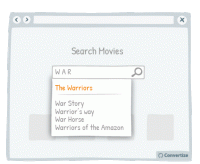
A/B Testing Idea #315 - Indicate what your visitor has most recently researched in a drop-down menu
When a user begins a search, start by showing them previous searches they have made that correspond. Displaying these first and perhaps in a different colour to really distinguish them is a good way of…
A/B Testing Idea #318 - Simplify your customer's thinking process by doing any calculations for them
People strongly prefer and feel more positive about things that are easy and quick for us to understand. If you want your customer to respond well to information you provide and to feel happy using your…
A/B Testing Idea #323 - When a customer selects a filter, ensure that it is automatically applied to the rest of your products
Often a customer types the colour of the desired product in the search bar. But often when typing, say, "red sofa", the search results will be all sofas, red or not red. To avoid discouraging…


Oops, you have reached your limit of 1 free tactic per hour
To get unlimited access to our 250+ tactics,
Join our FREE mailing list
Or wait 00:59:59
Congratulations!
You have unlocked our library of 250 tactics.
Keep learning or sign up to Convertize.com to start
implementing them directly in your webste.