Home
15 A/B Testing Ideas Using The 'Information Bias' Principle
This is the ultimate library of the Best A/B Testing Ideas: We have compiled 250 A/B Testing Ideas that you can try on your website to optimize your conversion rates and increase your revenues.
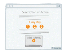
A/B Testing Idea #4 - To demonstrate how easy your site is to use, offer 'how-to' pages and prioritise video format
If you show your visitors how easy it is for them to act (i.e. to complete an action on your website, or to utilise one of your products, or services) by providing "how-to" pages and videos…
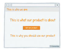
A/B Testing Idea #54 - The 4 Ws "Who, What, Where, Why" - Ensure that your homepage addresses all of these
Your homepage is most usually the first page your customers will arrive on when they visit your website and so it is vital that it is clear, easy to understand and gives them as much information as they…
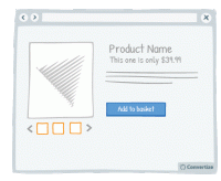
A/B Testing Idea #58 - Show more than 3 high-resolution product images
Product images are an important element of your product page. In fact, people react far more strongly to visuals than to text and it allows them to form a more emotional and personal attachment to the…
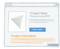
A/B Testing Idea #59 - Display all product information
Your customers will feel like the more information they are given in order to make a decision, then the better that decision will be. So the more information you can give them about the product (in…
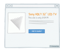
A/B Testing Idea #61 - Product name should be descriptive and unique
Choose a product names that is descriptive and unique. Indeed, having a descriptive name simplifies the understanding of the product and avoid confusion for your customers. In addition it helps to boost…
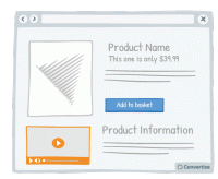
A/B Testing Idea #64 - In your product pages, include a video
Providing a video of the product will allow your visitors to see more precisely how it looks and functions, the same way they might when buying in store. Customers prefer to have as much information…
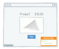
A/B Testing Idea #74 - Improve your customer service by having a live chat option
Live chat is a very effective method of communication with your site visitors. Offering an immediate and direct link to another human being will give your customers confidence and reassurance not only…
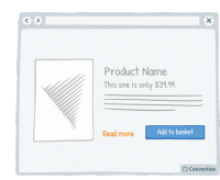
A/B Testing Idea #133 - Provide a "more info" button for every product
Your customers will feel like the more information they are given in order to make a decision, then the better that decision will be. So the more information you can give them about the product (in…
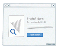
A/B Testing Idea #145 - Provide the option of enlarging product pictures
If the primary selling feature of your product is visual, you should provide the possibility of enlarging or zooming in on the image so that the customer can see the product in more detail, as they would…
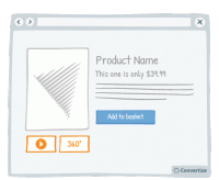
A/B Testing Idea #152 - Offer 360 degrees videos of your product
The more information a user has access to about a product, the more likely they are to buy it. You can take advantage of this by offering your user more extensive views of it. There are various different…
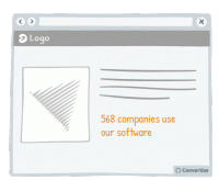
A/B Testing Idea #261 - Instead of trying too hard to sell, be more specific in your sales argument
Arguments or tag-lines that are too fluffy and reminiscent of an unfounded sales pitch - such as "our customers love us" or "our software is very reliable" - can be effective in the…
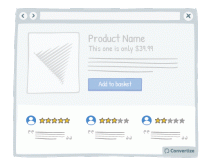
A/B Testing Idea #264 - Do not shy away from mentioning some fall backs
On most websites, negative reviews or drawbacks are invisible while on others (e.g. Amazon), those are clearly displayed alongside the pros. Believe it or not, but hiding your drawbacks is not the solution…
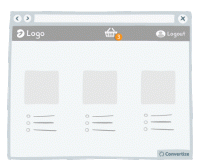
A/B Testing Idea #266 - Render the user's basket continuously accessible through out your funnel
It is a good idea to give customers the opportunity to view the contents of their basket at all times by displaying a basket icon on all pages that shows what is already saved in there when hovered over…
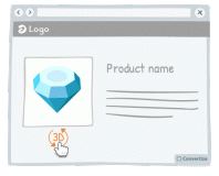
A/B Testing Idea #268 - Use interactive images rather than static ones
Research has shown that consumers are generally more drawn to interactive images than static ones. The interactive images provide a "fun" aspect to the user experience thanks, for example, to…
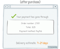
A/B Testing Idea #270 - Accurately indicate delivery time frames, including restrictions
To display delivery time in weeks or in days? That is the question... The answer is actually pretty simple. During the purchase process the customer will focus on the numbers themselves and they will …

Oops, you have reached your limit of 1 free tactic per hour
To get unlimited access to our 250+ tactics,
Join our FREE mailing list
Or wait 00:59:59


