Home
43 A/B Testing Ideas Using The 'Processing Efficacy' Principle
This is the ultimate library of the Best A/B Testing Ideas: We have compiled 250 A/B Testing Ideas that you can try on your website to optimize your conversion rates and increase your revenues.
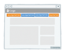
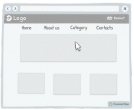
A/B Testing Idea #28 - Restructure your navigation menu
Re-ordering your navigation menu by putting the most important links at the beginning and the end of your menu will help to ensure visitors notice and click on them. Research has shown that people recall…
A/B Testing Idea #54 - The 4 Ws "Who, What, Where, Why" - Ensure that your homepage addresses all of these
Your homepage is most usually the first page your customers will arrive on when they visit your website and so it is vital that it is clear, easy to understand and gives them as much information as they…
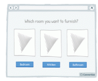
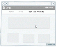
A/B Testing Idea #71 - Simplify and restrict options available to customers to choose from
People will often not chose a product if they are presented with a wide range of products to choose from. There is a risk of them being overwhelmed and thus not choosing anything. In order to avoid this…

A/B Testing Idea #82 - Give your pricing plans relatable, helpful names
The names you use for your pricing plans can really make a difference. By using names that your customers are familiar with, you will trigger an immediate emotional response that will enhance their positivity…
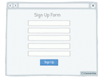
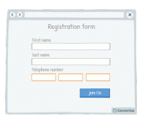
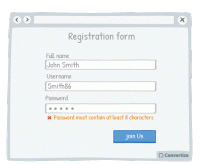
A/B Testing Idea #86 - Prioritise, whenever possible, single-column forms
People like to process things quickly and easily, and will be put off by anything that complicates this cognitive fluency. Using single column forms not only makes them look cleaner and easier to navigate…

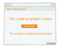
A/B Testing Idea #89 - Follow a simple rule: 1 Call-to-action 1: direct message 1: unique selling proposition
People respond best to clear, direct and easy-to-understand information and are easily distracted or put off by extraneous information or demands on their attention. To avoid this, try following the…

A/B Testing Idea #90 - Combine functions which are similar
People respond best to clear, direct and easy-to-understand information and are easily distracted or put off by extraneous information or demands on their attention. To avoid this, make sure you streamline…
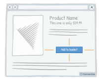
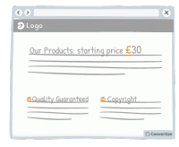
A/B Testing Idea #97 - Add white space around your call-to-action
Increasing the amount of white space around your Call-to-Action (CTA) will draw attention to it and make for a much more pleasing visual experience for the user. Equally, making sure there isn't an…

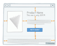
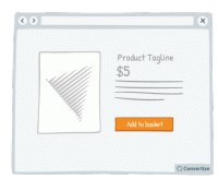
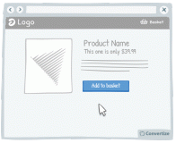
A/B Testing Idea #99 - Leverage the power of visual cues such as imagery to focus attention towards your call-to-action
Using clean, clear imagery is a great way to draw attention to your Call-to-Action (CTA). As in the example above, adding an additional simple visual stimulus that stands out through colour or another…
A/B Testing Idea #147 - Add more white space in your pages
A lot of websites consider white space to be lost space but they couldn't be more wrong! Increasing the amount of white space makes for a much clearer page and therefore a more pleasing visual experience…
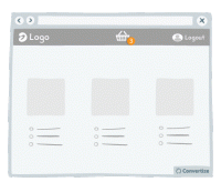
A/B Testing Idea #154 - Be consistent with your product images throughout your site
It's common knowledge that users lack patience when surfing the web. When they are on an eCommerce website they want to be able to see products quickly and easily. A good way of doing this is to…
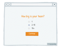
A/B Testing Idea #179 - Seek a gradual engagement, over a hurried signup
Making a form easy and fun to fill in will encourage people to complete it and convert. Starting your form by asking for a lot of personal information will annoy people and they are more likely to abandon…
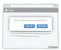
A/B Testing Idea #256 - Engage your users with a simple task or question
Place your customers in a positive frame of mind by giving them a small "victory". Indeed, ask your client to perform a simple task before you can ask then for something longer and more complicated…

A/B Testing Idea #259 - Prioritise active over passive voice
Make simple, concise sentences in the active voice to simplify the understanding and impact of your message. A grammatically complex sentence will not have the same immediate effect on the mind of your…

A/B Testing Idea #260 - Prioritise pictures, visual elements over lone text
“A picture paints a thousand words”. Indeed, the human brain learns and retains information much better when it comes in the form of images rather than words. Images do not require translation…

A/B Testing Idea #261 - Instead of trying too hard to sell, be more specific in your sales argument
Arguments or tag-lines that are too fluffy and reminiscent of an unfounded sales pitch - such as "our customers love us" or "our software is very reliable" - can be effective in the…
A/B Testing Idea #266 - Render the user's basket continuously accessible through out your funnel
It is a good idea to give customers the opportunity to view the contents of their basket at all times by displaying a basket icon on all pages that shows what is already saved in there when hovered over…
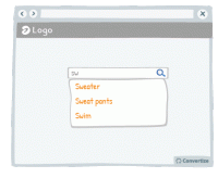
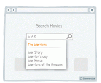
A/B Testing Idea #275 - Allow users, with your search bar, to jump to suggestions based on what they typed
In order to increase conversion rates, simply help your customer to find what they are looking for as quickly and easily as possible. Offering suggestions in the search bar based on what the customer …
A/B Testing Idea #277 - Avoid showing your Call-to-action more than once on the same page
Don't be tempted to display the same information twice in two different locations on your page (if it is a one-screen page that doesn't require any scrolling) because this will make it too busy…
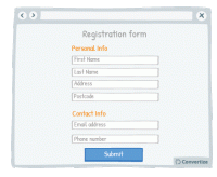
A/B Testing Idea #280 - Separate your form into smaller sections
When you want someone to complete a form, it is best not to discourage them by presenting that form in one large block that will immediately seem dense, unclear and long. By separating your form into …
A/B Testing Idea #281 - Be careful when using special characters, faults could decrease your credibility
When you create a web page, be careful that you don't have any accidental character faults due to coding problems or lack of care. The kind of symbols that are often seen on web pages, such as ▢ &…

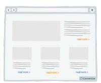
A/B Testing Idea #289 - Condense your content to avoid losing the attention of your user
Make your blocks of content compact. That is to say, you should avoid trapping negative (i.e. useless, empty) space within your layout. For example, in the left-hand image above, you can see that there…

A/B Testing Idea #290 - Whenever possible, prioritise single and vertical columns
Using a two-column layout on your site could disturb the fluency with which the reader absorbs your content as you are splitting their attention between two areas. Rather than leading your visitor'…

A/B Testing Idea #291 - Nudge users to read your page by slightly overlapping design elements and images
If you completely separate the design of each content block then you won't give your visitor the encouragement they need to continue on reading down. Rather, after reading only the first block they…
A/B Testing Idea #293 - Indicate popular options as the default ones
Everyone hates filling out information online - the easier and quicker you can make that for your users, the more likely they are to follow through, complete an action and ultimately convert. One way …
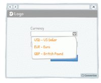
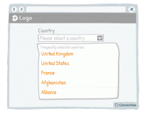
A/B Testing Idea #294 - Display often-used options at the top of drop down lists
Everyone hates filling out information online - the easier and quicker you can make that for your customers, the more likely they are to follow through, complete an action and ultimately convert. One …
A/B Testing Idea #301 - Limit human error by disabling or replacing your call-to-action after users select it
Once your customer clicks on a Call-to-Action, disable or remove it to indicate that they have already clicked once and the action has been performed. This will prevent your customer from being tempted…
A/B Testing Idea #304 - With forms, offer fields which match the required information
Matching your field layout to whichever input format is required will improve user experience by giving assistance and avoiding errors or frustration. For example, when asking for a phone number you should…

A/B Testing Idea #306 - Visually distinguish between important functions using colour, size and space
To avoid grave slip-ups, make sure that important functions are highlighted by separating them and using a different colour. This will ensure that the user's attention is drawn to it and they won&#…

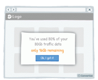
A/B Testing Idea #310 - Offer a clear and simple manner to close pop-up windows
Ensure you give your customer the power to close any pop-ups or other boxes on your site. Showing an immediately recognisable cross in the top-right of all boxes will allow customers to easily close them…
A/B Testing Idea #312 - Make sure you facilitate the user experience of drop-down menus and pop-up windows
Your users aren't perfect, they will regularly make mistakes with the cursor (as do we all!). For this reason, you need to create interfaces that are flexible and forgiving. Visitors are often confronted…
A/B Testing Idea #313 - Add hyperlinks for main menus, and any relevant categories
Users are not perfect, they make mistakes regularly. Indeed, it is common to see people click on areas that are not clickable. Do not try to fight against those mistakes, instead, add clickable functionality…
A/B Testing Idea #314 - When displaying error messages, include relevant indicators
When displaying error messages, make sure that you clearly explain the reason for the error. If your user is getting error messages without anything to tell them why it can't be validated and how …
A/B Testing Idea #315 - Indicate what your visitor has most recently researched in a drop-down menu
When a user begins a search, start by showing them previous searches they have made that correspond. Displaying these first and perhaps in a different colour to really distinguish them is a good way of…
A/B Testing Idea #316 - Display links already used with a dissimilar colour
Clearly show which links a user has already clicked on by displaying them in a different colour. Using another colour will help those links to stand out, which will help the user to keep track of what…
A/B Testing Idea #317 - Ensure that your fields are reactive to errors, antonyms and other syntax differences
Making sure your site visitors have a user experience that is as fluid and easy as possible is important to encourage your visitors to enjoy using your site and ultimately find what they are looking for…
A/B Testing Idea #318 - Simplify your customer's thinking process by doing any calculations for them
People strongly prefer and feel more positive about things that are easy and quick for us to understand. If you want your customer to respond well to information you provide and to feel happy using your…

A/B Testing Idea #319 - Display navigation categories (breadcrumbs) to indicate the location of the user on your website
To help your visitor feel at ease with the logic and layout of your site, clearly display a breadcrumb trail (or other sequence map) so they can quickly see where they are on your site and how they arrived…
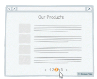
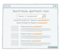
A/B Testing Idea #321 - Use page numbers or ‘Load More’ options rather than infinite scrolling
On eCommerce product pages, it is essential that you choose the right way to display your products to provide your customers with the most effective base to start making choices. People tend to become…
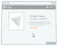
A/B Testing Idea #325 - Increase the clickable zone of your call-to-action if it is small
If your website contains small Call-to-Actions like the "see more" in the drawing above, add a transparent border around it in order to expand the clickable area. Users will not necessarily …
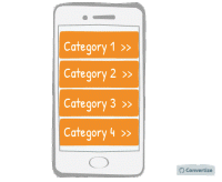
A/B Testing Idea #326 - Make your menus responsive for mobile
It is important these days to ensure your website is mobile responsive. When designing the interface for this though, it is advisable to use one-window drilldowns. That is to say, present each section…
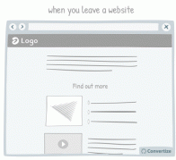
A/B Testing Idea #327 - Avoid showing pop-up windows at the wrong time
Do not set up your pop-ups or overlays to trigger at the wrong times. Having a pop-up triggered as soon as you load a website can be extremely irritating to a user. Some will simply close the website …

A/B Testing Idea #329 - On mobile devices, ensure that you have easily clickable areas
On smaller screens, such as on mobile or tablet, it is common for users to experience frustration and unease when trying to click options as the hit areas can be too imprecise. When we are using our fingers…


Oops, you have reached your limit of 1 free tactic per hour
To get unlimited access to our 250+ tactics,
Join our FREE mailing list
Or wait 00:59:59
Congratulations!
You have unlocked our library of 250 tactics.
Keep learning or sign up to Convertize.com to start
implementing them directly in your webste.